
CuuuJooo
Registered User
- May 28, 2021
- 260
- 307
My God. He CAN actually paint like someone not hopped up on goofballs.
My God. He CAN actually paint like someone not hopped up on goofballs.
I think the 'sloppiness' if you will is just part of the grand scheme of it all...It does look like a guy might've done this in his basement 11:40 pm while on his 4th beer.Just more proof that Dave can find a way to overcomplicate or fail to perfectly execute even the simplest of "2D FX" designs. The "brush textures FX" or whatever just completely detracts from the concept. It's distracting and ends up looking like it was just hand painted by a DIYer at home. It takes away from the intended "simplicity" of the design.
Like taking acid before painting the CuJo mask.This one failed on the design table.
The 35 not being centered correctly with the kerning really irks me but then again that's expecting a walnut like DaveFlares to do something correct.
Had he just done it like a proper airbrush without the hand painted texturing, it would have looked better. But Dave is gonna Dave. He can't get out of his own way.Just more proof that Dave can find a way to overcomplicate or fail to perfectly execute even the simplest of "2D FX" designs. The "brush textures FX" or whatever just completely detracts from the concept. It's distracting and ends up looking like it was just hand painted by a DIYer at home. It takes away from the intended "simplicity" of the design.
Sweet mother of Crosby that mask is hideous.This one failed on the design table.

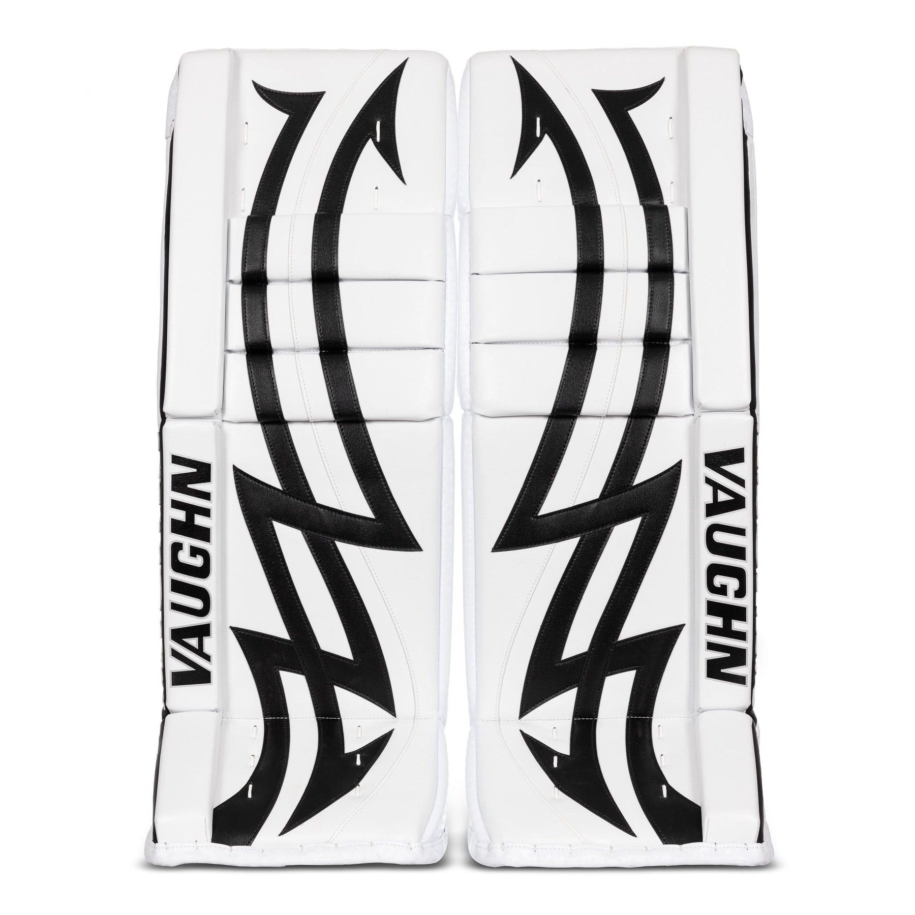
Here's Jarry's new pads set up for those that like to see what everyone is doing, no matter what.
I think the 'sloppiness' if you will is just part of the grand scheme of it all...It does look like a guy might've done this in his basement 11:40 pm while on his 4th beer.
I think some people are trying too hard to find fault in the Talbot mask. When he's wearing that in-game you're not going to see that detail, it's just there for looking at it close up.
The 35 not being centered correctly with the kerning really irks me but then again that's expecting a walnut like DaveFlares to do something correct.
Had he just done it like a proper airbrush without the hand painted texturing, it would have looked better. But Dave is gonna Dave. He can't get out of his own way.
Here's Jarry's new pads set up for those that like to see what everyone is doing, no matter what.
Yawn:
Meh, printed graphics hardly ever work for me:
This one failed on the design table.
Oh heck yeah. These are sweet. Hope we get more goalies going back to more "classic" pad designs like that.
It'll get "yawns" from a lot of people...but i still love a good, clean white pads setup like that. Ideally, a little pop of colour somewhere...like an outer roll, knee rolls, or just a restrained sort of mild pattern. But that looks way better to me than something like say...
This. Printed graphics aren't it. Just ends up looking like old timey road hockey pads for children.
What in the ever loving...
Oh heck yeah. These are sweet. Hope we get more goalies going back to more "classic" pad designs like that.
View attachment 906825
Vaughn was offering some older graphics on their latest retail pad. So we'll probably see a few more NHL guys with older designs. The iceberg graphic was popular. I think Jonathan Quick got them to use a decade old graphic recently.
A few years back some goalies were rocking the 2001-03 era CCM Heaton 10 graphic. Maybe fortunate for my wallet that it was never an option for a beer leaguer.
View attachment 906826
Probably somewhat alone in this, but i kinda miss this design:
It'd be cool if that made a comeback with someone.
Yawn:
Meh, printed graphics hardly ever work for me:
Ah the tribal tat design lol.Probably somewhat alone in this, but i kinda miss this design:
It'd be cool if that made a comeback with someone.
