Nogatco Rd
Pierre-McGuire Luc Dubois
- Apr 3, 2021
- 4,683
- 8,485
That could definitely be itI suspect you are thinking of Mike Palmateer's mask while he was with Washington.
He was with the Caps for the '80-'81 season and the '81-82 campaign.
That could definitely be itI suspect you are thinking of Mike Palmateer's mask while he was with Washington.
He was with the Caps for the '80-'81 season and the '81-82 campaign.
My bad a fictitious “beast” that looks like a tiger and crappy Minnesota sports logos.That's not a tiger and those certainly aren't random logos on the side.
Weird take by a fan of a team that is named after a fictitious "Jersey Devil" that either looked like a weird Devil Chicken or a dwarf/elf with fangs, bat wings, and hooves.My bad a fictitious “beast” that looks like a tiger and crappy Minnesota sports logos.
You'd think with enough of the older blokes in head office and management knowing what that looks like would say something by now.
I really don't think these are a problem.
You just don’t understand 5D galaxy sparkle technology .I think Daveart sucks
You just don’t understand 5D galaxy sparkle technology .
It’s the wave of the future
Is that Aaron Rodgers?I like it...That said IMHO the Jets need to follow what the Oilers and Flames had done - go back to their logo/jerseys of past years...Their current iteration (F18 crest) is dull.
The Jets 3rd jersey would be a solid choice.
View attachment 904640
Is that Aaron Rodgers?
I figured as much. Just did a double take when I first saw it.Photoshopped after he joined the New York Jets.
And here it is, the first official Utah lid.
It's quite literally a homage to Brodeur's masks, which are classics. So it's an homage to a classic which I mean yeah..Which one ?
And here it is, the first official Utah lid.
I like it...That said IMHO the Jets need to follow what the Oilers and Flames had done - go back to their logo/jerseys of past years...Their current iteration (F18 crest) is dull.
The Jets 3rd jersey would be a solid choice.
View attachment 904640

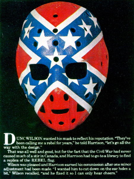
Palmateer was actually the 2nd one to wear that "style" that looks like the Confederate Flag but his wasn't exactly the Confederate flag by looks unless you really tried to force that narrative, apparently they can't figure out how idiotic it looks even today. Dunc wore it for the Rangers which was just stupid, then 5-6yrs later, Palmateer has his but it's just a Star which is less egregious than say Dunc and his whole reasoning behind it.I suspect you are thinking of Mike Palmateer's mask while he was with Washington.
He was with the Caps for the '80-'81 season and the '81-82 campaign.


