OT: Which threads blow you away? The great jersey debate

Svechhammer

THIS is hockey?
Jun 8, 2017
25,388
92,612
Ok gross the stormy jersey is straight up bad


1000000705.png
 

MinJaBen

Canes Sharks Boy
Sponsor
Dec 14, 2015
21,355
82,869
Durm
View attachment 838153

Tried my hand at the Stormy Fauxback. Can't decide if I like it

For the record, the number font and nameplate are what the team wore in their last jerseys in Hartford, just with a single outline instead of double.
To me, it seems weird to have the mascot on the jersey....wearying another jersey. In general, I like the Stormy mascot graphic, but not as the primary logo on a jersey.

Ok gross the stormy jersey is straight up bad


View attachment 838197

This is giving me the same vibe as that Michigan State off centered 'M'.

And the colors are all wrong.
 

AD Skinner

Registered User
Mar 18, 2009
13,260
40,792
bubble bath
To me, it seems weird to have the mascot on the jersey....wearying another jersey. In general, I like the Stormy mascot graphic, but not as the primary logo on a jersey.


This is giving me the same vibe as that Michigan State off centered 'M'.

And the colors are all wrong.
I get what you’re saying but the Miami dolphins had a dolphin on their helmet wearing a different helmet for how many years
 

VaCaps Fan

Registered User
Sponsor
Feb 18, 2018
4,663
7,004
At a discount store and trying to convince my brother to not waste $40 dollars on a fanatics jersey. Even on discount fanatics sucks (Michael Rubin
 

Borsig

PoKechetkov
Nov 3, 2007
5,117
9,944
Low country coast
All of you have scared me into buying another adidas jersey. I bought my first jersey at the arena back in December but probably won’t be able to make it to another game this season. Who has the best prices online?
I think the stadium ones if still avalable are 106. I paid that for mine at CPS. But they are plain AF without the numbers.

If you want a red one just get the old school CCM. Granted I've had my RBA one for like 15 or 20 years but, you can find them on ebay. I'd make sure I had a black and white CCM though.


Adidas Stadium Series Jersey 2023 108 for a staduim. I still need to get a stadium series shoulder patch for it.

Adidas official has them for 180 (red) and you can use codees and what not to bring them down.
 
  • Like
Reactions: VaCaps Fan

raynman

Registered User
Jan 20, 2013
5,057
11,164
I think the stadium ones if still avalable are 106. I paid that for mine at CPS. But they are plain AF without the numbers.

If you want a red one just get the old school CCM. Granted I've had my RBA one for like 15 or 20 years but, you can find them on ebay. I'd make sure I had a black and white CCM though.


Adidas Stadium Series Jersey 2023 108 for a staduim. I still need to get a stadium series shoulder patch for it.

Adidas official has them for 180 (red) and you can use codees and what not to bring them down.
Didn’t know the stadium series was on sale, thanks. I’m really after the navy blue Whalers but apparently that’s either been discontinued or sold out.
 
  • Like
Reactions: VaCaps Fan

Socrates Karmanos

Registered User
May 21, 2022
19
52
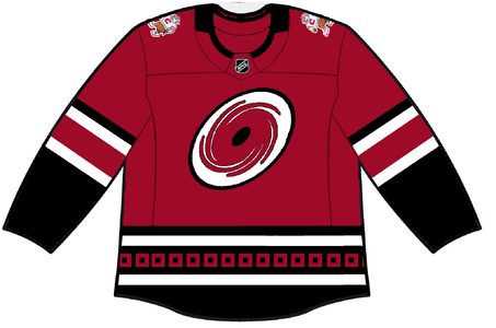
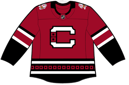
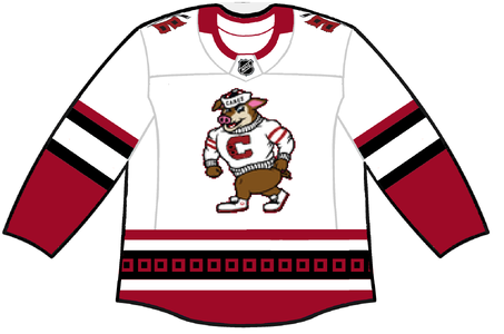
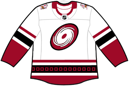
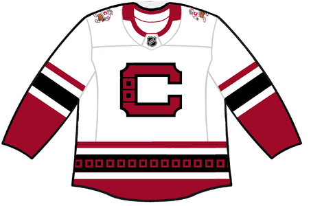
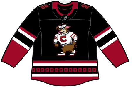
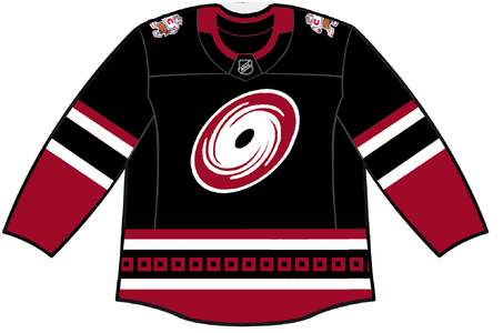
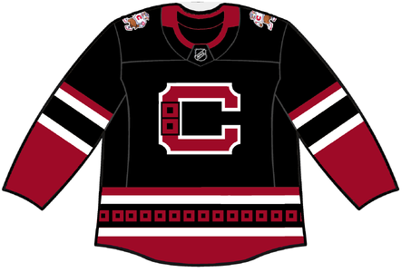
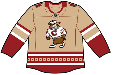
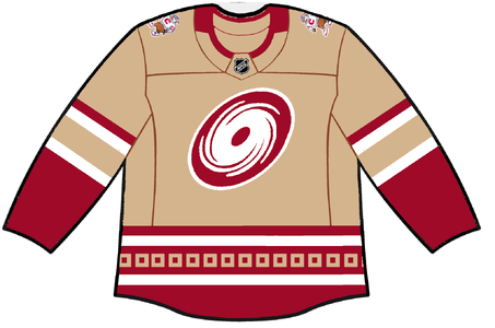
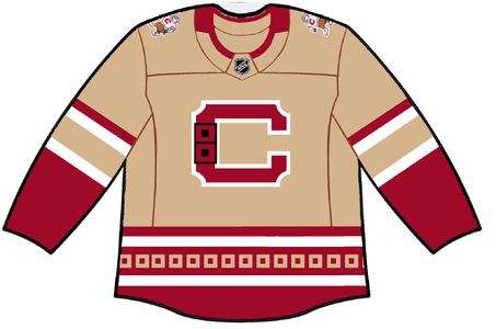
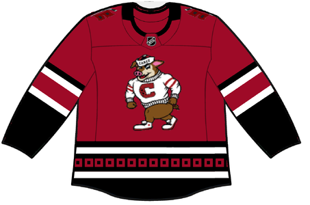
Alright, y'all, I had a drink or two and booted up MSPaint. Rate my abominations (or preferably don't). I also thought a jersey using the stormy logo could use some tan. I also tried to make a C logo that doesn't suck. I ripped it off from the Citadel logo. The stormy main logo looks like shit cause I sized up a low res PNG from one of @Svechhammer's concepts. The swirly hurricane a ripped off some fanmade Hurricanes logo in Whaler colors that had some other stuff I got rid of. Idk how to make it not look I drew it with my mouse.
 

Attachments

  • home2.png
    home2.png
    320.5 KB · Views: 6
  • home1.png
    home1.png
    265.1 KB · Views: 7
  • away3.png
    away3.png
    403.7 KB · Views: 7
  • away2.png
    away2.png
    361.4 KB · Views: 8
  • away1.png
    away1.png
    303.6 KB · Views: 7
  • alt_b3.png
    alt_b3.png
    361 KB · Views: 4
  • alt_b2.png
    alt_b2.png
    333.6 KB · Views: 6
  • alt_b1.png
    alt_b1.png
    280.3 KB · Views: 5
  • alt_a3.png
    alt_a3.png
    375.8 KB · Views: 7
  • alt_a2.png
    alt_a2.png
    342.9 KB · Views: 8
  • alt_a1.png
    alt_a1.png
    289.6 KB · Views: 7
  • home3.png
    home3.png
    344.7 KB · Views: 8

Svechhammer

THIS is hockey?
Jun 8, 2017
25,388
92,612
Alright, y'all, I had a drink or two and booted up MSPaint. Rate my abominations (or preferably don't). I also thought a jersey using the stormy logo could use some tan. I also tried to make a C logo that doesn't suck. I ripped it off from the Citadel logo. The stormy main logo looks like shit cause I sized up a low res PNG from one of @Svechhammer's concepts. The swirly hurricane a ripped off some fanmade Hurricanes logo in Whaler colors that had some other stuff I got rid of. Idk how to make it not look I drew it with my mouse.

Hey I was just looking these over on Reddit and I really do like them. I actually think these could work should the Canes be hell bent on rebranding.
 

AD Skinner

Registered User
Mar 18, 2009
13,260
40,792
bubble bath
I unironically think having stormy on the front works. Is it silly? Yes. Is it unabashedly North Carolina? Also yes. Keep the red and black storm flags and the fat slanted nascar numbers and you’ve got a stew going.

Just for clarity I think the best thing they could do is go back to the original jersey with a few tweaks so they can still sell new ones but keep the traditionalist fans happy. But if they are dead set on changing things up they could do a lot worse than these
 

WreckingCrew

Registered User
Feb 4, 2015
13,423
41,019
Alright, y'all, I had a drink or two and booted up MSPaint. Rate my abominations (or preferably don't). I also thought a jersey using the stormy logo could use some tan. I also tried to make a C logo that doesn't suck. I ripped it off from the Citadel logo. The stormy main logo looks like shit cause I sized up a low res PNG from one of @Svechhammer's concepts. The swirly hurricane a ripped off some fanmade Hurricanes logo in Whaler colors that had some other stuff I got rid of. Idk how to make it not look I drew it with my mouse.
Gotta be honest, that first column is 100% toilet bowl flush logo lol ...except it's swirling in the wrong direction?
 

Socrates Karmanos

Registered User
May 21, 2022
19
52
I unironically think having stormy on the front works. Is it silly? Yes. Is it unabashedly North Carolina? Also yes. Keep the red and black storm flags and the fat slanted nascar numbers and you’ve got a stew going.

Just for clarity I think the best thing they could do is go back to the original jersey with a few tweaks so they can still sell new ones but keep the traditionalist fans happy. But if they are dead set on changing things up they could do a lot worse than these
I’d be pretty ok with this. My favorite all time Canes jerseys are the classic whites. I think some tips could be taken from the modern jerseys. I like the arm striping on the current homes and I like a simpler color palette that doesn’t include silver. And have the current double warning flag logo as the shoulder patch. The stormy/C logo jersey would make a cool third jersey. Sorry to the black jersey lovers, I just don’t think the canes look good in black, especially not the black helmet/pants with the red jersey 🤮. Ironically, I think the black jerseys I posted might look the best of the bunch.

If I were the lord of the jerseys, I’d make some changes on personal preference. I’d go for a more unique color palette that’s still related to what we have now. That’s why I put tan in one of the concepts. It’s meant to give a unique color scheme that also complements the brown in the stormy logo. I am up for a logo change. The current one isn’t horrible but isn’t amazing. I think it’s raised up by its history of use. I’ve just never seen anyone design anything that’s better. Maybe good logos for a hurricanes team is too hard? I mean the Miami Hurricanes don’t have a hurricane anywhere in their branding. I think the current logo with some tweaks could be good. Some slight simplifications in design and color palette. I often like the logo better when it’s in one color. I also just hate when logos try to cram in dumb subliminal messages like vague looking letters or state outlines.
 

LakeLivin

Armchair Quarterback
Mar 11, 2016
5,100
15,015
North Carolina
I hate to be negative but I still haven't seen anything that I think would be deserving of a reboot. I'm not saying I think all of the proposals are worse than any of the current unis, just that none have struck me as being so much better as to merit a change. And I say that as one who really doesn't care for our hurricane swirl.

I'd like to think we can do better than a stylized letter for a logo but if they did go that route, given the Calgary "C" and the fact that the "C" in Montreal's logo is so dominant, might we be better off going with an "H" instead of a "C" for ours? Wonder if they could make an H out of hockey sticks that wouldn't look cheesy? Anyone got some spare time and access to an AI image generator?
 
  • Like
Reactions: AD Skinner

cptjeff

Reprehensible User
Sep 18, 2008
21,752
39,116
Washington, DC.
Wonder if they could make an H out of hockey sticks that wouldn't look cheesy? Anyone got some spare time and access to an AI image generator?
TBH, that's an inherently cheesy concept.

The Canes have enough of a brand identity at this point that you don't need to slap a hockey stick on the primary logo for people to know it's a hockey team. The primary element has to be a hurricane or a hurricane related thing, not a generic piece of hockey equipment.

With the current logos the primary focuses are a hurricane and a pair of hurricane flags. Flown off of the hockey stick since they need a pole regardless, but the focus is very clearly the hurricane flags. Because they're not the Carolina Hockey Sticks.

If you want to change the logo, you need a logo that represents either a hurricane or something hurricane related better than our current set. Nothing I've seen gets there. Some have come close, and might have been better on day 1, but aren't anywhere close to good enough to override 25 years or so of brand identity.
 
  • Like
Reactions: Svechhammer

Ad

Upcoming events

Ad

Ad