
Team name poll, part 2
- Thread starter Summer Rose
- Start date
-
We sincerely apologize for the extended downtime. Our hosting provider, XenForo Cloud, encountered a major issue with their backup system, which unfortunately resulted in the loss of some critical data from the past year.
What This Means for You:
- If you created an account after March 2024, it no longer exists. You will need to sign up again to access the forum.
- If you registered before March 2024 but changed your email, username, or password in the past year, those changes were lost. You’ll need to update your account details manually once you're logged in.
- Threads and posts created within the last year have been restored.
Our team is working with Xenforo Cloud to recover data using backups, sitemaps, and other available resources. We know this is frustrating, and we deeply regret the impact on our community. We are taking steps with Xenforo Cloud to ensure this never happens again. This is work in progress. Thank you for your patience and support as we work through this.
In the meantime, feel free to join our Discord Server

I think we're sure that they are placeholders.All 3 are weak and generic. No creativity on any of them. Are we sure these aren't placeholders?
Arizonatah
Registered User
Team up with Sesame Street and make Mr. Snuffleupugus the mascot 


Canis Latrans
Registered User
rt
The Kinder, Gentler Version
Arizonatah
Registered User
Not usually a fan of jagged lines on the bottom and sleeves but looks good to me. I wouldn't complain.
Coyotedroppings
Registered User
- Jul 16, 2017
- 6,254
- 5,009
Surprised by the Outlaw love, it's the most generic, overused, po dunk name out there and the commonality of the logo is further proof. I actually like the idea behind the Yeti logo ( Wild like, or not), but the end result is a borderline disaster, due to the "color stupidity". Hockey club name however shouldn't even be an option imo. That leaves us with Mammoth, which I sorta, / kinda like, it's a beast native to the area, but the logo's just okay, at best. Wasatch was the way to go, given the dismal choices proposed and what seems to be the teams penchant for what I'll call odd logos. Just put the moutain range on for the crest, a Utah shoulder patch and move on, leave the Yeti the hell out of it.
Last edited:
Mammoth is the name I want. Ever since Black Diamonds fell out of contention, this has been my number one.
I have yet to see a decent Mammoth logo though. I think it can be done. Hopefully it's quite different from the "angry cartoon elephant" that we've seen over and over.
I have yet to see a decent Mammoth logo though. I think it can be done. Hopefully it's quite different from the "angry cartoon elephant" that we've seen over and over.
Dirty Old Man
Yotah Hockey Club
thing about Mammoth is it has a ready-made slogan to go with the 'XXX Up' that's been so popular lately (Horns Up, Forks Up, Lopes Up, etc.)... namely Tusks Up! ... the hand gesture itself is TBD... although a quick google search shows Amherst College in Mass, and for some reason Cal State Fullerton (Titans) also use tusks up...
I think the outlaw logo being so generic is explained by them adding it at the very last minute. The real question is what the Wasatch logo would've looked like and my theory is it would've been the same as the hockey club logo
And since I don't want to be one of those guys who complains without offering suggestions - what I think would make a good logo is a profile-view silhouette of a full mammoth body. The proportions should be realistic to avoid the cartoon feel. The head and trunk and tusks should be up, as if it's calling out. When the trunk is curled down it gives off vibes of an embarrassed dog tail. Maybe a ridge line of mountain peaks could be set behind the silhouette. I'm suggesting silhouette so that we can get an impression of realistic detail, like shaggy hair, without actually cramming too much detail in. I like logos that are set in a circle, like Doubleday & Cartwright often do with their designs (see Inter Miami or Milwaukee Bucks).Mammoth is the name I want. Ever since Black Diamonds fell out of contention, this has been my number one.
I have yet to see a decent Mammoth logo though. I think it can be done. Hopefully it's quite different from the "angry cartoon elephant" that we've seen over and over.
Llewzaher
Registered User
I would actually like to see a front profile .. rather than the side …
I think for the branding and posters, they should use a yeti riding the Mammoth , or leading it or something and then use the Yeti as the mascot … I just don’t see a cool looking Mammoth mascot .. but maybe they will surprise me
I think for the branding and posters, they should use a yeti riding the Mammoth , or leading it or something and then use the Yeti as the mascot … I just don’t see a cool looking Mammoth mascot .. but maybe they will surprise me
Llewzaher
Registered User
I like the idea of a zoomed out full body look , in the style of the bucks … if they do it right it could be cool .And since I don't want to be one of those guys who complains without offering suggestions - what I think would make a good logo is a profile-view silhouette of a full mammoth body. The proportions should be realistic to avoid the cartoon feel. The head and trunk and tusks should be up, as if it's calling out. When the trunk is curled down it gives off vibes of an embarrassed dog tail. Maybe a ridge line of mountain peaks could be set behind the silhouette. I'm suggesting silhouette so that we can get an impression of realistic detail, like shaggy hair, without actually cramming too much detail in. I like logos that are set in a circle, like Doubleday & Cartwright often do with their designs (see Inter Miami or Milwaukee Bucks).
Maybe the top of the circle , like the bucks, but with the mountain outline breaking the circle up
Llewzaher
Registered User
rt
The Kinder, Gentler Version
I think the mascot should be a caveman with a club as a nod to the inaugural season nickname of “Clubbers”. You can do a lot of funny stuff with caveman mascot. You can name him “Yeti”.I would actually like to see a front profile .. rather than the side …
I think for the branding and posters, they should use a yeti riding the Mammoth , or leading it or something and then use the Yeti as the mascot … I just don’t see a cool looking Mammoth mascot .. but maybe they will surprise me

Llewzaher
Registered User
I love it !… make sure he can play the drums .. having a caveman man play the drums would be like animal on the muppet showI think the mascot should be a caveman with a club as a nod to the inaugural season nickname of “Clubbers”. You can do a lot of funny stuff with caveman mascot. You can name him “Yeti”.
He can club Gritty over the head as well lol
Man great idea ! He would be totally unique!
Heck for the all star game have him show up in a tux with ripped sleeves and pants
A caveman mascot would be able to do stuff other mascots couldn’t
Clean Hits needs to schedule Chris Armstrong and give him the idea
paulmm3
Registered User
- Mar 29, 2014
- 1,093
- 506
This would be the best jersey option if the team went to Mammoth (I'd also prefer plural Mammoths over Mammoth). But Outlaws is the best name choice remaining.
Llewzaher
Registered User
This would be the best jersey option if the team went to Mammoth (I'd also prefer plural Mammoths over Mammoth). But Outlaws is the best name choice remaining.
it feels like the logo needs a pinstripe of another color .. copper, purple? Not sure ..
Llewzaher
Registered User
Wow , I was very tired when I wrote this and the excitement was a little overboard lol .. so let me just say .. I like the ideaI love it !… make sure he can play the drums .. having a caveman man play the drums would be like animal on the muppet show
He can club Gritty over the head as well lol
Man great idea ! He would be totally unique!
Heck for the all star game have him show up in a tux with ripped sleeves and pants
A caveman mascot would be able to do stuff other mascots couldn’t
Clean Hits needs to schedule Chris Armstrong and give him the idea
The muscled up mammoth holding a hockey stick looks like something from the ECHL.
Mangosteen
Yotes Ashtray of the NHL
- Apr 9, 2018
- 1,223
- 790
Would Keller be Captain Caveman

DethOfDragnz
Registered User
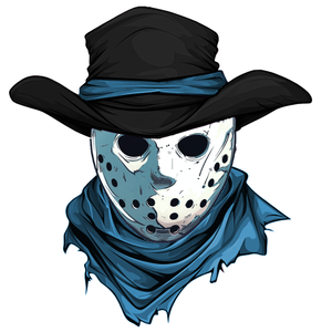
From what I have read Yeti is out. I think the next best choice is Outlaws. I took a few pics from online and edited a pic that I think could make a cool logo. I know it looks too Jason Voorhees as I did use a Jason mask for the image but it's meant to just be a rough example a cowboy with a hockey mask I think would be a great logo.
Attachments
Oddbob
Registered User
- Jan 21, 2016
- 15,770
- 10,315
Why have they decided on a colour scheme that is very similar to Winnipeg and Seattle? These logos are kind of generic as well. Didn't come here to shit on your team, just disappointed on the colour scheme and bland logos as I love seeing what new jerseys teams come up with. These are disappointing to say the least.
As far as the name, it has to be Outlaws out of these three. Couldn't hate hockey club anymore and I just don't like Mammoth.
As far as the name, it has to be Outlaws out of these three. Couldn't hate hockey club anymore and I just don't like Mammoth.
Oddbob
Registered User
- Jan 21, 2016
- 15,770
- 10,315
From what I have read Yeti is out. I think the next best choice is Outlaws. I took a few pics from online and edited a pic that I think could make a cool logo. I know it looks too Jason Voorhees as I did use a Jason mask for the image but it's meant to just be a rough example a cowboy with a hockey mask I think would be a great logo.
This would be cool except it needs a different hat.
Dr VinnyBoombatz
formerly ctwin22
Gotta say...I really like the Snowbeasts name.Utah Snowbeasts.. and make brand all Yeti
Latest posts
-
 HF Habs: Trade Proposal Thread 92 Waiting on the DRAFT Edition
- Latest: sampollock
-

-
