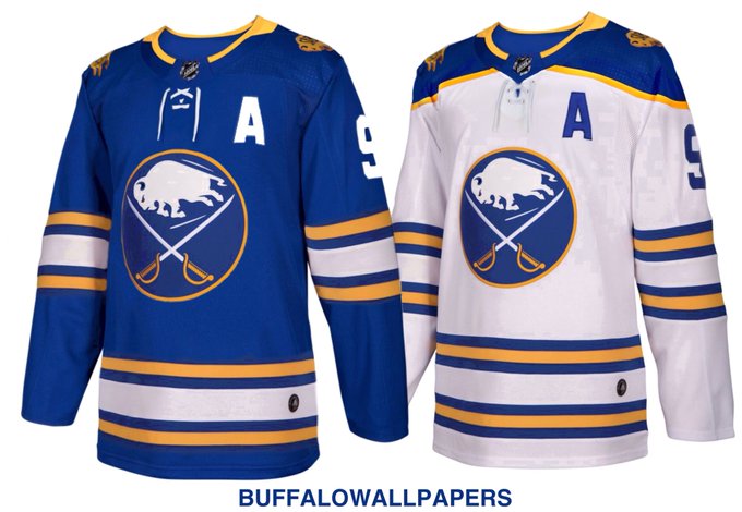
Sabres jersey concept

  • Work is still on-going to rebuild the site styling and features. Please report any issues you may experience so we can look into it. Click Here for Updates
This was my favorite:

b32521418a64839f.jpg
Ahh, the Buffalo butterknives jersery :)

There was some potential there, but the proportion of the 'sabres' in the crest is just way off.

Beyond the current/original which I both like on their own merits (I like the current design a bit better, but prefer the royal blue of the classics), IMO I think it goes 40th anniversary > AGH >butterknives>>>>>2013 'turdburger' edition thirds>>>>>>>>>>>>>>>>>>>>>>Sluggalo.
 
I agree. However, I am a big fan of change and trying new things. That especially goes for team uniforms. There should be some constants like color (blue & gold) and primary logo, but try things out. Create a new 3rd or 4th jersey every year.

I definitely didn't like the red and black change, but having an AGH third jersey would have been fine with me. Not sure why the NHL stopped being creative. Maybe that should be, not sure why the NHL never got creative.

Change the shade of blue and gold if you want, create new secondary logos, whatever. Have fun!

Third can be anything and I'm fine.

Well anything except Ted Black's "Turd Jerseys."
 
And keep those numbers off of the upper left chest. Numbers on the sleeve and helmet are fine; but the chest is totally redundant, and only amounts to clutter.
 
  • Like
Reactions: ZZamboni
The classic royal blue is just too good. Why the Sabres ever tried to go with any other color is mind boggling even tho red is my favorite color. It doesnt scream Sabres too me.
 
The classic royal blue is just too good. Why the Sabres ever tried to go with any other color is mind boggling even tho red is my favorite color. It doesnt scream Sabres too me.
It was the 90s, and black and red were more trendy, marketable colors than royal and gold. That's really all there was to it.
 
Oh dear god, I forgot about those things.

#IAgreeWithYou
#NeverAgain.
The most hideous logo/crest in the history of sports.
"Hey Guys! I have a great idea for our redesign...let's amputate the Buffalo's legs! It'll look so cool and cutting edge...."
"Mmkay...cutting edge is good, mmkay."
 
I mean, if we miss the goathead, we can just cheer on the Basingstoke Bison
LogoBasingstokeBison.jpg

The Basingstoke Bison are an English Ice Hockey club from Basingstoke, Hampshire, England. They currently compete in the English Premier Ice Hockey League. They won the 2015-2016 English Premier Ice Hockey League title - ending a 23 year drought.

Along with the logo being similar to the Sabres "goathead" one - theres another Sabres connection to the club. Former Sabres draft pick (1992 - Fourth Round) Dean Melanson played for them during the 2007-2008 season. Melanson played five games with the Sabres during the 1994-1995 season and was a member of the Rochester Americans team that won the Calder Cup in the 1995-1996 season.
 
Last edited:
Or HC Dinamo Minsk - who currently has former Sabres goalie Jhonas Enroth as one of their goalies. Yes, thats former Sabre Evander Kane below wearing a HC Dinamo Minsk jersey. He played 12 games for them (where he scored one goal) during the 2012-2013 lockout before being released.
th

evander-kane-dinamo-minsk-belarus-khl-nhl-lockout1.jpeg
 

Ad

Upcoming events

Ad