OT: - Official Jersey and Merch Thread III | Page 7 | HFBoards - NHL Message Board and Forum for National Hockey League

OT: Official Jersey and Merch Thread III

Status
Not open for further replies.
I got a little more info on the jerseys last night.

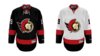
Home will primarily black, with red sleeves (halfway), a tweaked version of the 2D logo, and a red stripe along the bottom.

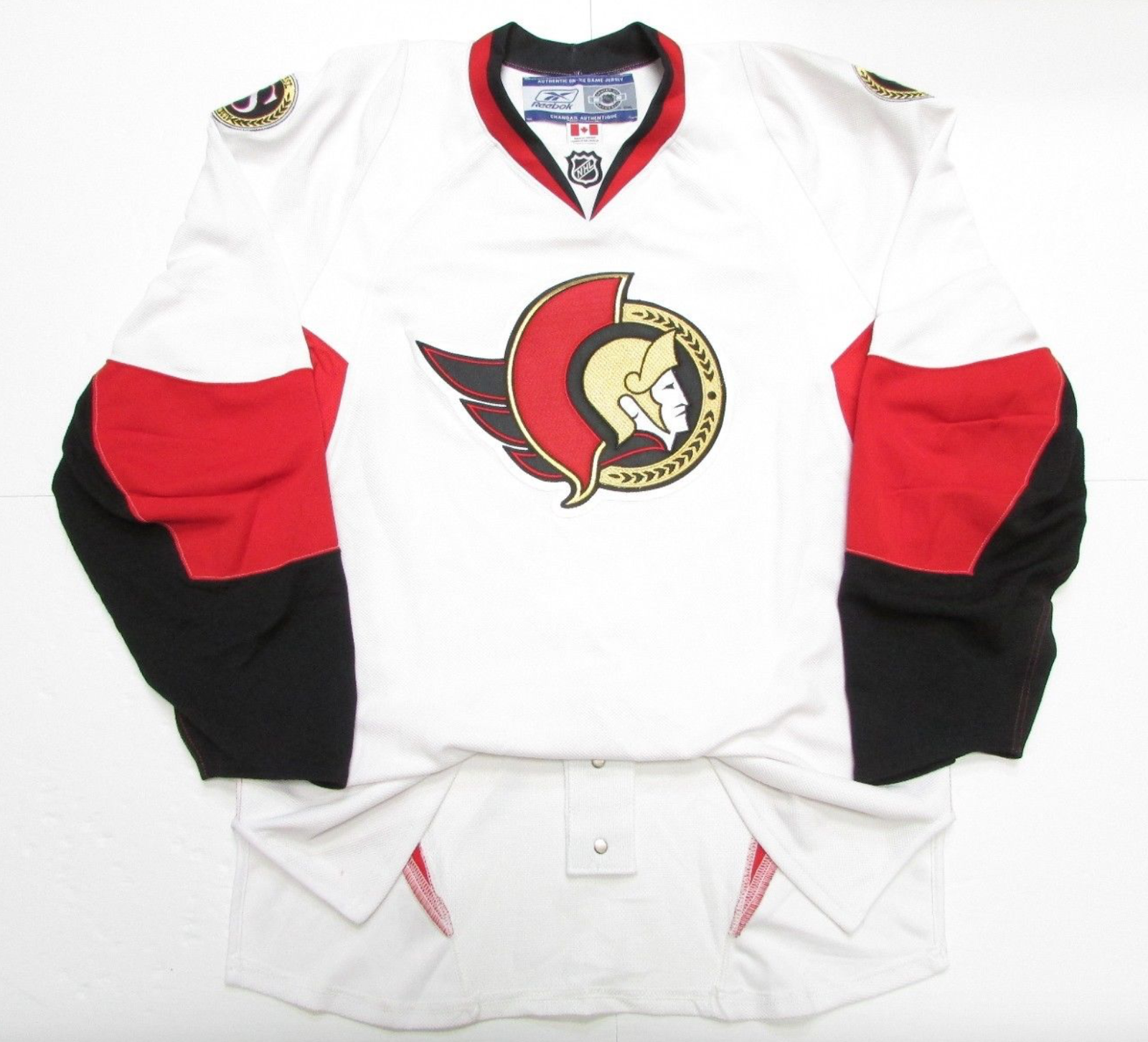
Away will be white with black sleeves and a red stripe along the bottom. (Basically the original 92 jersey)

I asked about the striping on the home sleeves and it appears that the jersey will be a little bit different from the black 92 jerseys.

No idea what could be subject to change, or if this is going to end up 100% accurate.

Would love to see a mock-up considering this info, for anyone with the time and know how!
 
Based on the description provided by @benjiv1, it sounds like the template being used is the same one the Coyotes use. That template has long forearms. I also assume we are using the updated 2D logo because he mentions the logo being tweaked. I included a version with the official updated logo, as well as the fan made logo that was posted by somebody in this thread ages ago.

I did a rough mockup. I stink at photoshop.

n4kodEM.jpg


Ixv88Ku.jpg
 
They better not be using the "updated 2D" monstrosity that currently exists.

Thinking about it a bit more, updated could possibly refer to a smaller slightly different version of the 2D logo. There is one that has been used on prototype jerseys. They have also used it on CCM Vintage line versions of the black jersey. It would fit the description of being slightly different or slightly updated.

Screen+Shot+2017-10-16+at+6.09.00+PM.png
 
  • Like
Reactions: Do Make Say Think
Thinking about it a bit more, updated could possibly refer to a smaller slightly different version of the 2D logo. There is one that has been used on prototype jerseys. They have also used it on CCM Vintage line versions of the black jersey. It would fit the description of being slightly different or slightly updated.

Well that just looks silly to me too, but I could just be tough to please :laugh:

Honestly though, the new school/old school hybrid in your last post is decent. I'd prefer they just not mess with near perfection, but assuming benjiv is right and it's an updated version than I could live with that one.

I also have an issue with the arm design of the Coyotes template, but that's the first thing I thought of when I read benjiv's description as well.
 
Based on the description provided by @benjiv1, it sounds like the template being used is the same one the Coyotes use. That template has long forearms. I also assume we are using the updated 2D logo because he mentions the logo being tweaked. I included a version with the official updated logo, as well as the fan made logo that was posted by somebody in this thread ages ago.

I did a rough mockup. I stink at photoshop.

n4kodEM.jpg


Ixv88Ku.jpg
Well I hope that isn't it.

So close, yet so far.
 
  • Like
Reactions: danielpalfredsson
Well I hope that isn't it.

So close, yet so far.

If they've decided that the fans want the throwback, they have such an easy job. They just have to take the late 90's 2D jerseys and apply them to an Adidas template.

I don't think the top one I posted would look that bad in person but it would be a disappointment compared to them just using the throwbacks.
 
Based on the description provided by @benjiv1, it sounds like the template being used is the same one the Coyotes use. That template has long forearms. I also assume we are using the updated 2D logo because he mentions the logo being tweaked. I included a version with the official updated logo, as well as the fan made logo that was posted by somebody in this thread ages ago.

I did a rough mockup. I stink at photoshop.

n4kodEM.jpg


Ixv88Ku.jpg

Top logo.

No second stripe on the arm, THICC stripe on the bottom.

Heritage jersey shoulder logos. (I think)
 
Top logo.

No second stripe on the arm, THICC stripe on the bottom.

Heritage jersey shoulder logos. (I think)

Nashville’s home jersey might be the closest template.

So this...

n4kodEM.jpg


Credit to @danielpalfredsson for the original mockup (and apologies for butchering it).

Any word if there's white on the jersey? (Nashville has a white trim to help the blue pop a bit more)
 
  • Like
Reactions: danielpalfredsson
If you are looking to play with a template, these are closest to what was described to me, minus the yoke and obviously replacing the red primary with black.

White jersey is close minus the yokes and shoulder logos. (should be the bilingual crest)
Red jersey should be black with red stripes instead of white, minus the yokes and shoulder logo.
 

Attachments

  • Eight.jpeg
    Eight.jpeg
    378.2 KB · Views: 20
  • Seven.jpeg
    Seven.jpeg
    412 KB · Views: 17
If you are looking to play with a template, these are closest to what was described to me, minus the yoke and obviously replacing the red primary with black.

White jersey is close minus the yokes and shoulder logos. (should be the bilingual crest)
Red jersey should be black with red stripes instead of white, minus the yokes and shoulder logo.

These are absolutely gorgeous.

I'd prefer the deep red for home but I do appreciate black as a primary colour since we are between the blue Leafs and the red Habs.

I am a big fan of the yokes but I seem to be in the minority so hey, all good.
 
If you are looking to play with a template, these are closest to what was described to me, minus the yoke and obviously replacing the red primary with black.

White jersey is close minus the yokes and shoulder logos. (should be the bilingual crest)
Red jersey should be black with red stripes instead of white, minus the yokes and shoulder logo.

I would pay alot of money for that dark red Jersey...lots of money. You listening Eugene? Money...
 
  • Like
Reactions: BloodRedArmy
SensChirp must have been lurking.

Add the shoulder patches and this is it.

If I recall, that concept has been floating around for a while. If that ends up as our jersey, the Sens probably either had some parallel thinking, or saw that concept on twitter.

The jerseys in the picture are on an old Reebok template, but I can't imagine it'd look that much different as Adizero. It would just have the silly Adidas neck line. While I prefer the 95-96 style design with the black/red/white, the ones in your post would be fine. They wouldn't be a disaster at all.

Yah, the exact description was that there is a concept floating around online that is very close. I couldn’t remember the exact one, but as soon as I saw SensChirp’s tweet, I realized that is likely the image they were referring to. (I specifically asked about stripes on the bottom and sleeves).

Also, if you look at Chabot’s sweater, they use the shield crest for his “logo”. Pretty sure that is going on the shoulders, but I would be interested in seeing it incorporated into the Captain’s C...
 

Attachments

  • 64FC17C6-7554-4DD2-85A2-03AF5FD27DEA.jpeg
    64FC17C6-7554-4DD2-85A2-03AF5FD27DEA.jpeg
    67.3 KB · Views: 19
  • Like
Reactions: danielpalfredsson
Status
Not open for further replies.

Users who are viewing this thread

Ad

Ad