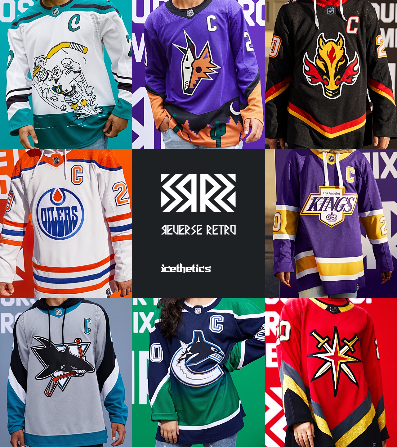
NHL unveils reverse retro jerseys

Status
Not open for further replies.
I actually don't hate the Wings one. What do you do with a Wings jersey? They've had so few elements over the years that they've painted themselves into a corner with projects like these.

The problem with the Wings is that their jersey hasn't really changed in 90 years...it's actually pretty amazing. This was their jersey from their first season in 1932:

RedWings01.png

DetroitRedWings32-33jersey.png


How do you build retros that don't look their current jersey?
 
  • Like
Reactions: Machinehead
There’s actually quite a few I like;
Ottawa - obviously
St Louis Reds
Anaheim
Minnesota

I just don’t understand where the grey has come from for Detroit? Like, even red and white makes pink and that would have been better.
 
5fb2a41f57973a611d8f225e_1116-atlantic.jpg

BOS: That's how a yellow jersey should look like 9/10
BUF: Meh 5/10
DET: Seriously? 0/10
FLA: Very sharp 9/10
MTL: Habs in blue is weird, but that jersey is gorgeous 10/10
OTT: Needs more white, at least make the numbers white 6,5/10
TB: Should be their home jersey 8/10
TOR: Not a fan 4/10


5fb2a40702adac32fef31565_1116-metro.jpg

CAR: A grey jersey that looks really nice 9/10
CBJ: I can't say why, but this looks sharp 8,5/10
NJ: Like that color scheme 8,5/10
NYI: Pretty, but uninspired 6/10
NYR: Love that logo, but the jersey needs more red 6,5/10
PHI: Okay, I guess 6/10
PIT: Meh 5/10
WSH: Was never a fan of the original one, and I'm not a fan of this one. 4/10


5fb2a3f7ec93ba403c16abe9_1116-pacific.jpg

ANA: For one or two games? Cool, I guess 7/10
ARI: Pure ugliness. Glorious 10/10
CGY: Meh 5/10
EDM: Classic, I like it 9/19
LA: Looks pretty sharp 9/10
SJ: Meh 5/10
VAN: Kinda ugly, kinda sharp. Not sure on that one 6.5/10
VGK: Hate that logo, the design is meh 3,5/10

5fb2a413143972257f9eaf1e_1116-central.jpg

CHI: Solid, but kinda boring 6,5/10
COL: Beautiful 9,5/10
DAL: Why? 1,5/10
MIN: Fantastic 10/10
NSH: Looks better than I expected, and way better than their home jersey 8/10
STL: Meh 5/10
WPG: Too much grey, not a fan 3/10

Love the COL/CAR/OTT/MTL/ANA/PHX jerseys

The Sabres retro is atrocious and the decision to go back to the original Sabres jersey must've been a good mistake, because most of the Sabres jersey design decisions range from ugly to f***** ugly.

Gotta love Buffalo hiking the price up $45 from what other teams are charging :rolleyes:

And making them butt-a** ugly. I don't get how the red and black goathead didn't win the retro design. The goathead is textbook 90's.

Here's my concept for what I'm talking about with the Oilers
Oiler.png

Ah, my favorite team, the Florida Oil Panthers.
 
I think the solution to Detroit's 3rd jersey is you introduce a new logo that encapsulates the city well on a white jersey

Or you put the Wings logo on the shoulders and keep the chest empty and experiment with patterns of red and white
 
I'd say Pittsburgh's is the worst. The colour scheme is fine (although they look slicker in black). But because it's boring and lazy. I have never been a fan of a team simply splashing the city name across the front with no logo. It's as if no effort was put into it.
 
Some of the jerseys had revisions so small, why even bother changing anything???

But overall, my grades are below:

BAD:
bos det tor nyr phil nyr calg (black is not a panacea), Nash (can you try a little harder??
Edm, SJ, Chi, Stl, winn (LOL), dal, TB (why?), LV

GOOD:
Buff, Fla (!!!!), minn(was that so hard?), Hart / Carolina (light gray awesome), NJ, Columbus (can you guys design a good logo already?),
Pitt, Ana, phx, LAK, Vanc (stole the show - just a great jersey scheme)
 
I was surprised by how much I like Ottawa's, that logo just works.

Probably gonna end up buying one of the Yotes, Minny, or a Makar Qolorado one. New Jersey's in the mix too.
 
  • Like
Reactions: Beville
BOS: Not much to say, classic Bruins jersey - 8.5/10
BUF: Like it, and wouldn't mind if they just went with these tbh - 7.5/10
DET: Again, bleh, but not sure what you're supposed to do with a Wings jersey - 3/10
FLA: A bit busy for me - 5.5/10
MTL: It's weird, but it's very, very nice. They took the risk other old teams wouldn't - 9/10
OTT: These look way better red than black. These should stick around - 8.5/10
TB: Got that dumb logo but it's retro so I can't penalize them. Other than that, this is what their jerseys should be - 7.5/10
TOR: Ugly Christmas sweater - 1/10

CAR: This whole "being a different team" thing rubs me the wrong way, but it's fine - 5/10
CBJ: It's literally a Washington Capitals jersey - 2/10
NJ: Finally went with a design that was long overdue. I believe there was an old EA game where they actually wore these, so that's cool as well - 10/10
NYI: They didn't do the project - 0/10
NYR: It's ok but they took a jersey that was already great and made it worse - 4/10
PHI: A lot going on, but it's nostalgic - 6/10
PIT: Fresh, yet nostalgic - 8/10
WSH: It's literally a Washington Capitals jersey except this time it's supposed to be - 6/5/10

ANA: So bad it's good, and it took balls to commit to it - 8/10
ARI: Best jersey in the entire set - 10/10
CGY: It's there. This jersey exists - 5/10
EDM: Second best jersey in the set - 10/10
LA: It's nice, but unsurprising - 7/10
SJ: Very busy and not feeling the grey at all - 2/10
VAN: I actually liked those back in the day and this is a nice re-up - 8/10
VGK: Pretty cool and they didn't have a ton to work with not being a "retro" team - 7/10

CHI: Like the Bruins, not much to say. A classic - 9/10
COL: Unpopular opinion but I always thought these jerseys were romanticized, the logo was always hideous, and again, being an entirely different team doesn't do it for me - 3.5/10
DAL: Most people agree that simple jerseys are good but this is a perfect example of trying to be simple for the sake of it, with a jersey that was always risky and different - 1/10
MIN: See Carolina and Colorado, but it is a nice jersey - 6.5/10
NSH: I actually love these. They look like old school Preds jerseys but cleaned up many of the problems with those sets - 9.5/10
STL: It's certainly red - 4.5/10
WPG: Pajamas - 2/10
 
Buffalo may be the nicest white jersey in the league. Montreal and Ottowa is nice too.

But most of these are awful. The red wings one barely qualifies as a practice jersey. I think Adidas ran out of ink with this one.
 
It is hard to f*** up a Leafs jersey but yet here we are. It looks like something you would win from Dave & Busters with arcade tickets where they are trying hard not to violate copyright laws so the proportions and colours are way off.

Other ones that I find hideous:
Canucks - Dont like the look of the colour gradient
Ducks - Bringing back one of the worst jerseys of all time when they literally have the best retro jersey's in the league is an odd decision
Detroit - Practice jerseys
Dallas - Too white

Only ones I like:
Avs - Probably my favourite jersey ever
Ottawa - Red looks good with their retro logo
Habs - Love the bold move going blue, looks great
Washington - Always preferred those to the current jersey, the red template is a nice spin on a classic

The rest not mentioned are meh or boring
 
  • Like
Reactions: aybrowne and max21
Not sure why the Canucks fans hate theirs so much , I think it’s my favourite . Love those colours . The yellow/black / orange produced some of the ugliest sets of all time , confused as to why everyone suddenly loves them now
 
Congratulations - in this order - to the Wild, Avalanche, and Kings. Those are some amazing new options that you have.

Every other jersey gets a "pretty good" at best (and some are just pure madness).

For my team, I don't hate the Canucks one. But I find the organization to be very stubborn in its attachment to the orca logo. As others have noted in this thread: the huge interest in other primary logo jerseys should be telling the owners something. If they'd taken the spaghetti plate era jerseys - or flying V - and made them blue and green, it would have been amazing (these new Kings jerseys shows that you can change color schemes from past eras and produce interesting results). To the Canucks' credit: they at least stuck with the blue/ green set up.
 
  • Like
Reactions: Delicious Pancakes
Edmonton and NYI look the same as their regular jerseys to me

Toronto is ugly but at least its different. Ugly jerseys age better than generic
 
The problem with the Wings is that their jersey hasn't really changed in 90 years...it's actually pretty amazing. This was their jersey from their first season in 1932:

RedWings01.png

DetroitRedWings32-33jersey.png


How do you build retros that don't look their current jersey?
I just spent probably as much time as the Detroit designers spent thinking...

2cf5a2be7346efca.jpg

They've never done a red version of this.

Make a red sweater, but make the sleeves white with a red stripe. Literally the reverse of this retro. Oh wait... was that the actual goal of this? :sarcasm:

No, better not actually do that then, instead just go with their non-effort.
 
The problem with the Wings is that their jersey hasn't really changed in 90 years...it's actually pretty amazing. This was their jersey from their first season in 1932:

RedWings01.png

DetroitRedWings32-33jersey.png


How do you build retros that don't look their current jersey?

Goalie looks like Frankenstein's monster.
 
  • Like
Reactions: NHL WAR
Anaheim - Very fun & bold, mighty duck is one of the best logos in sports and wish they wore mighty duck/teal colors full time. 8.5/10
Arizona - Another fun and bold one, I like deserts. 8/10
Boston - Kinda boring but nothing wrong with it 7/10
Buffalo - Was never the biggest fan of the "Buffalo" along the bottom but other than that it's one of the better ones. 7/10
Calgary - Classic. 10/10
Carolina - A classic but I have always found Whalers jerseys to be one of the most overrated of all time, blue & green are not a good combo. 7/10
Chicago - Love black Blackhawks jerseys. Look intimidating. 10/10
Colrado - Creative, would've liked to see it be a blue color or something though it looks plain. 7/10
Columbus - Love the red & white combo, also love the classic jackets logo. Reminds me of the Capitals throwback jersey which is one of my favorites of all time. 10/10
Dallas Stars - lol 0/10
Detroit - what's the point of this? 0.5/10
Edmonton - Not very exciting. Meh 6/10
Florida - Awesome logo 7/10
Los Angeles - Gorgeous 10/10
Minnesota - Awesome 10/10
Montreal - Literally a reverse jersey. Nothing too exciting 6/10
Nashville - Don't mind it & I normally hate Nashville jerseys 6/10
New Jersey - Christmas 10/10
New York Islanders - Isn't this their normal jersey lmao 0/10
New York Rangers - It takes some serious talent to mess up a Liberty jersey but they've managed to do it. This was going to be a day one purchase for me but boy is this ever hideous. The sleeves piping looks awful, so plain, the numbers are disgusting and look like cheap ironed on ones. Looks like pajamas or a fake jersey from china, or a practice jersey. 0.5/10
Ottawa - Think it would've looked better with gold or white in place of the black stripes 5/10
Philadelphia - Looks like those ugly stadium jerseys 4.5/10
Pittsburgh - Snoop dogg 10/10
San Jose - I like it 7.5/10
St Louis - Ugly classic 7.5/10
Tampa Bay - Much better than their regular jerseys 7/10
Toronto - Their logo looks like characters from the Simpsons back on the Tracy Ulman Show LOL 0/10
Vancouver - Absolutely HIDEOUS 0/10
Vegas - Like the red as well as paying homage to a non-NHL team 7.5/10
 
  • Like
Reactions: xigon and Laminator
Status
Not open for further replies.

Users who are viewing this thread

Ad

Ad