DrewGl
Registered User
The Caps one is butt. Would have been better with a blue or white jersey. That is just too much red.

Burn them both, my god. Put them out of there misery.Ducks Wild Wing as well.
icethetics.com: Fourth jersey designs leak for Golden Knights, Ducks
View attachment 373765
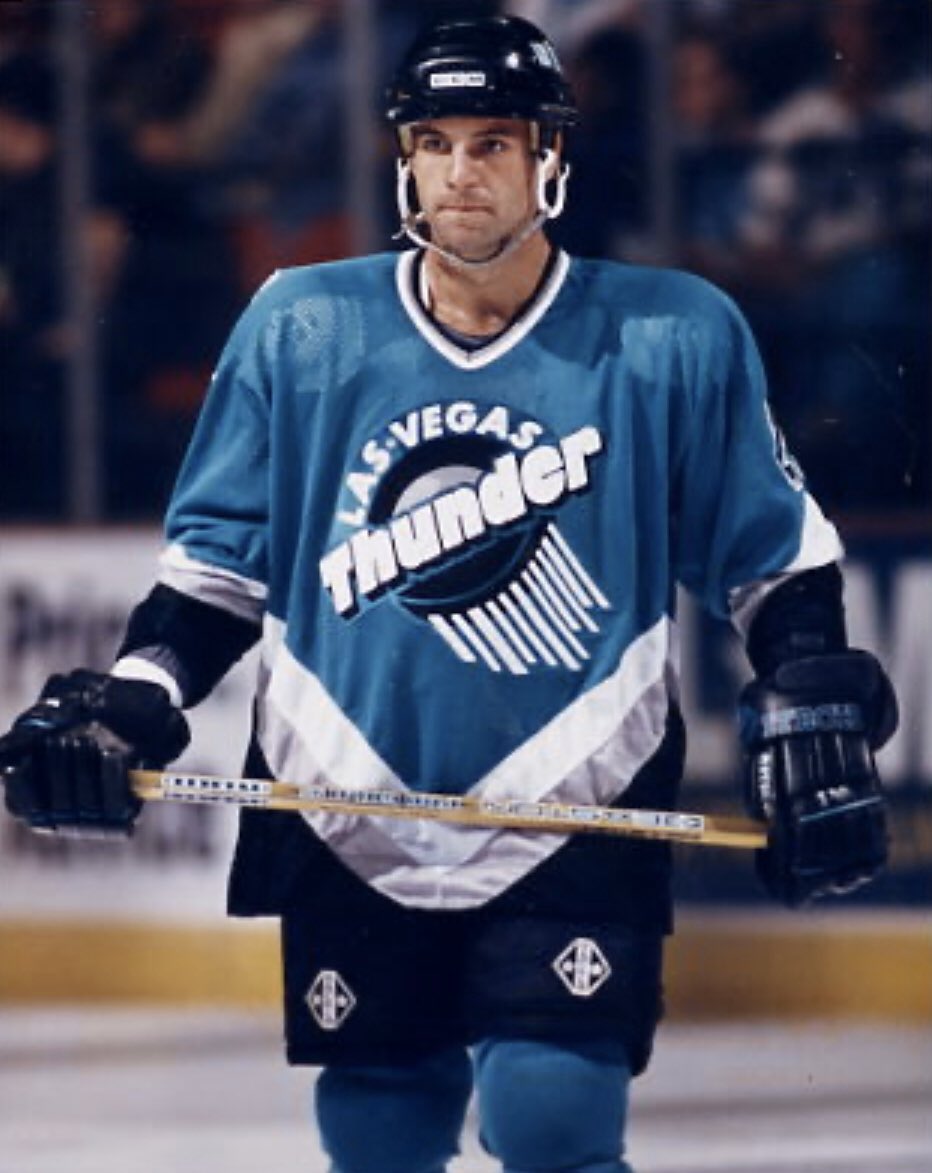
It's the Thunder jersey, but in Golden Knights colors. It's hardly a Sabres ripoff just because the body is red.

I'll be honest, I actually really like it. It's a really fun way for them to get in on the program with how limited their jersey history is.


Buddy of mine is a ebay jersey seller according to the descriptions he got the rangers are using the liberty template but with their normal colors...as in the primary jersey colorsSince these new jerseys are in reverse, this jersey would be in red.
What about a white or red one of winter classic one?
These look cool in photos, but I remember it being tough to read the numbers on the back of the jersey during game action
Both of those jerseys should be burned at the stake like a 17th century witch


You like fish sticks?We want fish sticks!

Lmao was this intentional or accidentalWow the ducks jersey is a crime against humanity. Disgusting.

Might as well used this as the logo
Rockets have GOAT jerseys
Anyone else kinda get Kelowna Rockets vibes from the Vegas jersey? Or is it just me?
Lmao was this intentional or accidental
These are safely two of the ugliest jersey designs of all time. It's almost impressive.Ducks Wild Wing as well.
icethetics.com: Fourth jersey designs leak for Golden Knights, Ducks
View attachment 373765
