GrumpyKoala
Registered User
- Aug 11, 2020
- 3,312
- 5,405
I hate glitters on uniforms...
You know who you are....
You know who you are....
More like, just do the design over again in a different art style because the current one isn't very good. Id suggest something stylized because thats the norm for NHL logos, but the point is the current one sucks in every way, it doesnt have the detail of a photorealistic logo, and as a simple logo its not well thought out enough to be drawn from memory.You think it should look more realistic as in more like an orca?
Or more realistic as in more similar stylistically to the indigenous artwork it’s inspired by?
They should just stick with that nice white, cool green and blue colour scheme that they started with in the 70s, it looks good, and theres no room for confusing colour schemes with anyone else in the league.I also feel like they've gone through 600 iterations of the green and blue/orca logo uniforms since the late 90s. "VANCOUVER" wordmark to no Vancouver wordmark, brought back the hockey stick in a rink and the demented lumberjack, the late 90s wine and tin foil silver trim with dark blue "Messier-era" jerseys, etc. It's weird how their team colors are all over the place through the last 3 decades.
I'd like it better if they changed the logo to David Puddy's painted face lol.The Devils’ branding checks a lot of boxes:
- distinctive name that’s a nod to local history/folklore
- brilliant logo
- strong/aggressive color scheme (teams wearing red have a proven advantage over teams that don’t)
Only thing I would change is adding a bit more color as an accent - I find their current setup a little too boring and generic.
View attachment 1031923
^^Love this version: the blue is close enough to black that it’s not a massive departure from tradition, and the blue/yellow/red combo is a subtle homage to the team’s origins as the Colorado Rockies.
My thoughts exactly.Dallas, Panthers and Tampa need to go back to their 90’s/2000’s look. Each had a more unique identity than today
No best Logo is Montreal Canadiens and Chicago BlackHawks in my booksHomer vote, but the Devils have A+ branding. You just see that logo and you're like, Yup, NJ Devils.
Canucks have had 3 different color schemes. Kings too, and Sabres blue have been much darker shades, plus their black ones as well.They should just stick with that nice white, cool green and blue colour scheme that they started with in the 70s, it looks good, and theres no room for confusing colour schemes with anyone else in the league.
I like the demented lumberjack, although it might be a bit too out there to use as a main logo.
Think the NJD are an excellent example of "less is more". Strong colors, strong name, strong logo...and they don't mess with it.Homer vote, but the Devils have A+ branding. You just see that logo and you're like, Yup, NJ Devils.
@Machinehead something like this?Hell, I'll give a quick thought on all of them.
- Anaheim Ducks - I think the eggplant and jade is like, right there. Just do that.
- Boston Bruins - It's good isn't it?
- Buffalo Sabres - Wouldn't mind seeing them blend the eras a bit. A good buffalo head with the royal blue and gold.
- Calgary Flames - Good.
- Carolina Hurricanes - Go back to the originals. Like the Ducks, they dumped something iconic to them, trying to be iconic.
- Chicago Blackhawks - People have thoughts about the logo which I'm not getting into but the jerseys are S-tier.
- Colorado Avalanche - My favorite branding in the league. Love the unique mix of colors.
- Columbus Blue Jackets - I don't know, very generic for me.
- Dallas Stars - Excellent.
- Detroit Red Wings - I mean, c'mon...
- Edmonton Oilers - Love their jerseys, hate the logo. It's very 70's. I would go with the metal droplet logo from their mid-2000's alts. It's cool.
- Florida Panthers - See Anaheim and Carolina.
- Los Angeles Kings - Awesome jerseys, despise the logo. It's a random shape.
- Minnesota Wild - Great logo and colors. Would like to see better design. I'm a big blending of the eras guy. Would like to see Wild colors and logo on a Northstars layout.
- Montreal Canadiens - The logo sucks and I'm tired of pretending it doesn't, but it's Montreal I guess. The jerseys are great.
- Nashville Predators - I really liked their first rebrand. I know people hate the piping but the ones now are too yellow. They need to bring in more blue to offset it a bit.
- New Jersey Devils - go back to the old ones. Also an alternate with black and red swapped seems obvious. Can't believe they still haven't done it.
- New York Islanders - Yeah, it's good.
- New York Rangers - Hot take: kinda here for a bit of a rebrand. Nothing crazy. I'm thinking the Liberty head on a jersey more inspired by the current ones. You guessed it: blending of the eras. @MrLunatik had this right, and also I copied his format. Thanks.
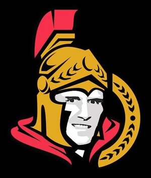
- Ottawa Senators - The 2D logo is much better but they're too bland now. I would like to see them incorporate that gold stripe as they did on some of their alternates.
- Philadelphia Flyers - Drop the goofy 70's ass nameplate and just put the names. Other than that, it's great.
- Pittsburgh Penguins - I didn't hate the modern look as much as others, but yeah, the classic look is really good.
- San Jose Sharks - You've gone too far. I'd like to see more black reincorporated.
- Seattle Kraken - I love these. Excellent start for them.
- St. Louis Blues - I don't know, the jerseys are objectively fine but they just don't sing to me. The logo kicks ass.
- Tampa Bay Lightning - See San Jose, but times 100. This team desperately needs to go back to black. Do a white version of these and run with that combo.
- Toronto Maple Leafs - I mean, it's the Leafs. Wouldn't touch it.
- Utah Mammoth - The color scheme just doesn't sing to me, but I think the new logo is really cool. Hate the wordmark on the white.
- Vancouver Canucks - I'd like to see them incorporate a bit more green. I know they've rebranded a hundred times, but it's actually been awhile this time.
- Vegas Golden Knights - It's a good brand. Like the jerseys and the logo is fantastic. I preferred the charcoal primaries over the gold, but I don't find the gold offensive either.
- Washington Capitals -I know they won the Cup in these, but I'm sorry, they have to go. Just do a retro-inspired layout with the W logo. It would be perfect and it's right there.
- Winnipeg Jets - Not particularly exciting to me, but fine.
I never liked the Sens 3D logo and boycotted any items with it.
View attachment 1031589
Recommitting to the original 2D logo was the right move.
BTW, I think Sens have an amazing and excellent color scheme.
I'm kinda partial to the lighter blue, but I'd be fine with this. An interesting concept I've seen is the 90's Liberty arms until you get to the cutoff, and then it goes into retro striping.@Machinehead something like this?
darker blue like the current 3rd, which IIRC is inspired by a jersey from the 70s?
striping of the 90s
liberty head
View attachment 1032111
you need to go to a VGK game. So many weird and disjointed mascots, tron dancers, castles, drumlines, its like the owner was pitched ideas in 2017 for the games and just said "yes".I hated Vegas an entire year before they played a single game in the NHL because Bill Foley never hid the fact that he wanted to name the team for his own ego draped in the American flag and his own Army service, right down to the West Point color scheme. The only thing distinctly Las Vegas about the Golden Knights is that shoulder patch. Otherwise, there is nothing that indicates this was the city’s first major league team. The logo looks like it belongs on a f***ing energy drink, although, again, it’s part of his military ego play, since it’s evocative of a Spartan helmet (historically, not a people with knights). Awful, awful, awful. I hope he sells the team and they get rebranded a la the Anaheim Ducks.
Florida Panthers sucks for the exact same reason, but I’d argue in some ways it’s worse. The pouncing panther logo was intimidating and cool. But you have another West Point ego case owning them and he has to slather his Army service all over the new logo, evoking his Army company.
The lesson is, if a West Point alum tells you he wants to own a sports team, tell him to f*** off.
Totally agree with the Minnesota part. This team is visually boring as hell. They should do a complete redesign. The jerseys look like they're worn for 25 years and being washed like 20.000 times. Change the colors, change the logo. Maybe they get to the second round then!There are two that I would fully reboot all the way down to changing the name and colors:
Wild - This could be a marketing class case study in being “too clever by half”. It’s actually a pretty inspired concept that probably made a great presentation in the boardroom. In practice it’s bland and doesn’t convey a coherent identity. 25 years they’ve had the label of being boring. That’s just an abject failure from a marketing standpoint. Frankly, the brand doesn’t mean enough to be worth preserving — just blow it up and start over.
Blue Jackets - This is like if Utah had gone with “Wasatch”. Nobody knows what this name is supposed to mean until it’s explained to them by someone else who had it explained to them. Outside of the immediate local area it doesn’t resonate at all, and even if it did, I’m not sure the Civil War is really something you want to evoke in a national brand (it’s “Atlanta Flames” thinking). And it translates so poorly to a visual identity — they started off with a cartoonishly bad concept, then tried to make it more “major league” by making it so generic that it just blends into the background. I know the fanbase is diehard and will defend it, but they could have done so much better and would lose next to nothing if they scrapped it.
A few others that have good potential but mid-to-poor execution: Ducks, Capitals, Kings, Hurricanes, Predators
Some that are executed reasonably well, but limited by a low-ceiling choice of name and colors: Islanders, Oilers, Canucks, Senators
Well, I know that a lot of teams have red, black and white, but they are Ottawa's city colours that are generally employed for all of their sports teams with a couple of exceptions.
As a Seattle resident, I was really excited about getting a team here. I was just hoping please don't name them the Kraken. Cascades was my personal choice, but that was far down the list. Emeralds or Totems was my choice for the main frontrunners. Instead they chose a drunk frat boy type of name. So many great names to choose from to capture the Pacific Northwest and you choose that.
red pants are a no but the rest is absolutely beautifulI'm kinda partial to the lighter blue, but I'd be fine with this. An interesting concept I've seen is the 90's Liberty arms until you get to the cutoff, and then it goes into retro striping.
It incorporates both shades of blue.
View attachment 1032121
Man, I think that's fresh as hell.
The only change I'd make to these is putting the old school Rangers logo on the shoulder.
Maybe I'm just biased because you know, f***in Liberty, (fun fact: the Rangers debuted this logo the same year the New York Liberty were founded) but I always loved this logo. It's simple, bold, kinda f***in scary.
Love the palm tree crossed with a stick logo with a sun in the back. Great satire of Florida hockey.On the positive side, I loved Florida's rebrand. It's just so clean. It's both really detailed but not busy at all. It's a super local mascot, and the colors are a natural fit. In particular I like the shoulder logo.
View attachment 1031575
The stick and palm tree jerseys had great potential, but they ruined them with the ugly shades of yellow/red on top of black. That and the diagonal sleeve stripes look cheap and amateurish. But I'd love this as an alternate if they made slight changes.
View attachment 1031580
Anaheim - the orange doesn't fit. It's not ugly, I just don't see the connection between their theme and the orange.