NHL team branding that you like, dislike, or have an opinion about | HFBoards - NHL Message Board and Forum for National Hockey League

NHL team branding that you like, dislike, or have an opinion about

kerrabria

Registered User
May 3, 2018
4,130
5,809
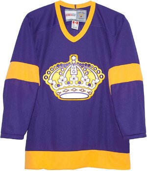
With the Utah Mammoth officially announced, we have the latest package of an NHL team's logo, alternate logos, jerseys, primary colors, etc.

Do you particularly like or hate any NHL team's branding? Do you think anybody needs a rebrand? A new name even? Prefer alternate logos or jerseys over the primary set?
 
I've always hated Vegas' branding. I thought dropping the "Las" was gimmicky and only because it would make Foley's "[Adjective] Knights" obsession too clunky.

And "Golden Knights" was the worst of the three options. "Silver Knights" would have fitted the Silver State. Silver/gray also looks way nicer on the ice than their morning piss yellow. "Desert Knights" would have been a little cheesey, but it would have lent itself to unique colors and logos. Instead, we got one of the most boring and underdeveloped logos in sports.
Personally like the Vegas logo and anything Golden has to be good right...Since the NHL lost the Golden Seals I liked Golden Knights
 
  • Like
Reactions: TheDawnOfANewTage
On the positive side, I loved Florida's rebrand. It's just so clean. It's both really detailed but not busy at all. It's a super local mascot, and the colors are a natural fit. In particular I like the shoulder logo.

1746651255399.png


The stick and palm tree jerseys had great potential, but they ruined them with the ugly shades of yellow/red on top of black. That and the diagonal sleeve stripes look cheap and amateurish. But I'd love this as an alternate if they made slight changes.

1746651508516.jpeg
 
I hated the Kings going back to the Chevy Logo would have rather the original colours with the Real Crown and not the Queens Crown...and name plate adds nothing...one thing hockey has that others don't is the jazzy Logo's front and centre and huge

The King's Burger King Logo situation was so bizarre it's awesome. The story was interesting.

The REAL Story Behind The Los Angeles Kings' Infamous "Burger King Jersey"

In some of the pics in the article, it looks like the logo was photoshopped on. It really sticks out. It's hilarious. IMO it certainly has a ton of untapped potential.
 
Blue Jackets - terrible name and branding. I know it has historical significance in Ohio but it’s pretty dumb when there’s a team called the Blues. Change name to Canons and color to powder blue, cream and white.

Hurricanes- name is fine but go back to Whalers colors.

Mammoth- go purple instead of black on their current scheme.

Jets, Stars, Lightning, Panthers all need to go back to their 90s jerseys and schemes.

other than that, I think most teams have good branding/colors.
 
I never liked the Sens 3D logo and boycotted any items with it.

View attachment 1031589

Recommitting to the original 2D logo was the right move.

I have always loved the version someone posted on HF with Phaneuf's face inside. :laugh:

the young homies over in Utah absolutely cooked with their new branding

I'm no good with photoshop, but IMO the fact the Mammoth image if flipped upside down in a certain way can also look like an angry bearded gnome with a hook arm is awesome. :)

I'm thinking from the perspective of anyone wearing that jersey and looking down on that logo, might laugh.
 
Blue Jackets - terrible name and branding. I know it has historical significance in Ohio but it’s pretty dumb when there’s a team called the Blues. Change name to Canons and color to powder blue, cream and white.

Hurricanes- name is fine but go back to Whalers colors.

Mammoth- go purple instead of black on their current scheme.

Jets, Stars, Lightning, Panthers all need to go back to their 90s jerseys and schemes.

other than that, I think most teams have good branding/colors.
Would removing the Blue and just calling them Jackets (original logo would make more sense) make it easier for the average NHL follower? Seriously, if differentiating between Blues & Blue Jackets is the biggest problem with them, I don't think they make the list.

And just No to pastel colors that everyone seems to like nowadays. Reminds me of the dudes tie from fight club.
 
I think Mammoth is a really stupid name and to this day no one has ever told me if it means one singular mammoth, or if it means Utah Very Big. Either way, it sounds like one of the generic, default teams someone would create in the NHL video game.

The Florida Panthers is a great name but they desperately need a new logo and new jerseys. Looks like a soccer team.

Don't really have any complaints after that.

The Atlanta Thrashers branding/jerseys are perfect, they need to bring that back exactly as it was.
 
Blue Jackets - terrible name and branding. I know it has historical significance in Ohio but it’s pretty dumb when there’s a team called the Blues. Change name to Canons and color to powder blue, cream and white.

Hurricanes- name is fine but go back to Whalers colors.

Mammoth- go purple instead of black on their current scheme.

Jets, Stars, Lightning, Panthers all need to go back to their 90s jerseys and schemes.

other than that, I think most teams have good branding/colors.
I think Blue Jackets is a great name one of the best in the NHL
 
I think Mammoth is a really stupid name and to this day no one has ever told me if it means one singular mammoth, or if it means Utah Very Big. Either way, it sounds like one of the generic, default teams someone would create in the NHL video game.

The Florida Panthers is a great name but they desperately need a new logo and new jerseys. Looks like a soccer team.

Don't really have any complaints after that.

The Atlanta Thrashers branding/jerseys are perfect, they need to bring that back exactly as it was.
I like Mammoth better than Yeti whch I thought was really dumb dumb
 
Blue Jackets - terrible name and branding. I know it has historical significance in Ohio but it’s pretty dumb when there’s a team called the Blues. Change name to Canons and color to powder blue, cream and white.

Blue Jackets are the Blue Jackets and the Blues are the Blues. Not rocket science.

I agree that the branding is generic. I do prefer the cannon logo/jerseys. But the Columbus Cannons sounds stupid as all f***. Sounds like a minor league baseball team at best. A beer league hockey team at worst. They should go with the Columbus Chill if they 1) rename the team and 2) can get the rights to that name. But honestly. Blue Jackets is fine. I don’t really see the discussion about the name being “bad” anywhere but HFBoards tbh. I live in Columbus.

I don't know if this was intentional, but... there indeed was a minor league baseball team named the Cannons. :laugh:

A notable player for the team was Alex Rodriguez.

 
LA, Anaheim and Washington have the worst branding and jerseys in all of sport.
 
Last edited:
  • Angry
Reactions: Grinner

Users who are viewing this thread

Ad

Ad