
- Apr 3, 2016
- 3,048
- 3,431
Not going to say anything, other than this is near perfect. All the new jersey's this year have been solid.
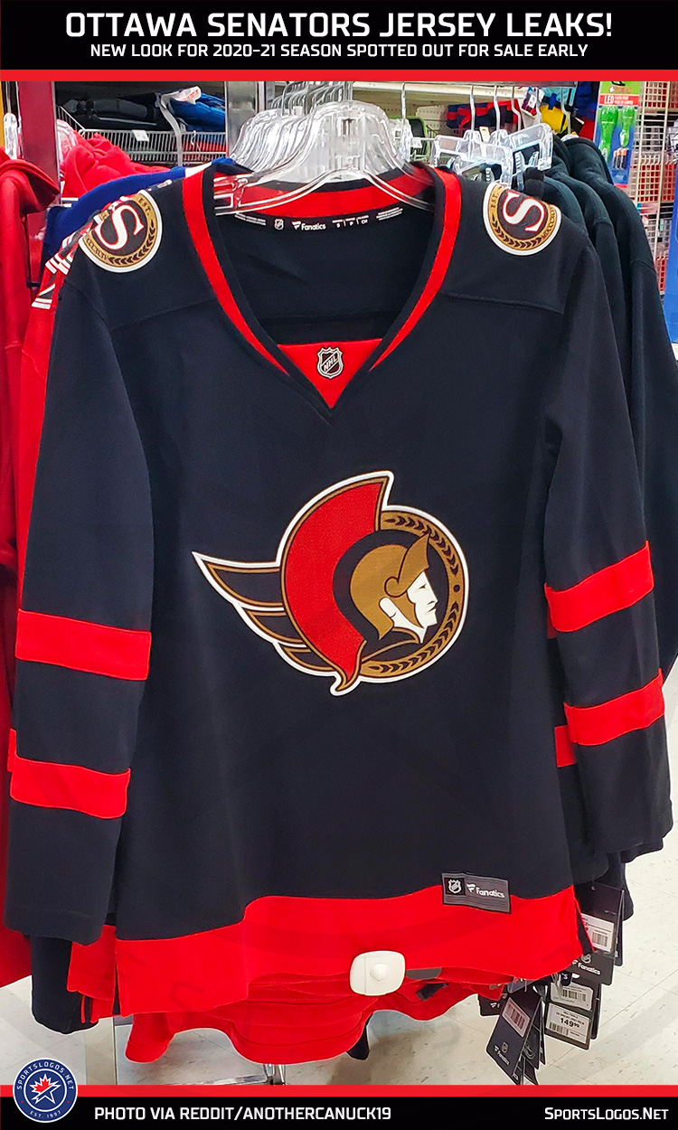
Leaves them open to a great 3rd jersey as well.I prefer red being the primary color, but not a bad design, and beautiful throwback logo.

Beautiful. Brings back memories of their first playoff series against Buffalo were they lost in OT in game 7.
I remember those days. The Leafs were in the Western Conference and hadn't made the playoffs that season, and most Leafs fans became Sens fans. I didn't miss a game that entire series.
Then of course the Leafs moved to the Eastern Conference and a rivalry developed.
Is there a reason why the neckline/collar has a different style from the current Adidas jerseys? Or, is that just how Fanatics jerseys are in general?
Either way, I think that would be a nice improvement over the current jersey/logo.
Agreed, red as the primary color would look way better.I prefer red being the primary color, but not a bad design, and beautiful throwback logo.
Ah, yes -- that would make sense. Thanks!I'm guessing that's a women's cut due to how small the logo is. Fanatics women's jerseys all seem to have that same collar.
Probably because that's not the jersey.Is there a reason why the neckline/collar has a different style from the current Adidas jerseys? Or, is that just how Fanatics jerseys are in general?
Either way, I think that would be a nice improvement over the current jersey/logo.
Oh goodness, the jokes after a defensive miscue next season almost write themselves.Switching to a 2D logo, Melnyk couldn't afford 3D.
