
GENESISPuck94
Registered User
I feel like the liberty logo is always too low on the front of the jerseys. I get they need space for C and A on the front, but still, it would look better if the logo were higher up near the chest.
Why can’t they show us players wearing the full uniform instead of these teasers
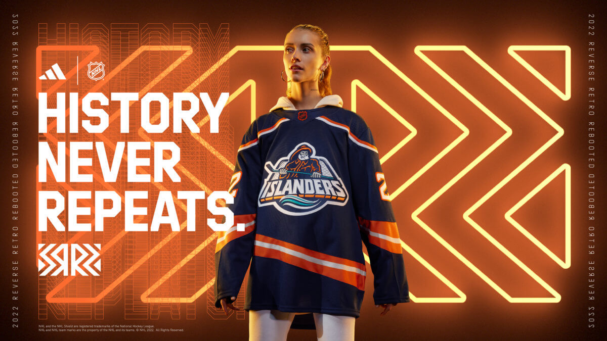
Vegas is definitely the worst. But I have a weird dislike for them and Seattle participating .BTW I think the Islanders have the worst jersey of the bunch. It’s like they had the idea to finally bring back Fishermen jersey, but at the very end Lou L stepped in and said “we’re not doing that” and this was the highly sterilized and result
BTW I think the Islanders have the worst jersey of the bunch. It’s like they had the idea to finally bring back Fishermen jersey, but at the very end Lou L stepped in and said “we’re not doing that” and this was the highly sterilized and result
How dare you!?NGL I like Vegas’ Jersey with the glow in the dark lol
Are you blindI think St. Louis has the worst ones. Not too thrilled with Vancouver's either (Flying V missed opportunity).
Rangers did fine. Not super creative, but not super boring.
Are you blind
These things are going for $300. They should make cheaper versions.
These things are going for $300. They should make cheaper versions.
These liberty jerseys will sellout on the first and only production run and then regularly sell for $300+ like the last set of reverse retros.No I'm not. I don't like them. Proportionally the logo letters and logo are too low on the sweater, the Blue not looks prehistoric like it's from 100 years ago. And the yellow/gold make it too busy.
Just wait like a six month-year on ebay or some sites until they have another jersey release for the league.

I have to say they look really good
I preordered mine on the msg store website.Where are they selling them?
