TheCLAM
Registered User
Really hoping for new news on this. They said uniform, logo, centennial plans would be announced in the new year.
Any time now lol
11 days and counting aha
Really hoping for new news on this. They said uniform, logo, centennial plans would be announced in the new year.
Any time now lol
Logo is too Mickey Mouse, very childlike. My all time favorite Leafs Jersey is the 62-63, obviously the player name is needed, but logo size and everything else is perfect.


made this concept about 6 years ago ...
love it but am still undecided about laces/neckline style
")
Logo is too Mickey Mouse, very childlike. My all time favorite Leafs Jersey is the 62-63, obviously the player name is needed, but logo size and everything else is perfect.
")
made this concept about 6 years ago ...
love it but am still undecided about laces/neckline style
made this concept about 6 years ago ...
love it but am still undecided about laces/neckline style
It has a cleaner look than this:

I love the look of the leaf itself, but I can never get over the fact that the text looks like it's shifted over too far to the right. I'd be interested to see that jersey without the words on the logo at all.
That's basically my concept (but on the current jersey).

https://www.flickr.com/photos/mordechaih/24283781436
Thanks LV!The first time you posted this I hated it, now I'm kind of warming up to it. It looks clean.
Theyre really pushing the logo without any words in it.
A bunch of new clothing just released has it

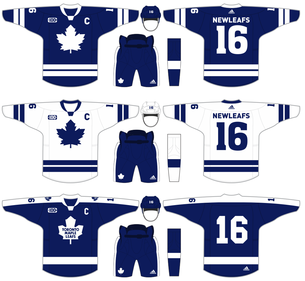
I'm guessing the new set will end up looking something like this
I hope we keep our current thirds though, the 1967-era jersey is my favorite of all time
really? anything online
i really hope not


I'm guessing the new set will end up looking something like this
I hope we keep our current thirds though, the 1967-era jersey is my favorite of all time
I love the look of the leaf itself, but I can never get over the fact that the text looks like it's shifted over too far to the right. I'd be interested to see that jersey without the words on the logo at all.
The name on this jersey needs to be Pulford, as in Bob Pulford.