DoktorJeep
B2B GM of the Summer Champion
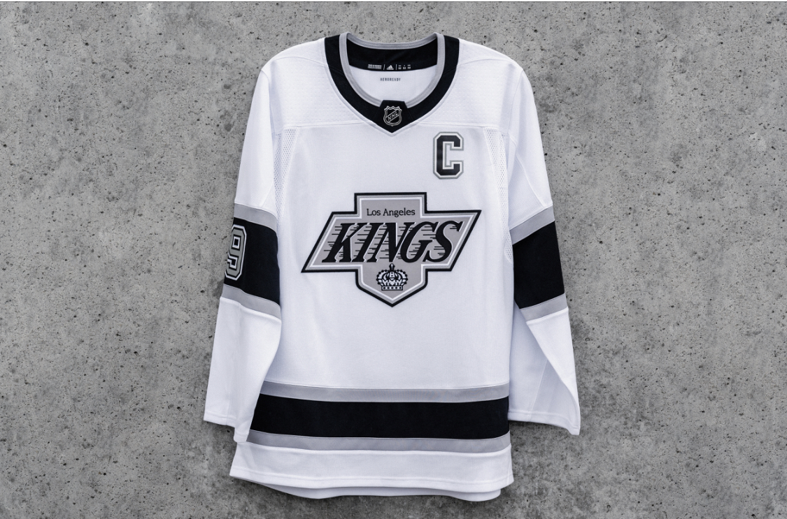
Seriously. Black and white were Raiders colors. Why does any Kings fan want to be associated with a fan base that had more arrests per sixty minutes than anyone else. The Coliseum had a jail built into the facility. What does any of that have to do with hockey.
Integrity, Family, etc. How does any of that align with a doubling down on a color scheme that is boring and born out of a crass desire to latch onto a dubious cultural trend.
These stupid fools in charge waste two years worrying about making sure the new branding works on anything from the jerseys the players wear to the generic merchandise, only to lose sight of what actual story they are trying to tell. It’s leadership by a committee of hacks and mediocrities.