Exactly. Kopitar and Doughty have worn practically every jersey LA has had before over time just on heritage/retro nights. It just feels flat as far as a rebrand goes. It is just an acceptable change because chrome domes were stupid and the home plate was not a very well-liked rebrand. We just tolerated and ignored it because we immediately won and who cares after that

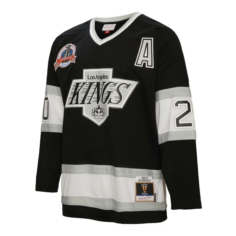
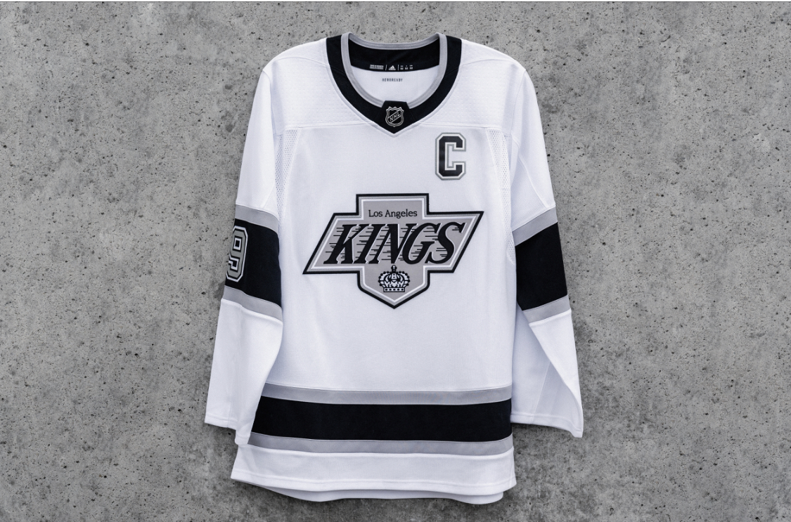
I am happy with the chevy logo overall, the changes to it get a shrug from me. It is the team I remember the most from my childhood as I was very young when they were in purple and gold - I can only remember like 2-3 live games watching them before the Gretzky era. Would have been nice to use our unique colors rather than black and white, but it is iconic Kings and it is clear that all leadership in the organization wanted "the Gretzky era" to return so there is no use fighting it.