Rumor: Kings rebranding with a new logo?

  • Work is still on-going to rebuild the site styling and features. Please report any issues you may experience so we can look into it. Click Here for Updates
hey waitaminute

1718860117773.jpeg


HEY ITS NEW WERE REBRANDING TO SOMETHING FRESH

really would anyone put it past the kings to be this lazy

1718860385224.jpeg
 
  • Haha
Reactions: Schrute farms
Got this from a friend. Not 100 percent if its legit.
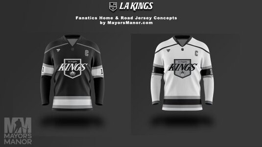
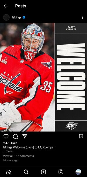
 

Attachments

  • IMG_2899_20240618_161927.jpg
    IMG_2899_20240618_161927.jpg
    27.5 KB · Views: 21
It's brand "new" guys. They changed the font and made the shield fatter to resemble the home plate. It is what it is, I liked the Chevy era (though I also liked Teenage Mutant Ninja Turtles and GI Joes then too), though not as much as going back to purple and gold, but we all knew Luc is nostalgic and wanted his Chevy logo back.

If they were going Chevy, I wish they went with the alternates at least and changed the color scheme.
 
  • Like
Reactions: King'sPawn
I feel like Luc & Blake are some super high concept comedy performance artists -- one day we'll understand and 'get it'...and see the amazing "art" they provided us that was well beyond our years. We just can't understand it right now.
 
  • Like
Reactions: fivehole32
If you were reading between the lines the past couple of years, this was inevitable. They were using the chevy logo a lot and the fact that they used the alternate jersey as the road jersey in the playoffs should've been the indicator that they were heading this direction.

I'm fine with it I guess, I just want some purple to come back
 
It's basically the same logo from when I first became a fan so, yeah, I've always liked it and have no issue with them going back to it.

That said, simply going back to it with the same colors is supremely lazy. The first reverse retro was extremely lazy too but it sold like hotcakes since it was purple. The second reverse retro was gorgeous and universally praised so, once again, this organization has shot itself in the foot with something that should be easy.

If you want the Chevy logo back then okay...just toss the original color scheme on it and ditch the silver altogether.
 
There's nothing atrocious or all that interesting about it. They 100% played it safe which can sometimes be more divisive than a huge re-design. They'll lean into purple and gold for future alternates. I just hope they don't go with shiny and glittery trim on the jerseys. Keep the look clean, please!
 
  • Like
Reactions: yankeeking
that looks so shit hahahahahahahahah perfect for fanatics

is that even a unique font or is it from the stock windows pack? the ability of this org to find new and innovative ways to f*** things up is second to none
Nailed it. The font is the worst part. Derpy Derp.
 

Ad

Upcoming events

Ad