
SnuggaRUDE
Registered User
- Apr 5, 2013
- 9,123
- 7,611
Is Reebok making NHL jerseys again?This is a really boring jersey.
Nice.I prefer this one.
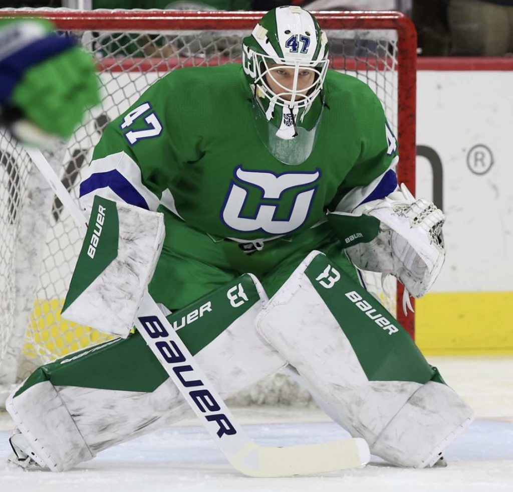
I wish they had kept their colours at least. Hurricanes design is boring as shit.Cut the shit and bring back the Whalers jersey already.
Yeah, the red and white jerseys are already overdone in the league. I'm glad the Coyotes shifted from it at least.I wish they had kept their colours at least. Hurricanes design is boring as shit.
Agree with other this take. I don’t really like it much but it will pop on screenI wouldn’t want to wear it around but it’ll look good on tv I think.
oh god was that thing a migraine inducing disaster back in the day, holy hell, I had honestly forgotten about it.It’s like if the Nintendo Virtual Boy f***ed a Canes jersey.
Gross.
oh god was that thing a migraine inducing disaster back in the day, holy hell, I had honestly forgotten about it.

I wish they had kept their colours at least. Hurricanes design is boring as shit.
 I still like the Capitals one better.
