Great photos in hockey history you've just seen for the first time (Part III)

Doctor Coffin

This may hurt a bit...
May 23, 2013
445
174
Gilles Gilbert, Curt Fraser, Greg Smith. Even as a Hawks fan I loved those one-year 1982-83 Maska Red Wings uniforms with the Arabic style numerals and the reversed colors on the winged wheel.
 

Attachments

  • img723.jpg
    img723.jpg
    520.3 KB · Views: 28
  • Like
Reactions: SealsFan

Gilles Meloche

I Moe I Moe
Feb 18, 2006
1,302
499
Toronto, Canada
Reese the Piece?
David Schill

He was born in Kitchener Ontario. Schill spent 4 years in the OHL playing with the London Knights, Toronto Marlboros, Hamilton Dukes and finally for his hometown Kitchener Rangers where he backed up Mike Torchia. On February 1 1992, the Toronto Maple Leafs depth chart was tested. Rick Wamsley was forced to leave the team with the news of his father's passing. Felix Potvin was next in line, but he was down with an injury. Damian Rhodes received the call but he was snowed in on the east coast. The call went out to Schill who was playing with the Brantford Smoke of the CoHL. He was at the airport in Toronto ready to catch a flight and replace Rhodes in Newfoundland on an emergency basis. The Leafs redirected Schill to Maple Leafs Gardens to backup Grant Fuhr in a game against the New Jersey Devils that evening.

Post courtesy of: NHL Goalie Hub on June 24, 2023
 

Nogatco Rd

Music Has The Right To Children
Apr 3, 2021
2,174
4,264
Ronnie and Nancy meet Jari Kurri, c. 1993.
hbnne7ne1bs51.jpg


Jari: "So... you're a retired right-wing President who believes in tax shelters for the rich and destroying the unions... May I introduce you to my young friend, Teemu...?"
lol these pics of celebrity locker room visits from the 80s and 90s are wild
 
  • Like
Reactions: VanIslander

The Panther

Registered User
Mar 25, 2014
19,911
16,830
Tokyo, Japan
View attachment 893397

Both jerseys are criminally underrated IMO
I'm gonna have to disagree with you, there.

That Pens' one with with the big robo-Penguin was all right -- I think the Penguin-logo there is better than the typical (rather wimpy-looking one) that they previously and typically use. However, the mid-90s-ish design details on it are very unattractive. There are too may colors (as is typical of this mid-/late-90s period of re-designed jerseys). I don't want to see gray on a Penguins' jersey! There are at least 5 different tones on Lemieux's chest, which is at least 2 too many for a hockey jersey.

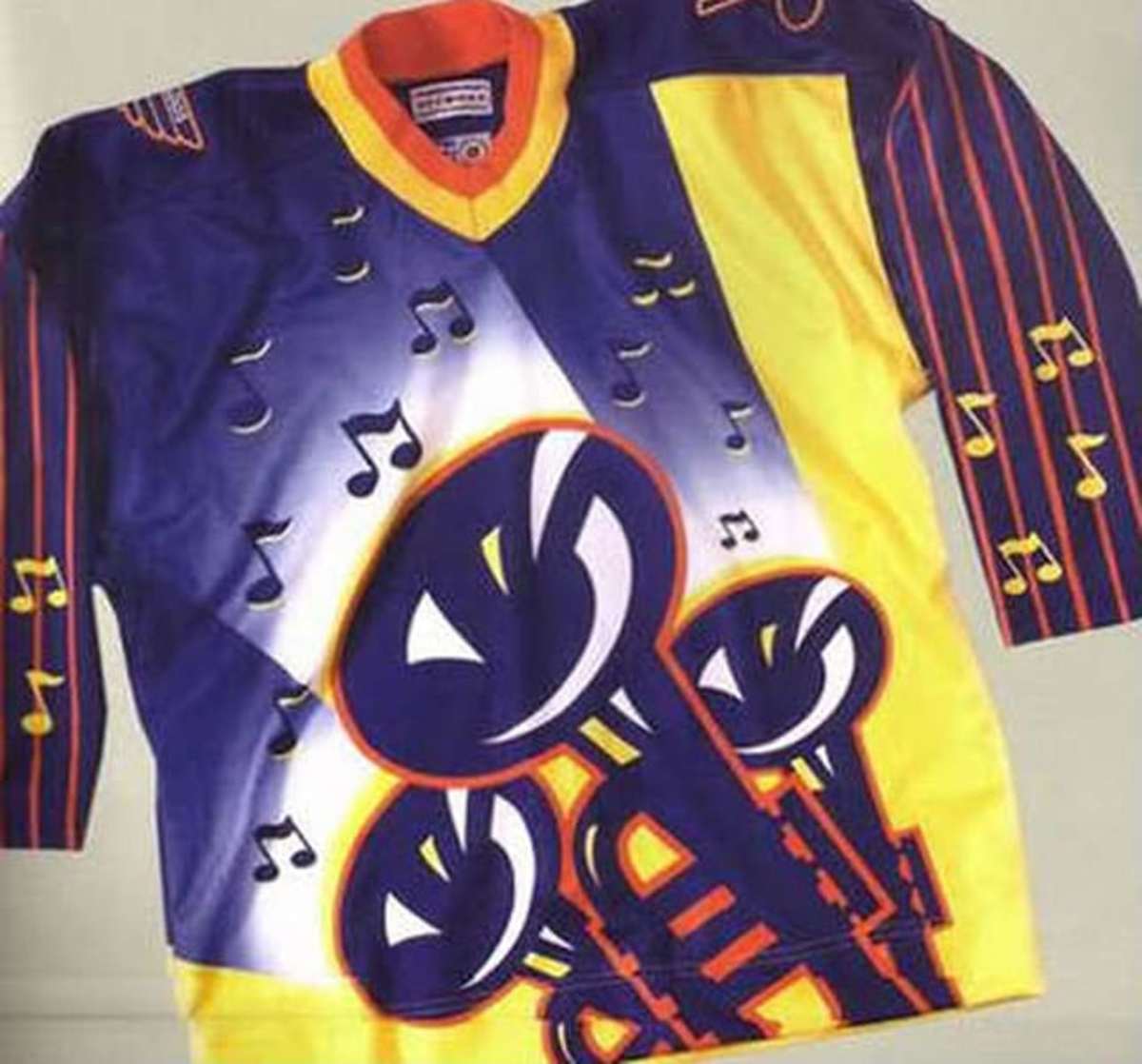
And those Blues one from c.1995-1997... UGH!! They looked like dog-crap. There is WAY too much red on those jerseys. Ideally, there is no red whatsoever on a St. Louis Blues' jersey. Jersey lines at odd angles (like those red lines under the blue-note) just look terrible. Then, the angle of all those lines crowds out the blue-note itself, shrinking its space, and making the jersey look crowded and "busy", which is always a bad look for a hockey top.

I personally liked the Blues' jerseys more around the late 80s (?) when they were much simper and dispensed with the red entirely:
s-l1600.webp


But at least Mike Keenan (in one of his more sober moments) had the good judgement to refuse to allow his club to wear this:

blues.jpg
 

Ad

Upcoming events

Ad

Ad