Doctor Coffin
This may hurt a bit...
- May 23, 2013
- 461
- 194
Partial skyline for the WHA New York Raiders home jersey...
View attachment 852747View attachment 852748

What’s the backstory on someone with a resume like his finishing out his career by randomly playing a few games for a 2nd division team called the Squirrels in a hockey backwater?
What’s the backstory on someone with a resume like his finishing out his career by randomly playing a few games for a 2nd division team called the Squirrels in a hockey backwater?
OK that would do it I guess!He got offered a boatload of money to be their player-coach.
David SchillReese the Piece?

lol these pics of celebrity locker room visits from the 80s and 90s are wildRonnie and Nancy meet Jari Kurri, c. 1993.

Jari: "So... you're a retired right-wing President who believes in tax shelters for the rich and destroying the unions... May I introduce you to my young friend, Teemu...?"
I'm gonna have to disagree with you, there.


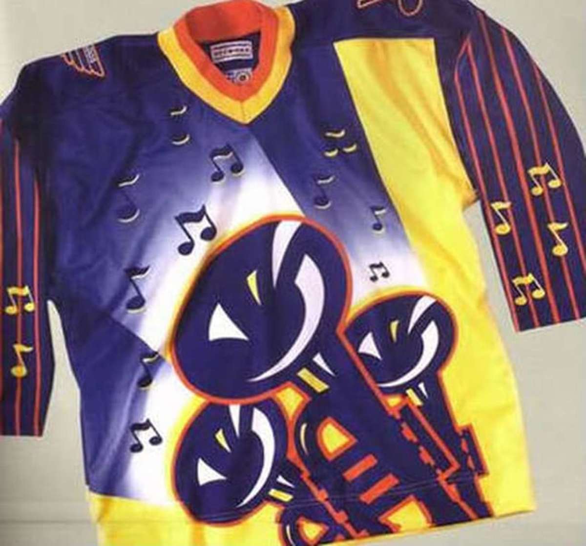
Criminally overrated by ya!Both jerseys are criminally underrated IMO
