Florida Panthers completely changing jersey (logo leaked post 661)

  • Xenforo Cloud will be upgrading us to version 2.3.5 on March 3rd at 12 AM GMT. This version has increased stability and fixes several bugs. We expect downtime for the duration of the update. The admin team will continue to work on existing issues, templates and upgrade all necessary available addons to minimize impact of this new version. Click Here for Updates
Status
Not open for further replies.
I always thought their logo/uniforms were decent enough. Puzzled by the change.

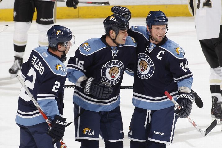
I'm no marketing expert but I've always felt that part of the trouble with expansion teams (in all sports) is that they're seemingly constantly changing their jersey, color, and logo in drastic ways. Part of what makes the O6 team's uniforms so great is the consistency behind them. Obviously a team like Florida is lacking at least 30 years of history and tradition but I think it's hard to make that if you're changing your brand recognition every couple of years.
 
I was a huge fan of the original Panthers jersey. Classic and sweet. I have one myself. Then Reebok came along and well there it went. All these crappy patches and lines going every which way. Hope they go back to the original somewhat.
 
Something I threw together for fun.


fpjeh.png


Grades would be appreciated.
 
Last edited:
All the Panthers had to do was stick with these for the past 20 years and they'd be classics.

53130046-season-scott-mellanby-of-the-panthers-gettyimages.jpg

vanbiesbrouckjpg-5cb2e037ce7a9869.jpg
 
Good. They could use the head of the Panther, but they don't need the entire thing.

That's actually my favorite thing about their logo. Like 98% of teams named after animals have that animal's head as a logo. At least the Panthers' shape was unique.

I agree that the execution could be better, but I hope they keep the idea of the full body leaping cat.
 
As long as it isn't a side-view of a Panther standing on its hind legs with one arm above the other to make an "F" shape, I'm a happy camper.
 
They're doing a complete makeover but keeping the old color scheme? That's what I've always hated the most. Too much going on. Just choose one primary and one secondary and stick to it.
 
All the Panthers had to do was stick with these for the past 20 years and they'd be classics.

53130046-season-scott-mellanby-of-the-panthers-gettyimages.jpg

vanbiesbrouckjpg-5cb2e037ce7a9869.jpg

100%

Despite growing up a Bruins fan, one year I asked for that home jersey with my name and age on it for my birthday.


My dad said he would get it for me for Halloween.
 
KITTENS.jpg


That's how you open up your demographic. Get those cat ladies on board.
 
All the Panthers had to do was stick with these for the past 20 years and they'd be classics.

My thoughts exactly. Felt the exactly same way with the Senators jerseys from the 90s, and the early 2000s Stars jerseys. Not sure why every team feels its needs a major rebranding every few years.
 
Status
Not open for further replies.

Ad

Upcoming events

Ad