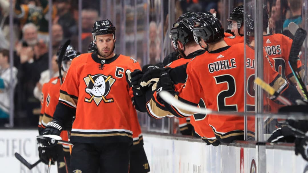
Ducks & Kings to Unveil New Logos

WhiskeyYerTheDevils

yer leadin me astray
Sponsor
Apr 27, 2005
34,203
31,128
Yes, it is. Ducks going back to their old "mighty" logo with a few modernizations and current color scheme (burnt orange, black, white, vegas gold) has been confirmed multiple times by now. Should be a good one, and we will finally not be the team with the most hideous logo and jerseys in the league anymore.
The logo is a big improvement, but the color scheme is so meh. We have enough red/orange/gold teams in the league, and far too few with green or purple.

Missed opportunity.
 
  • Like
Reactions: POVERTY

StreetHawk

Registered User
Sep 30, 2017
26,997
10,195
Yeah, I like these.

I would keep the silver in the crown and otherwise make the lettering white on the dark jerseys. It pops more.

Along with the other changes you suggested, I think they would have something there.

The Kings are one of those teams that makes me wish they switched it up every year like in soccer (or maybe every couple of years). They have a wealth of interesting elements to choose from and I don't really hate anything they've done.
Is silver really needed in the stripes? That's why most teams only go with a primary and secondary color and at most use a 3rd color as a small stripe. Without any white stripes, the dark jerseys are really dark. Using white numbers with only purple and silver stripes on the black jersey would look odd. But, you could then see the numbers better.

Canucks back in their black skate days, had red as their 3rd color, so only a sliver of the outline of the numbers had white. No white stripes. I found their jerseys to be much darker than Pitt/Bos who were also black and yellow but they at least had a strip of white on the stripes which really does brighten up the jersey.
 

Machinehead

GoAwayBrady
Jan 21, 2011
146,180
122,317
NYC
Is silver really needed in the stripes? That's why most teams only go with a primary and secondary color and at most use a 3rd color as a small stripe. Without any white stripes, the dark jerseys are really dark. Using white numbers with only purple and silver stripes on the black jersey would look odd. But, you could then see the numbers better.

Canucks back in their black skate days, had red as their 3rd color, so only a sliver of the outline of the numbers had white. No white stripes. I found their jerseys to be much darker than Pitt/Bos who were also black and yellow but they at least had a strip of white on the stripes which really does brighten up the jersey.
Nah, the only place I would have silver in these is in the crown.
 

StreetHawk

Registered User
Sep 30, 2017
26,997
10,195
Nah, the only place I would have silver in these is in the crown.
So, basically swap the Silver numbers and stripes for white then on the dark jersey and only use black and purple stripes on the white jersey.

Third color, if used should be very minimal. But, kind of depends on the color combo. I mean the Blues use 2 shades of blue and yellow. If they opted to keep their numbers yellows when they first went to this double blue look, it would be fine since Yellow against the blue does pop and you can see the numbers. Black and Purple together is very dark. Silver really doesn't brighten it up too much unless you have some white in there.
 

Sgt Schultz

Registered User
Jun 30, 2019
420
567
Santa Fe, NM
These are the worst jerseys ever iced by an NHL team.
Oh, I don't know. Here are a couple of contenders.
1718652841709.jpeg

1718652582393.jpeg


This one gets an asterisk, because it is a throwback to a much earlier time
1718652660156.jpeg


And then, the grand prize winner. This one was so bad, Mike Keenan forbid them from being worn on the game they were scheduled for . This makes the Blues reverse retro red sweaters look like gold.
1718652700981.png


Not to be outdone, if we expand our search beyond the NHL, the Memphis River Kings would like to have a word with us
1718652901713.jpeg
 
Last edited:

Oilslick941611

Registered User
Jul 4, 2006
15,740
15,977
Ottawa
Oh, I don't know. Here are a couple of contenders.

View attachment 883626

View attachment 883627

This one gets an asterisk, because it is a throwback to a much earlier time
View attachment 883633

And then, the grand prize winner. This one was so bad, Mike Keenan forbid them from being worn on the game they were scheduled for . This makes the Blues reverse retro red sweaters look like gold.
View attachment 883635

Not to be outdone, if we expand our search beyond the NHL, the Memphis River Kings would like to have a word with us
View attachment 883636
Those are all 3rd, or special event jerseys. Not worn by a team for 8 years.

And to be honest, those 90s 3rd jerseys look way better than what the ducks from 06 to 14. The Montreal centennial jerseys suck ass, but the ducks are worse. All those other jerseys had a timeline for being worn, but the ducks jersey was the main jersey, Not comparable at all.
 

Sgt Schultz

Registered User
Jun 30, 2019
420
567
Santa Fe, NM
Those are all 3rd, or special event jerseys. Not worn by a team for 8 years.

And to be honest, those 90s 3rd jerseys look way better than what the ducks from 06 to 14. The Montreal centennial jerseys suck ass, but the ducks are worse. All those other jerseys had a timeline for being worn, but the ducks jersey was the main jersey, Not comparable at all.
I'm convinced the Canadiens' centennial sweaters were designed to cause vertigo in their opponents. But, as I said, they were throwbacks and some of the earliest uniforms were not designed to be fashions statements, which is true in pretty much every sport.

Maybe it's me, but the Ducks have always had a problem. The original unis were rather cartoonish, although we all know the reason. Then it was almost like they tried too hard to go in the opposite direction.

As for the Kings, I'll second @ujju2 on the purple and black unis. Place the crown logo on the purple sweater and get rid of the "Los Angeles" on the bottom (everybody knows where they are from) and it is a winner for me.
 
  • Like
Reactions: ujju2

Oilslick941611

Registered User
Jul 4, 2006
15,740
15,977
Ottawa
I'm convinced the Canadiens' centennial sweaters were designed to cause vertigo in their opponents. But, as I said, they were throwbacks and some of the earliest uniforms were not designed to be fashions statements, which is true in pretty much every sport.

Maybe it's me, but the Ducks have always had a problem. The original unis were rather cartoonish, although we all know the reason. Then it was almost like they tried too hard to go in the opposite direction.

As for the Kings, I'll second @ujju2 on the purple and black unis. Place the crown logo on the purple sweater and get rid of the "Los Angeles" on the bottom (everybody knows where they are from) and it is a winner for me.
im a big fan of removing primarily black jerseys from the game. So the kings going back to back purple gets a thumbs up from me.

As for the ducks, well, I was born in 86. The marketing worked for me. I love thier original colour scheme. It's too bad they ditched it for black and I'll never forgive them for it. Those duck movies got me into hockey and the teal was everywhere in the 90s so I love it. The logo isn't that bad either. Im interested to see what updates they do to it. The ducks got their jerseys right the first time around.
 
  • Like
Reactions: Raccoon Jesus

HanSolo

DJ Crazy Times
Apr 7, 2008
98,002
33,223
Las Vegas
Yes, it is. Ducks going back to their old "mighty" logo with a few modernizations and current color scheme (burnt orange, black, white, vegas gold) has been confirmed multiple times by now. Should be a good one, and we will finally not be the team with the most hideous logo and jerseys in the league anymore.
Too early to say on the jerseys. This team hasn't had the best track record in that regard. The best jerseys they've put out post Mighty era were, ironically, variants of the old Mighty Ducks jerseys.

636677960948918058-Front-Jersey.jpg

shape%2Fcover%2Fsport%2F80aba884b5e23229f73dad804d895112bf8eb03df791af138da8e86f986d3353.jpg


And the second one is still not great because the lower half sleeve striping is basically ripped right from the Ducks' 06-07 socks with is not a great looks for the arms. A lot of people liked the 30th anniversary jersey but I think that while the colors were great and the striping was generally fine, the crest was an overly busy eyesore.

1000061439.jpg


Then there's all these ugly looks.

FeLDajR.jpeg


s-l1200.webp

(there's no getting around how uniquely awful the striping is on this jersey and how this has been the primaries for much longer than the original rebrand kit)

I don't really count the action pose wild wing jersey reverse retro as a modern design attempt so I don't count that against Anaheim's recent failures to nail down a respectable look, but taking nostalgia glasses off, that was one of the fugliest jerseys in league history.
 

Terry Yake

Registered User
Aug 5, 2013
27,204
15,843
Too early to say on the jerseys. This team hasn't had the best track record in that regard. The best jerseys they've put out post Mighty era were, ironically, variants of the old Mighty Ducks jerseys.

636677960948918058-Front-Jersey.jpg

shape%2Fcover%2Fsport%2F80aba884b5e23229f73dad804d895112bf8eb03df791af138da8e86f986d3353.jpg


And the second one is still not great because the lower half sleeve striping is basically ripped right from the Ducks' 06-07 socks with is not a great looks for the arms. A lot of people liked the 30th anniversary jersey but I think that while the colors were great and the striping was generally fine, the crest was an overly busy eyesore.

View attachment 883649

Then there's all these ugly looks.

FeLDajR.jpeg


s-l1200.webp

(there's no getting around how uniquely awful the striping is on this jersey and how this has been the primaries for much longer than the original rebrand kit)

I don't really count the action pose wild wing jersey reverse retro as a modern design attempt so I don't count that against Anaheim's recent failures to nail down a respectable look, but taking nostalgia glasses off, that was one of the fugliest jerseys in league history.
the first one (18-19 3rd) would've been perfect as a full time home sweater with a white away variant. but it doesn't contain any orange so no chance the samuelis would go for it
 
  • Like
Reactions: piqued and HanSolo

HanSolo

DJ Crazy Times
Apr 7, 2008
98,002
33,223
Las Vegas
the first one (18-19 3rd) would've been perfect as a full time home sweater with a white away variant. but it doesn't contain any orange so no chance the samuelis would go for it
Well not enough anyway. The sticks are orange. But it's a fair characterization.
 

Sgt Schultz

Registered User
Jun 30, 2019
420
567
Santa Fe, NM
im a big fan of removing primarily black jerseys from the game. So the kings going back to back purple gets a thumbs up from me.

As for the ducks, well, I was born in 86. The marketing worked for me. I love thier original colour scheme. It's too bad they ditched it for black and I'll never forgive them for it. Those duck movies got me into hockey and the teal was everywhere in the 90s so I love it. The logo isn't that bad either. Im interested to see what updates they do to it. The ducks got their jerseys right the first time around.
If I were dictator, the only teams that would wear black sweaters are the Bruins and Penguins. Even with that, I preferred the Bruins black sweaters with the gold socks.

Otherwise, black is a good color for pants to contrast with another color sweater and socks......if black is the team's secondary color.

Kings.....go back to purple sweaters. Sounds like the Ducks are committed to orange. I would personally go back to eggplant since it was unique, and they can see how some shade of orange works with that.
 

Rich Nixon

No Prior Knowledge of "Flyers"
Jul 11, 2006
15,048
19,167
Key Biscayne
The orange displayed in that Ducks teaser image is the exact same hue as the Flyers' current orange. Makes the Cutter Gauthier situation even funnier to me.
 
  • Wow
Reactions: Nogatco Rd

rojac

HFBoards Sponsor
Sponsor
Apr 5, 2007
13,076
2,959
Waterloo, ON
In the NBA, Charlotte was able to get its Hornets name back from New Orleans when NO rebranded to the Pelicans.

I know it’s a pipe dream and will never happen, but I always hope the Dallas Stars would just rebrand as the Dallas Lone Stars so Minnesota can have ownership of the North Stars and that great N* logo once again. MLB has the Red Sox and White Sox. Who’s to say NHL can’t have 2 “Star” franchises? 😉
Or Minnesota fans could be rational adults and accept that the North Stars are gone and that the new Minnesota team s named the Wild. Love n the present not the past.
 
  • Like
Reactions: cptjeff

TheDawnOfANewTage

Dahlin, it’ll all be fine
Dec 17, 2018
12,572
18,439
Oh, I don't know. Here are a couple of contenders.
View attachment 883642
View attachment 883639

This one gets an asterisk, because it is a throwback to a much earlier time
View attachment 883640

And then, the grand prize winner. This one was so bad, Mike Keenan forbid them from being worn on the game they were scheduled for . This makes the Blues reverse retro red sweaters look like gold.
View attachment 883641

Not to be outdone, if we expand our search beyond the NHL, the Memphis River Kings would like to have a word with us
View attachment 883643


These are all fantastic. All press is good press, and this shit presses.

Particularly a fan of the barber pole Habs, because you know some of the players hated that shit on sight. Huge game, special atmosphere, you look like an elf meets a magic eye picture in motion, have a great game.

Anywho, thirds/alternates get a pass from me. Buffalo going with the slug is the worst, all the fans wanted a return to the classic and they said “f*** you, here’s some bullshit, deal with it until long enough passes where we don’t have to admit it was a mistake.”

Looking forward to both new looks, hope they don’t f*** ‘em up.
 

LuGBuG

Quack Quack
Mar 16, 2006
4,578
2,966
Ducks
As a ducks fan looking forward to it. Like the tease. Like the new orange. Looking forward to a new era of hopefully contending for a long time again. This has been the worst stretch in our history.
 
  • Like
Reactions: DrandonBudinsky

Rich Nixon

No Prior Knowledge of "Flyers"
Jul 11, 2006
15,048
19,167
Key Biscayne
As a ducks fan looking forward to it. Like the tease. Like the new orange. Looking forward to a new era of hopefully contending for a long time again. This has been the worst stretch in our history.

IMG_3702.jpeg


:laugh: I can't. How do two teams adopt the exact same shade of the same color 11 months apart?
 
Last edited:
  • Haha
Reactions: Raccoon Jesus

DrandonBudinsky

Black & Blueshirts
Mar 15, 2022
218
332
SADisonSquareGarden
View attachment 883762

:laugh: I can't. How do two teams adopt the exact same shade of the same color 11 months apart?
Is it the same? Hoping they release some more sneaks. But if it is similar, eh, it happens. 🤷🏻‍♂️

Hey, At least it’s not like these two.
When they play each other, it sometimes looks like an intersquad scrimmage when the screen is small enough

4B93B0E4-96F3-48CC-B97C-B94EB914050D.jpeg
 

Ad

Upcoming events

  • Slovakia vs Romania
    Slovakia vs Romania
    Wagers: 4
    Staked: $5,600.00
    Event closes
    • Updated:
  • Ukraine vs Belgium
    Ukraine vs Belgium
    Wagers: 4
    Staked: $1,770.00
    Event closes
    • Updated:
  • Czechia vs Turkey
    Czechia vs Turkey
    Wagers: 3
    Staked: $230.00
    Event closes
    • Updated:
  • Georgia vs Portugal
    Georgia vs Portugal
    Wagers: 6
    Staked: $14,089.00
    Event closes
    • Updated:
  • Ecuador vs Jamaica
    Ecuador vs Jamaica
    Wagers: 2
    Staked: $225.00
    Event closes
    • Updated:

Ad

Ad