Ducks & Kings to Unveil New Logos

BKarchitect

Registered User
Oct 12, 2017
7,576
13,211
Kansas City, MO
You just knew they weren't going to go back to Forum Blue and Gold as their primary because they can sell that look in the Retro/Alt category like hotcakes and still try to get people to buy this very slight update to the black and silver Chevy-logo era stuff.

With the Kings forgoing Forum Blue and the Ducks set on Orange over Eggplant...plus the Coyotes beautiful purple alts now dead and Utah seemingly steering itself into a black primary / powder blue secondary color block...it appears the purple renaissance I was hoping for is DOA.
 
  • Like
Reactions: piqued

HanSolo

DJ Crazy Times
Apr 7, 2008
98,129
33,501
Las Vegas
Kings are a rival team but separating that, I generally dislike wordmark logos. I think this is slightly below fine with that bias in mind, but I've seen worse.
 

kilowatt

the vibes are not immaculate
Jan 1, 2009
18,554
21,440
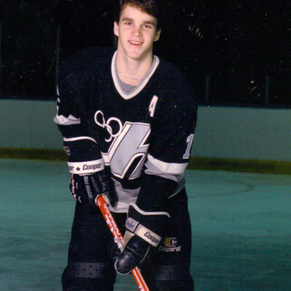
You guys are never gonna guess what Robitaille's jersey looked like in juniors when he played for the Hull Olympiques.

section15__lrobitaille.jpg


More black and white!
 

BigKing

Blake Out of Hell III: Back in to Hell
Mar 11, 2003
11,562
12,250
Belmont Shore, CA
google.com
View attachment 884771

I think it’s a good update. They nipped and tucked the overall “chevy” banner. More weight in the “Kings” font looks better and Los Angeles is more legible from a distance.
Looks like the "new" crown is more like the one used on the last RR than the original crown.

Blake has talked about the Kings needing to be more physical and tougher around the net on both ends of the ice. Logo change foreshadowing upcoming roster moves as the update makes the logo look bigger and slower, if a logo could be slow or fast.
 

StreetHawk

Registered User
Sep 30, 2017
27,066
10,241
Meh. Just put the damn crown in the middle of a black, white and sliver uniform even if you don't want to embrace the purple and gold. They made the Chevy logo look better, but you still don't need anything more than the crown.
The words are larger than the crown. The team is called the Kings. Can figure that out if you just use a crown for the logo.
 

ru4reals

Registered User
Jul 4, 2007
11,656
7,184
They went to a worse version of an already sh*tty logo. Only Luc and the Kings. LoL.
 

DrandonBudinsky

Black & Blueshirts
Mar 15, 2022
239
359
SADisonSquareGarden
That isn't true. This was part of the first push of 3rd jerseys from the NHL. It was a pilot program and the teams had little input on the end result was.

While I agree that the program was a push to get third jerseys in 1996, I have to also say that it was a “test market” of sorts for teams to try out-of-the-box ideas to update their looks to consider rebrands. Kind of like what reverse retros are these days

This proved to work so well for the Rangers that they adopted the Liberty jerseys full time as alternates. Hey look, it’s Luc!
7B133A63-2FF9-4FE3-AFA8-D465F5A28AB8.jpeg

For an Original Six team, that is highly rare to go this bold. (The flipside is the Pooh bear wasn’t a hit )

Respectfully, not entirely sure your statement that the teams had little input is accurate. There’s behind the scenes shots of the Rangers’ GM at the time,Neil Smith, with designers and he was really involved with the final Liberty third jersey design and roll out. These were just some of the designs he nixed before choosing the Liberty design.
FF76EAAC-7430-4E4F-8E5C-34323EDDFBFD.jpeg

FCCABF73-B957-42C8-8C3F-BBB7E6BDBD9D.jpeg


And as this article states the Kings worked with a design firm to update their branding, so I think teams had final say. It’s just that the NHL asked some teams to slap their crests on to jerseys that had gradients or bolder design elements.

Dan went on to tell me that he was the Creative Director at The Mednick Group in 1993, which at the time was one of the largest independent design and marketing companies on the West Coast. The Mednick Group were approached by the Los Angeles Kings who were looking for a revamp of their current logo.

359E13DC-221D-4A7F-8B68-9E5C2D27143E.jpeg
 
  • Like
Reactions: cptjeff

cptjeff

Reprehensible User
Sep 18, 2008
21,118
36,796
Washington, DC.
And as this article states the Kings worked with a design firm to update their branding, so I think teams had final say. It’s just that the NHL asked some teams to slap their crests on to jerseys that had gradients or bolder design elements.


View attachment 884821

Crazy to see those- I always thought that what made the Burger King logo so bad was so cartoonishly mad, that if they had actually made the guy look dignified it could have worked.

Turns out, they had that option- and a lot of them (not the shouting/singing ones!) would indeed work. They just went with the 'make it angry and intimating' stupidity that was all the rage, and it just looked stupid. #4 or #6 would actually have been decent.
 
  • Like
Reactions: DrandonBudinsky

ScoreZeGoals

Boooorrrrriiiinnnnng
Jun 29, 2010
17,587
7,444
i feel like this is one of those designs you can look at and tweak a million times, but then you look back at what you're mimicking and the conclusion should easily be "the old one is better"

i just don't see any improvement over the original 90s chevy, even the new crown looks silly
The only improvement in my eyes is "Los Angeles" being bigger and easier to read
 

DrandonBudinsky

Black & Blueshirts
Mar 15, 2022
239
359
SADisonSquareGarden
Crazy to see those- I always thought that what made the Burger King logo so bad was so cartoonishly mad, that if they had actually made the guy look dignified it could have worked.

Turns out, they had that option- and a lot of them (not the shouting/singing ones!) would indeed work. They just went with the 'make it angry and intimating' stupidity that was all the rage, and it just looked stupid. #4 or #6 would actually have been decent.
This quote made me laugh:
"the Kings were a little sensitive about being a relatively old team" so the grey beard was given a youthful dye job… to purple.
4DB40FEA-422B-47FB-A18B-D0BE570E2984.jpeg


I did a simple concept mockup of what “could have been” in their 3rd jersey rollout had the Kings went the Rangers & Bruins route and went for a bold crest design instead of the gradient sashes.

7A9D5091-2A4B-41B9-BCE4-64330ED03AD4.png


Would the Kings fans at the time been open to this? Or would it have been given the Islanders’ “fishsticks” mockery? 🤷🏻‍♂️
 

BCNate

Registered User
Apr 3, 2016
3,301
3,318
Kings updated logo is an improvement on the last one for sure, but I can't see why they don't just go with the original crown as the logo.
 
  • Like
Reactions: DrandonBudinsky

Ad

Upcoming events

Ad

Ad