
Ducks & Kings to Unveil New Logos
- Thread starter JKG33
- Start date
You are using an out of date browser. It may not display this or other websites correctly.
You should upgrade or use an alternative browser.
You should upgrade or use an alternative browser.

TheDawnOfANewTage
Dahlin, it’ll all be fine
- Dec 17, 2018
- 12,785
- 18,754
And they shall be called.. the Dings. Better than the Kucks, at least.
Devil Dancer
Registered User
- Jan 21, 2006
- 18,519
- 5,575
dirtydanglez
Registered User
- Oct 30, 2022
- 5,158
- 5,194
ducks really needed this.
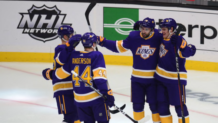
please please please go back to purple kings.
please please please go back to purple kings.
- Jun 17, 2009
- 10,383
- 6,532
ducks really needed this.
please please please go back to purple kings.
Sounds like we’re going to get Gretzky-era Kings throwbacks.
Utah is our last hope for purple jerseys.
Digital Kid
Registered User
Purple has been the colour of royalty for thousands of years. The Kings are the logical choice.
Hopefully the purple returns as a 3rd jersey colour.
Hopefully the purple returns as a 3rd jersey colour.
BKarchitect
Registered User
Kings should just go to the Retro Reverse full time. You get the Gretzky era Kings logo with the Forum Blue and Gold classic LA look. They are so freaking gorgeous. I love the old crown logo too but if they want the 80's/90's logo, please do this.
As for the Ducks - don't half ass it like the Retro Reverse. I demand full eggplant and teal and 90's diagonal look. The Black with tan and orange is so boring.

As for the Ducks - don't half ass it like the Retro Reverse. I demand full eggplant and teal and 90's diagonal look. The Black with tan and orange is so boring.
BKarchitect
Registered User
Highly unlikely given the powder blue and black color scheme that they have been working with in their placeholder and promo material. Maybe purple as an accent, but I'm thinking that powder blue is what they want to use as their main look.Sounds like we’re going to get Gretzky-era Kings throwbacks.
Utah is our last hope for purple jerseys.
PhysicalGraffiti
Bolts STM
BKarchitect
Registered User
Hopefully the Wild are watching (and change to this gorgeous look full-time):

Last edited:
ZDH
Registered User
- Mar 6, 2008
- 9,183
- 4,369
Just don't wash them or the heat sealed letters will peel off - also don't buy them unless you like supporting dogshit monopolies.
MessierII
Registered User
- Aug 10, 2011
- 28,457
- 17,724
Those are actually the nicest ones they’ve ever had. Minnesota has had some awful jerseys. Miss the north stars.Hopefully the Wild are watching:
BKarchitect
Registered User
Yeah, I meant, I hope they are watching and change from their drab dark green jerseys to these beauties as their primary lookThose are actually the nicest ones they’ve ever had. Minnesota has had some awful jerseys. Miss the north stars.

tarheelhockey
Offside Review Specialist
Why do the Ducks insist on forcing this orange/black color scheme? The eggplant/green is far more popular and flat-out looks better.
TheDawnOfANewTage
Dahlin, it’ll all be fine
- Dec 17, 2018
- 12,785
- 18,754
Highly unlikely given the powder blue and black color scheme that they have been working with in their placeholder and promo material. Maybe purple as an accent, but I'm thinking that powder blue is what they want to use as their main look.
Fans: “purple. We want purple.”
Management: “Ok, and we hear you, but our research group is saying black and grey, not enough of that in the league. And.. powder blue, the toughest, least used color. Like what the Thrashers did, ya, that look. Anywho, are you excited for the new jerseys!?”
Hope I’m wrong, but I still hold a grudge over the buffaslug debacle. Claiming they got hacked when their own coding slowly revealed the coiled shit they placed on the jerseys, A+ as always from Buffalo.
Our suspicion in Washington is that they’ll likely get new uniforms within 3-4 years. Most likely scenario is they wait until Ovechkin retires and until Fanatics has a year or two under their belt before they rebrand.Lightning should have been on this list, and I'd like to see the Caps change away from the word mark primary.
These jerseys are the jerseys they won the Cup in and the jersey that defines the Ovechkin era so they’ll probably be pretty thoughtful about how they close this chapter.
DrandonBudinsky
Black & Blueshirts
Kings should just go to the Retro Reverse full time. You get the Gretzky era Kings logo with the Forum Blue and Gold classic LA look. They are so freaking gorgeous. I love the old crown logo too but if they want the 80's/90's logo, please do this.
As for the Ducks - don't half ass it like the Retro Reverse. I demand full eggplant and teal and 90's diagonal look. The Black with tan and orange is so boring.

LA Raiders matching Silver and Black Kings era do scream ‘90s, but I agree. I prefer the purple/gold palette for the Kings.
I also didn’t mind the 25th Anniversary 3rds the Ducks went with. I actually liked the addition of the shoulder yoke on them. It could have used eggplant as the primary, but I could live with the black. Seemed like it would have been a combo Starter would’ve released as a fashion jersey in the 1990s.
Edit to add:
Looks like Starter DID put out a black Ducks fashion jersey in the ‘90s. I must have been channeling my subconscious

Last edited:
WhatTheDuck
9 - 20 - 8
Why do the Ducks insist on forcing this orange/black color scheme? The eggplant/green is far more popular and flat-out looks better.
For years now, I've been saying that if they insist on orange being included (for Orange County), they should combine old with new and have the old dark eggplant color as the base.

tarheelhockey
Offside Review Specialist
Hopefully the Wild are watching (and change to this gorgeous look full-time):
I dunno, those always remind me of a Subway commercial.
The original North Stars jerseys were better, which shows the importance of having a crisp, clean logo as the crest.
chris kontos
Registered User
- Feb 28, 2023
- 3,711
- 2,393
All the Kings need to do is have a full set of these


At the very least ditch the stupid plate and Chevy logos and just use a crown
At the very least ditch the stupid plate and Chevy logos and just use a crown
Baby Pettersson
Moderator
To bad it's going to be Fanatics garbage. No more jerseys for me!
KirkAlbuquerque
#WeNeverGetAGoodCoach
I hate it when teams have success in their worst look, makes them hesitant to upgrade . Kings, Capitals, Patriots, Broncos, etcOur suspicion in Washington is that they’ll likely get new uniforms within 3-4 years. Most likely scenario is they wait until Ovechkin retires and until Fanatics has a year or two under their belt before they rebrand.
These jerseys are the jerseys they won the Cup in and the jersey that defines the Ovechkin era so they’ll probably be pretty thoughtful about how they close this chapter.
At least the Penguins changed in the middle
Of their back to back Cups, that took sime
Balls . Although they just went back to their old look that they also won in IIRC
Last edited:
WhatTheDuck
9 - 20 - 8
I think trying to create NHL jerseys and logos, is probably my favourite use for AI so far haha

Ad
Latest posts
-

-
 OT: OT/Lounge/Meme Thread IV | Memes the best source of news
- Latest: LadyStanley
Upcoming events
-
 NHL Preseason Tampa Bay Lightning @ Nashville PredatorsWagers: 1Staked: $100.00Event closes
- Updated:
-
-
-
