ff8
Registered User
- Aug 25, 2022
- 964
- 1,050
Horrid, like every jersey advertisement.
"Inaugural away jersey patch partner"
We had seats in 444 right under it haha.Remember the giant mighty ducks logo that would light up and smoke every time they scored? Can they please bring it back?
So did we! A couple seasons we had multi-game packages in 444. Loved it.We had seats in 444 right under it haha.
I genuinely think 444 and the opposite section are the best viewing experience. Watching from behind the net allows you to see plays develop way better then from the side.So did we! A couple seasons we had multi-game packages in 444. Loved it.
Absolutely. And they were among the cheapest seats, too, because everyone wanted to watch hockey like it’s tennis.I genuinely think 444 and the opposite section are the best viewing experience. Watching from behind the net allows you to see plays develop way better then from the side.
Ya we had season ticket in 444 from 05-06 until we left for TN in 2020. My brother has the tickets now and I think he moved to the rail in 443.Absolutely. And they were among the cheapest seats, too, because everyone wanted to watch hockey like it’s tennis.
I actually think these numbers and font are by far the most positive parts of the jerseys. Art deco is pretty much the golden standard for type fonts and they nailed it beautifully.I just hate those numbers
To each their own!I actually think these numbers and font are by far the most positive parts of the jerseys. Art deco is pretty much the golden standard for type fonts and they nailed it beautifully.
Agreed, the numbers are much more readable, too. Tailor made for Ahlers (hopefully).I actually think these numbers and font are by far the most positive parts of the jerseys. Art deco is pretty much the golden standard for type fonts and they nailed it beautifully.
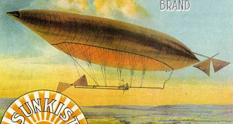
I love in general how they go to the roots of the region. Adds a very clear direction for the team in the approach/target market which I soooooo welcome. Felt like we were hanging in the air for a while. Fans can "attach" themselves way easier with the team now, even if not from the said region, like me. Feels like the team have a common theme and direction now.I love that the numbers are based on the history of the area (old school art-deco citrus advertising in Orange County). Think it's a nice touch,

I love in general how they go to the roots of the region. Adds a very clear direction for the team in the approach/target market which I soooooo welcome. Felt like we were hanging in the air for a while. Fans can "attach" themselves way easier with the team now, even if not from the said region, like me. Feels like the team have a common theme and direction now.
Do you have more info about the art deco? I have missed that. Quick googling shows indeed orange advertisings seem to be in that style. Any reason for that?
For jerseys I think home ones could be better. The black arms and black sleeves (and partially also black and white stripe on the pants) look awkward. They can be better. But the road ones are hard to beat. Only RR 2.0 beats those

