Do the Bruins Uniforms Need Fixing | HFBoards - NHL Message Board and Forum for National Hockey League

Do the Bruins Uniforms Need Fixing

smithformeragent

Moderator
Sep 22, 2005
32,557
30,272
Milford, NH
Lots of good uniform driven conversation yesterday w/ the Centennial game threads.

I've seen the Bruins go through a couple of major uniform changes in my lifetime.
  • The first came with the move to the FleetCenter and the elimination of the Gold spoked B on the black away jerseys. History books say Harry wanted one logo instead of two.
  • The next was the update to the Reebok Edge template in 2007/08 and the introduction of the serifed B.
  • Adidas Zero template in 2017 brought with it the move to black socks.
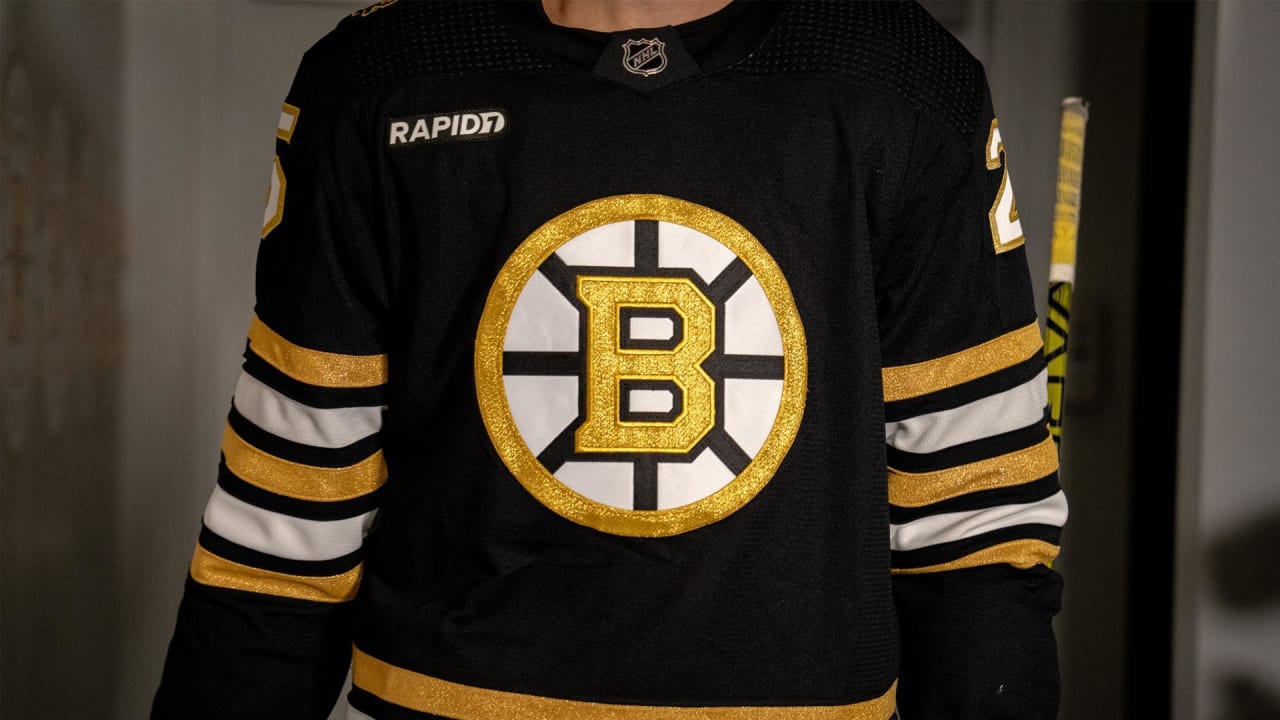
  • They wore the Centennial one-offs last season with the reintroduction of the gold B.
If I had my way, they'd basically go back to the 1980-1995 look with the gold B on the black uniforms and the gold socks.
  • It's clear that someone in charge down on Causeway is obsessed with the arm stripes matching the socks exactly.
What say you?

1733166547513.png

1733166514710.png

1733166530247.png

1733166483983.png

1733166496798.png


  • Like
Reactions: Gordoff
My favorite jersey to wear would be the Orr era.

My favorite jersey to look at is the Bruins Bear Boston alternate logo from the 2010ish era Bruins. Lots of black and just enough gold to make the jersey pop.
 
  • Like
Reactions: PatriceBergeronFan
I think they do a really good job with their 3rd jerseys and special event jerseys. The centennial game uni's were awesome and unique.

Loved the centennial season jerseys. Love the current uni's.


OT: Most overrated, uninteresting jerseys are the Neely era jerseys. I think people just like them because that's when a lot of us fell in love with this team.
 
  • Like
Reactions: sarge88 and Gordoff
My first memories are the Neely/Bourque/Oates era jerseys so I'll always have a soft spot for them and prefer that style. If I had my druthers I'd go back to the early 1990s jerseys full time. The Joe Thornton era ones were the worst of my lifetime. Our current homes are fine but I hate the road whites. Like the centennial jerseys from last year but they had too many stripes.

In general, I think they look way better with no shoulder yokes, and gold trim on the white jerseys instead of black.
 
  • Like
Reactions: Pierre Larouche
If nothing else, bring back the gold socks. But we are overdue for a major jersey refresh IMO.

I would love if they took the simplified B they used for the centennial jerseys last year and this past weekend and put that on the 80s/early 90s jersey. Would be a great modern update on a classic. The current jerseys are more or less a modernized version of the Orr-era jerseys, would make sense to do the same with the Neely/Bourque era next.
 
  • Like
Reactions: smithformeragent
There are already enough similarities with the Penguins as is.

I just don’t get the black socks.

They asked Neely about the 2016 Winter Classic uniforms and using black rather than brown, and he said “I like black”.

So not sure if he’s a factor behind the black socks that they carried over from the 08-16 alternates to the current set.

Their current homes are basically a mash up of that uniform and the previous home uniform from the Clode era.

1733174517274.png
 
  • Like
Reactions: Gordoff
My favorite jersey to wear would be the Orr era.

My favorite jersey to look at is the Bruins Bear Boston alternate logo from the 2010ish era Bruins. Lots of black and just enough gold to make the jersey pop.
They’ve worn the black version of these more recently.
1733174717405.jpeg


However, the whites are very nice as well.
1733174664859.jpeg


It’s a toss up between 70s or 80s for me.
 
I like the '60s early '70s uniforms
HATE the 1995 Thornton era uniforms
and never liked the '80s uniforms without the
shoulder panels.
loved the Gold jersey with the Spoked B
Really loved the centennial jersey that they wore
in the 100 year celebration against the Habs on
Sunday. Super Snazzy and if the 'Guins don't like
it f*** 'em because they stole our colors.
 
Interesting topic.....I can honestly say I am completely neutral....I can't remember which ones are from when, and since they are not hideous, I have no opinion...
 
  • Like
Reactions: pearljamvs5
80's to 1995 all the way! Enough of the shoulder yokes. So many teams have them. It clutters the jersey. The solid white and solid black jersey's are such a cleaner look (with the Gold rim and Black rim spoked B). And yes, bring back the gold socks and give the Penguins back their socks. I really do wonder who's running the S-Show on Causeway when it comes to the Bruins uniforms.

I still can't believe they stuck with those Fleet Center hideous jersey's for as long as they did. This was a period in Bruins hockey where I never have an interest in revisiting.

The current road whites are another cluster of Bruins nothing-ness. Black shoulder Yoke (nasty) and the arm and waist striping which represents nothing in Bruins history. They couldn't even get that right!
 
  • Like
Reactions: smithformeragent
80's to 1995 all the way! Enough of the shoulder yokes. So many teams have them. It clutters the jersey. The solid white and solid black jersey's are such a cleaner look (with the Gold rim and Black rim spoked B). And yes, bring back the gold socks and give the Penguins back their socks. I really do wonder who's running the S-Show on Causeway when it comes to the Bruins uniforms.

I still can't believe they stuck with those Fleet Center hideous jersey's for as long as they did. This was a period in Bruins hockey where I never have an interest in revisiting.

The current road whites are another cluster of Bruins nothing-ness. Black shoulder Yoke (nasty) and the arm and waist striping which represents nothing in Bruins history. They couldn't even get that right!
The black yokes instead of gold on the home whites are an aesthetic disaster and it disappoints me that the only Stanley Cup of most of our lifetimes was lifted in those jerseys.
 
As long as the home kit has yellow socks and a yellow B I don't really have an opinion on the shoulder trim. LSD bear would be a nice addition as well.

But I think I was the only one that loved the 2013 Red Sox away jerseys FWIW.
 
The Bruins change their jersey configuration more than any other original six team. I don't know why. Just leave it alone. Go back to the Neely era jerseys. They were perfect.

Habs, Blackhawks, Red Wings, Leafs have all had the same jersey for decades. Rangers had a brief period during the Torts era where they had a darker blue and statue of Liberty crest, but otherwise the same for most of their history. If it ain't broke don't fix it.
 
  • Like
Reactions: smithformeragent
I actually really liked last years jersey's (minus the cream colored ones). Had that Neely/Bourque feel to them but weren't the exact same. Those with the Reverse Retro or OG Pooh Bear would be my trio
 
The Bruins change their jersey configuration more than any other original six team. I don't know why. Just leave it alone. Go back to the Neely era jerseys. They were perfect.

Habs, Blackhawks, Red Wings, Leafs have all had the same jersey for decades. Rangers had a brief period during the Torts era where they had a darker blue and statue of Liberty crest, but otherwise the same for most of their history. If it ain't broke don't fix it.
I agree 100% with all of what you said! No other Original 6 team that moved into a new arena, changed their uniforms. The Bruins did a total make-over moving into the Fleetcenter.

It's like they didn't want to preserve any of the old Boston Garden history when they moved into new Fleetcenter.
 
As long as the home kit has yellow socks and a yellow B I don't really have an opinion on the shoulder trim. LSD bear would be a nice addition as well.

But I think I was the only one that loved the 2013 Red Sox away jerseys FWIW.
I like the Navy lettering on the aways for the Sox.

I actually prefer the pre 1992 set, or as Mazz calls them “the prison uniforms”.

1733265088976.jpeg
 

Users who are viewing this thread

Ad

Ad