Coyotes unveil new third jersey

  • Work is still on-going to rebuild the site styling and features. Please report any issues you may experience so we can look into it. Click Here for Updates
Why not both?
Because the original, more vibrant and colourful version is infinitely better?

Of course that's just my personal opinion, but the kinda crazy logo and odd striping just works so much better with the additional green and purple accents.
 
Incredibly bland for something designed by the dude who owns RHUDE. Saw some leaks of other merch in this collection that looks pretty cool though.
 
I concur with the idea that the Yotes should have a maroon alternate based on what the coyote in the logo is wearing. I think it'd look slick! A lot nicer than the league's one billionth boring wordmark jersey, anyway.
 
  • Like
Reactions: AD Skinner
Hooooly crap. I hate it when people complain and crap on every jersey that is released but good lord this is bad lol
 
Are you asking if I know what it means to be an incel? As in, what it means to truly live that experience? No. I don’t. I’m sure you could enlighten me on the subject. But I’d really rather you didn’t. I guess there are probably other forums where you can go to let all of that out. But this is hardly the place. Good luck on your journey. I hope you find what you seek.

rap-battle-supa-hot-fire.gif
 
3 points.
1. Only an idiot would pay for a Bobby Nicks burger.
2. Oilers will make the playoffs, relax.
3. That jersey is still ugly.
This jersey sucks but the other Coyotes jerseys are among the best in the NHL. Unlike these abominations:
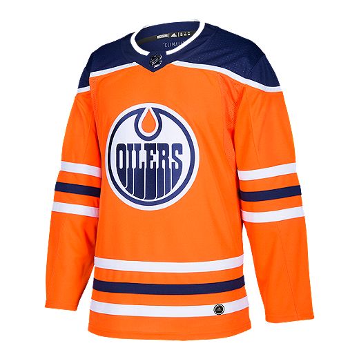
Oilers_Home_Authentic_Jersey_Blue_HR4677_01_laydown.jpg
332395998_80_a-Edmonton-Oilers-Authentic-Home-Hockey-Jersey-CA7086
ANYNAMEEDMONTONOILERSTHIRDNAVYADIDASJERSEYFRONT_878x.png


you know folks, maybe the entire case of using brick as a main color just doesn't work in hockey or sport in general.
These could have been cool with a Kachina/Kachina variant as the logo, or even better, the crescent moon logo (below). There are some great details on the jersey, especially the C and A patches.
1673976489277.png
 
Because the original, more vibrant and colourful version is infinitely better?

Of course that's just my personal opinion, but the kinda crazy logo and odd striping just works so much better with the additional green and purple accents.
You mean the purple accents that are only in the logo, which is still there, unchanged, on my red/black/sand version? :sarcasm:

A purple Kachina would also be great, FYI:

UYl0Xqv.png
 
Oh no it was leaked? People are just waiting in suspense wanting to know what it looks like. It looks pretty dreadful based on that picture.
 
It’s not bad it’s just kinda meh because of the word mark being the primary feature. It’s basically a hybrid of their brick red identity and their current aspirational identity.

I love the embrace of the desert colors, kachinas and the aesthetic promo video the organization released last year in terms of the direction they are headed but this particular uni doesn’t excite. It’s fine for a short-term third jersey though. Nothing I think worth getting worked up about.
 
Seeing the whole thing it's definitely better than expected, but still pretty meh. With a logo instead of the wordmark and a couple other tweaks this could have been great.

View attachment 637260
As I said earlier...the colour is amazing. Has a Qatar World Cup feel to it, which I absolutely loved the uniqueness of.

The jersey had so much more potential. The crescent moon patch is a nice touch. The "Arizona" remains lazy and uninspiring. They have access to some of the nicest logos in the league, and then went with this.
 
Honestly, I kind of like them. Going with a wordmark is always going to lead to criticism but this one isn't that bad. The colour is great, the striping pattern is interesting and ties in well with the Kachina jerseys. I'd like to see how they look on the ice, because it sounds like it's going to be a colour rush style uniform which isn't easy to pull off.
 

Ad

Upcoming events

Ad