Colorado 2022 Reverse Retro

Avs_19

Registered User
Jun 28, 2007
85,060
33,413
I think I kinda like it. I'd prefer if the blue was a bit lighter because some of the pics almost make it look black. Maybe it'll look better on the jersey itself.

Nothing beats the old one. Should've just brought the old one back. They probably could've made the same money with how well it'd sell.
 

LOFIN

Registered User
Sep 16, 2011
14,933
20,731
If the cowards wore these during the games, it would shoot them to #1!
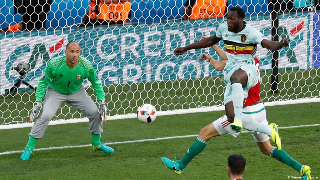
That would be awesome. Kinda reminds me of the Hungarian GK Kiraly going against the grain and wearing sweatpants instead of shorts:
19358583_101.jpg
 

Ceremony

blahem
Jun 8, 2012
113,498
16,106
Not sure where you’re getting that comparison it’s very clearly the Avs Mountain stripes
The bit at the bottom is. The sleeves look the same as the Wild jersey and the colour arrangement (albeit we've not seen it properly lit yet) makes it look even closer.

Bonus: the Devils have a Devils jersey in the same Rockies colours. Fantastic.
 
  • Like
Reactions: xigon

ASmileyFace

Landeskog Replacement
Feb 13, 2014
12,248
5,884
9,318'
Meh, not the best but not the worst
View attachment 596344
Maybe if I wasn't over Colorado Flag based merch I'd like our design more. 10 years ago I loved the Colorado flag, and would have bought this in a heartbeat. Now flag based stuff is everywhere and unoriginal. I would have loved to see them do something more creative with the yeti foot logo.
 
  • Like
Reactions: Newusername and SB

AvsFanInMichigan

“Thank you, thank you, thank you!”
Apr 16, 2018
2,336
2,494
Michigan
The bit at the bottom is. The sleeves look the same as the Wild jersey and the colour arrangement (albeit we've not seen it properly lit yet) makes it look even closer.

Bonus: the Devils have a Devils jersey in the same Rockies colours. Fantastic.
I think that’s the angle that’s making the sleeves look like that. They’re no different than the striping pattern that’s on the current jerseys. Imo they should’ve just done the original away jerseys just swapping the colors. Burgundy swapped with the blue stripe.
E7905147-1AD0-4553-B61E-E81E1099A44D.jpeg
 

Balthazar

I haven't talked to the trainers yet
Sponsor
Apr 25, 2006
50,318
53,863
I think that’s the angle that’s making the sleeves look like that. They’re no different than the striping pattern that’s on the current jerseys. Imo they should’ve just done the original away jerseys just swapping the colors. Burgundy swapped with the blue stripe. View attachment 596366
The burgundy back then was a shiny metallic red. It's not the same blend of red/purple/brown color that they use now.

Bringing back the original color alone would be great.
 

Hennessy

Ye Jacobites, by name
Dec 20, 2006
14,469
5,904
On my keister
Nothing was going to top that Nordiques retro, but these are fine. Not great, but not an abomination. Granted, the Stadium Series set grew on me and I love them, so my tastes may differ strongly to yours.
I will say I'm not a fan of the colors running down the sleeve, but I get what inspired it. Still, some bands or nothing would be preferable.
 

SirLoinOfCloth

Registered User
Apr 22, 2019
6,111
12,614
Colorado
Not sure what everyone sees in the Panthers one. It looks like a f***ing golf club for one. I literally hate that jersey, looks like someone designed it using free stickers on instagram or something.
 

Ceremony

blahem
Jun 8, 2012
113,498
16,106
Not sure what everyone sees in the Panthers one. It looks like a f***ing golf club for one. I literally hate that jersey, looks like someone designed it using free stickers on instagram or something.
The logo is also too large.

The logo also suffers from being a secondary, shoulder logo which doesn't work on the front of a jersey because it's not designed to be that big and because it's not supposed to have that much detail in it, because it's only supposed to be on the shoulder. Kind of like how both jerseys we've had with the CO flag C on it have looked stupid, and in the same way a jersey with the foot logo on the front would be.
 

henchman21

Mr. Meeseeks
Feb 24, 2012
64,298
49,400
Nothing was going to top that Nordiques retro, but these are fine. Not great, but not an abomination. Granted, the Stadium Series set grew on me and I love them, so my tastes may differ strongly to yours.
I will say I'm not a fan of the colors running down the sleeve, but I get what inspired it. Still, some bands or nothing would be preferable.
You say this like the Rocky Mountain Extreme didn't exist.
 

The Merchant

1787
Sponsor
Aug 2, 2011
19,644
30,233
El Pueblo
Absolute dogshit compared to the first RR. It's such a shame that they just shelved that design completely after one season. It was one of the best ever imo
 

Ad

Upcoming events

Ad

Ad