
I like the old one better but at least the new one is in the top 10 of the rest of the leagues reverse retroIn-the-flesh comparison, courtesy Reddit
Canucks Reverse Retro Jersey (yes, it's a gradient jersey)
- Thread starter LuckyDay
- Start date
You are using an out of date browser. It may not display this or other websites correctly.
You should upgrade or use an alternative browser.
You should upgrade or use an alternative browser.

Literally an hour ago – I assumed that's why this thread was bumped.So are we ever going to wear these?
Has a schedule or date been announced anywhere? I really want to see them in action.

I just happened to bump before the announcement. I was expecting more than 4 times and all and in a row seems weird. Hopefully there will be more.
Really looking forward to seeing this on ice.
Really looking forward to seeing this on ice.
Ringmaster
Registered User
Can we please get rid of the whale now? It’s time.
It's an Orca and NO
I like the color, but I've never liked the Orca Bay logo.
Agreed this is OK but that's about it. Loved the electric Oilers jerseys and didn't mind the grey tinged Leafs jerseys either. Usually I hate 3rd jerseys.
DustyMartellaughs
Flashing the leather.
Hockey fans are such jersey snobs (still love you guys though). If it's not one of 4 basic colors, has a logo with 40+ years of history, and doesn't follow a simple pattern then it's "ugly". These jerseys are nice. This is what an actual ugly jersey looks like:
Svencouver
Registered User
Hockey fans are such jersey snobs (still love you guys though). If it's not one of 4 basic colors, has a logo with 40+ years of history, and doesn't follow a simple pattern then it's "ugly". These jerseys are nice. This is what an actual ugly jersey looks like:
I hate you now
DustyMartellaughs
Flashing the leather.
Hockey fans are such jersey snobs (still love you guys though). If it's not one of 4 basic colors, has a logo with 40+ years of history, and doesn't follow a simple pattern then it's "ugly". These jerseys are nice. This is what an actual ugly jersey looks like:
I freakin’ LOVE this jersey!
EXTRAS
Registered User
- Jul 31, 2012
- 8,951
- 6,391
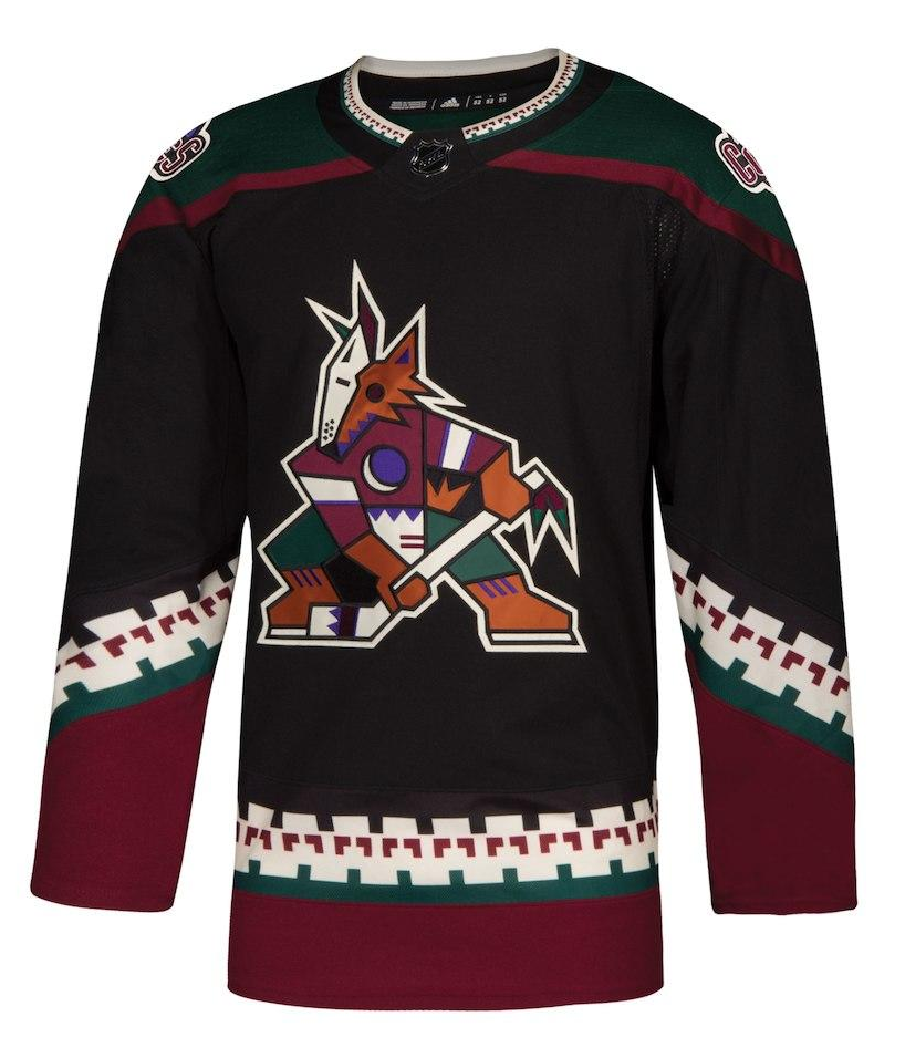
Yeah the coyotes have some pretty cool jerseys.
As for the canucks one, it isn't bad and isn't good. Just meh. I wouldn't even realize it was a new original jersey if I hadn't been told. Nothing stands out as new and interesting.
Im a white guy, but I really wish I'd have been able to grab a "year of the rat" canucks jersey...as I'm a year of the rat guy, and those ones are pretty cool for an extra jersey.
MS
1%er
The green colour that looks fine as a trim is an absolute eyesore when it's covering 60% of the jersey.
I like the color, but I've never liked the Orca Bay logo.
This. I also hate the airbrushing. I DO like the colours though.
HockeyWooot
Registered User
- Jan 28, 2020
- 2,386
- 2,631
I don’t love the jersey itself, but as a reverse retro I think it’s probably top10.
I never liked the bleeding orca all that much, I think a Blue Green White skate jersey or Flying V would have been a bolder choice.
I never liked the bleeding orca all that much, I think a Blue Green White skate jersey or Flying V would have been a bolder choice.
RussianRacket
He/Him/His Pronouns
RussianRacket
He/Him/His Pronouns
this is trueHockey fans are such jersey snobs (still love you guys though). If it's not one of 4 basic colors, has a logo with 40+ years of history, and doesn't follow a simple pattern then it's "ugly". These jerseys are nice. This is what an actual ugly jersey looks like:
imo montreal, boston, toronto, and detroit have some of the ugliest jerseys in the league.
related but different sport. pinstripes are ugly as all hell.
The Vasili Jerry
Serenity now!
This is still where it should've been. No Sprite can in sight.
ProstheticConscience
Check dein Limit
- Aug 28, 2011
- 15,975
- 26,087
MS
1%er
Well the jerseys are done. Probably never to be worn again.
These jerseys were awful but good god that’s terrible reasoning for not wearing them ever again.
Always good when superstition is driving team decisions instead of logic.
WTG
December 5th
People in sports are super superstitious. People still refer to "Canucks Luck" or they think that the Canucks are the only team to get shutout by a backup. My favorite is the idea that "the refs have it out for us" mentality. Or that Bettman is secretly rigging the lottery to benefiting teams he likes.These jerseys were awful but good god that’s terrible reasoning for not wearing them ever again.
Always good when superstition is driving team decisions instead of logic.
VanJack
Registered User
- Jul 11, 2014
- 21,653
- 18,810
Is there team in professional sports that has debuted more awful jerseys than the Canucks? The 'Flying V' still sets the standard for gaudy, amateurish professional sports jerseys three decades later. As for the latest retro jersey, it's basically 'meh' for me.Well that’s one positive so far this season.
Of course it doesn't help that the Canucks have some of their worst hockey of the season in these unies....and that's saying something considering how bad they were to start the season.
Users who are viewing this thread
Total: 1 (members: 0, guests: 1)
Latest posts
-

-
 GDT: [WCF R3 GM5] Dallas Stars vs. Edmonton Oilers – 7:00 PM CT (ESPN+/CBC) (90 Viewers)
- Latest: MBTendy
-
 GDT: WCF | V | "Project Stardust" | Oilers @ Stars | 5.29.25 | 6:00PM | SN (228 Viewers)
- Latest: GhostfaceWu
-
-
 GDT: [WCF R3 GM5] Dallas Stars vs. Edmonton Oilers – 7:00 PM CT (ESPN+/CBC) (333 Viewers)
- Latest: wunderpanda