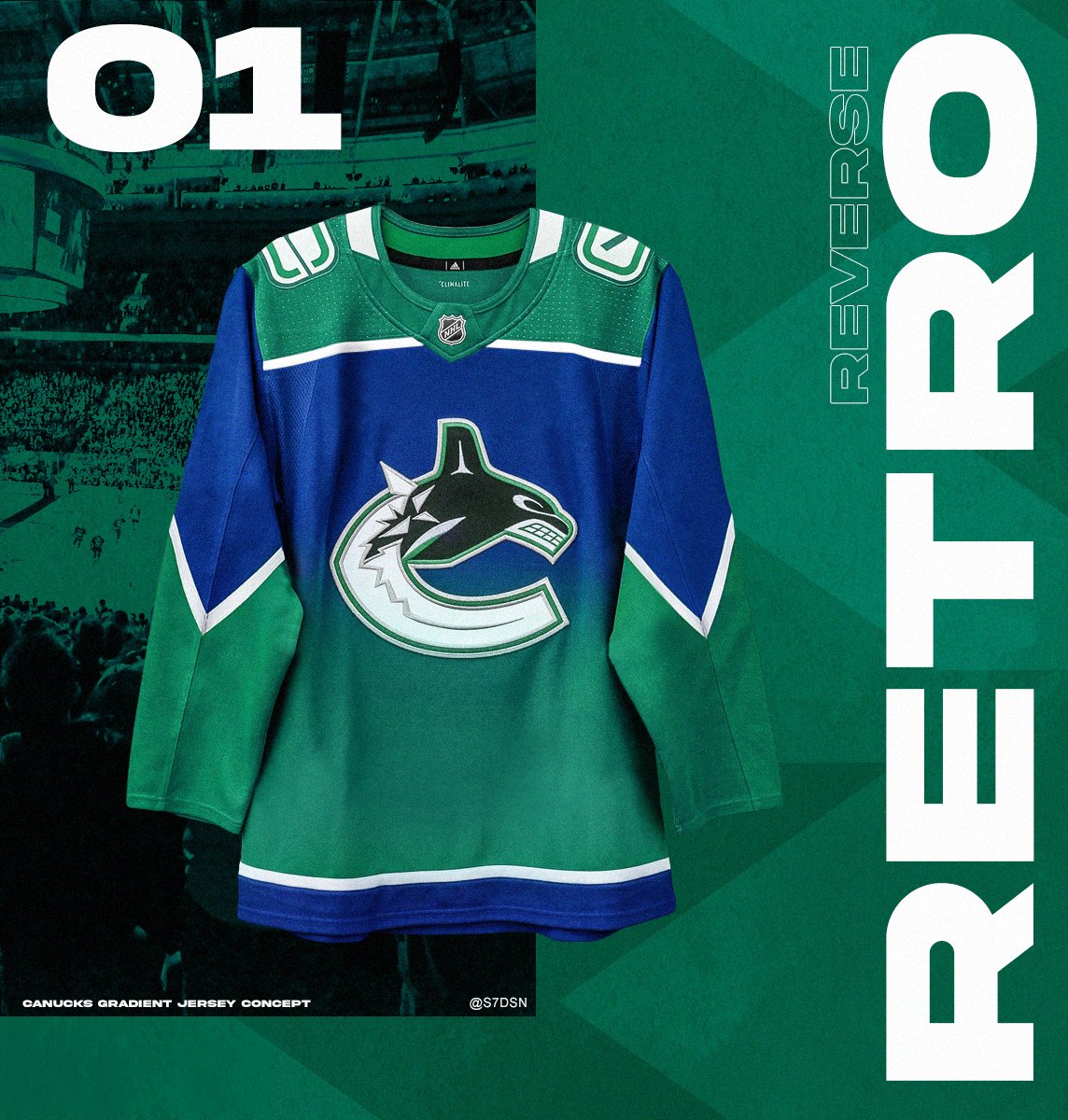
The thing that interests me about this jersey is that they changed the outline of the Orca logo from navy/dark blue to Kelly green.
This detail always bothered me ever since we changed our colour scheme to the lighter blue/kelly green colour scheme as the whale logo retained the dark blue colour scheme of the silver/dark blue era so it never quite looked like it belonged on the green/blue jersey.
I wonder how this rejiggered logo would look on our standard home/away jerseys, the green may allow it to mesh better?


")