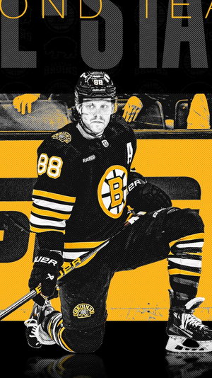
Boston Bruins Bruins announce 2024-2025 logos

  • Xenforo Cloud has scheduled an upgrade to XenForo version 2.2.16. This will take place on or shortly after the following date and time: Jul 05, 2024 at 05:00 PM (PT) There shouldn't be any downtime, as it's just a maintenance release. More info here

BigGoalBrad

Registered User
Jun 3, 2012
10,235
3,011
Perfect opportunity to go with the Centennial logos, but with athletic gold instead of Centennial gold.

Ditch the black socks and burn them in a fire, never to see the light of day again.

Swing and a miss.
100%.

I have this logo tattooed and still hate it compared to the centennial one.

Wish I could have gotten a jersey but hated the gold.

I’m a bit surprised Fanatics didn’t do much to tweak the Adidas template.

The shoulders don’t have the waffle effect, but this would have been the perfect opportunity to fix the god awful collars.

B’s don’t look too bad, but some teams like the Islanders are awful.View attachment 888114
View attachment 888115
Yuck the yellow shoulders suck what an awful regression.
 

Patdud

Registered User
Sponsor
Mar 23, 2022
1,926
2,859
New Hampshire
I’m a bit surprised Fanatics didn’t do much to tweak the Adidas template.

The shoulders don’t have the waffle effect, but this would have been the perfect opportunity to fix the god awful collars.

B’s don’t look too bad, but some teams like the Islanders are awful.
Is it just me or does this photo make them looke "Mumu" ish
 

Patdud

Registered User
Sponsor
Mar 23, 2022
1,926
2,859
New Hampshire
The bruins themselves know how great the centennial jerseys would have looked with the regular yellow, they’ve been using it in their marketing all year!
 

Attachments

  • IMG_4242.png
    IMG_4242.png
    1.2 MB · Views: 3

BB79

Registered User
Apr 30, 2011
5,322
6,311
I'm glad the shoulder dimples are gone, they made the jerseys look a little too busy. I agree that F missed a golden chance to fix the terrible looking collars. Hopefully they'll revise them in the next few years. Teams with solid color collars seem to have better looking jerseys, i.e. Sabres and Red Wings than others i.e. Rangers with go multi-color

Lastly, the Bruins really should have kept the centennial logo, just adjust the gold to the usual gold. The logo at center ice looked way better this season. Oh well
 

Gordoff

Formerly: Strafer
Jan 18, 2003
25,786
26,630
The Hub
I’m a bit surprised Fanatics didn’t do much to tweak the Adidas template.

The shoulders don’t have the waffle effect, but this would have been the perfect opportunity to fix the god awful collars.

B’s don’t look too bad, but some teams like the Islanders are awful.View attachment 888114
Wasn't the " Waffle "Effect" for ventilation? I remember that the Bruins gave the players new uniforms (can't remember the '70s). Anyway they claimed that the players would be cooler playing in hot buildings in May. Problem IIRC is that the players thought that it was a jinx have new uniforms starting in the playoffs.
 
  • Like
Reactions: smithformeragent

Ad

Upcoming events

Ad

Ad