Best NHL Jerseys of All Time

Whaleafs

“The Leafs are mulch again”
Mar 24, 2017
1,348
2,068
HFX
Probably done before but didn't see any threads active from the last quite a few years.

My top 3 no particular order:

Gretzky Kings
Last Whalers iteration
Rangers Lady Liberty
kingsblk.jpg
kingswht.jpg
whalersnvy.jpg
whalerswht.jpg
rangersnvy.jpg
rangerswht.jpg
 
Last edited:

tarheelhockey

Offside Review Specialist
Feb 12, 2010
85,931
141,386
Bojangles Parking Lot
I always found Whalers to be awesome.

Something about the name and symbol just says badass.

Back before it meant anything to me (i.e., 1996 and earlier) I remember feeling it was in the realm of the Clippers, Pacers, Islanders as ugly, un-marketable names that seemed like leftovers from another era. I never, ever heard anything about the Whalers name or logo being a classic when people talked about the NHL.

Seems there's a pretty heavy retro-filter applied to it. Just IMO.
 

pucky

Registered User
Jan 11, 2011
8,079
172
That Canucks jersey is awful....the Canucks ought to win worst jersey award....the Orca and the rink both suck.....the Johnny Canuck cartoon logo also sucks. What's wrong with Vancouver? All the drugs there or what?

I don't think they should win best jersey but the Whalers and Kings jerseys are pretty cool. The NYR ones were interesting. They should have continued to use the same striping pattern, though. The logo was good, though, as it set the uniform apart from the diagonal 'Rangers' version. The Red Wings and Islanders jerseys (posted above) are also great and shouldn't be messed with.
 

Whaleafs

“The Leafs are mulch again”
Mar 24, 2017
1,348
2,068
HFX
That Canucks jersey is awful....the Canucks ought to win worst jersey award....the Orca and the rink both suck.....the Johnny Canuck cartoon logo also sucks. What's wrong with Vancouver? All the drugs there or what?

Definitely agree about the Canucks, although the late 90's Orca one did grow on me. I didn't like it originally because it replaced the 94 style which were the best they've ever had IMO.
 

Albatros

Registered User
Aug 19, 2017
13,422
8,764
Ostsee
The late 90s were an amazing time visually, a lot of groundbreaking designs that maybe didn't please the hardcore traditionalists but really stood out and also grew on you no matter what the first reaction.

Anaheim-Ducks-Wild-Wing-Jersey.png


los-angeles-kings-wayne-gretzky.jpg


s-wendel-clark-of-the-new-york-islanders-waits-for-a-face-off-against-picture-id89080574


f7d5309e27a7f566e845d68110a3cf21--sports-uniforms-hockey-rules.jpg


season-player-teppo-numminen-of-the-phoenix-coyotes-picture-id52333453


02.05714016.jpg
 

tarheelhockey

Offside Review Specialist
Feb 12, 2010
85,931
141,386
Bojangles Parking Lot
The late 90s were an amazing time visually, a lot of groundbreaking designs that maybe didn't please the hardcore traditionalists but really stood out and also grew on you no matter what the first reaction.

None of those grew on me. They look worse in retrospect than they did then. I could kind of tolerate the St. Louis and NYI looks at the time, but I realize now how far off target they really were. It says a lot that both teams completely rebranded within 3 years... the new looks weren't growing on anyone.
 

pucky

Registered User
Jan 11, 2011
8,079
172
Definitely agree about the Canucks, although the late 90's Orca one did grow on me. I didn't like it originally because it replaced the 94 style which were the best they've ever had IMO.
But, the Orca Bay one had nothing to do with the team name whatsoever and was only stroking the ego of the previous owner. Okay, I'm joking a bit there but it was just branding by the Orca corp. before. It really made no sense on the Canucks jersey and still doesn't.

I agree with you about '94 - the Canucks skate logo and colours is the best overall jersey they've ever had even though some Nucks fans don't like them anymore and prefer their blue/green/white setup with the Orca or rink logo. The latter two are awful and the rink one looks like a kid drew it. It's rather bland and the Orca one, as mentioned, doesn't make any sense. If they want the blue/green colours so bad, they should tweak the skate logo and replace the colours - I think someone did a photoshop/mock up job of that jersey with the blue/green colours. It's better than what they currently wear now.
 
Last edited:

pucky

Registered User
Jan 11, 2011
8,079
172
None of those grew on me. They look worse in retrospect than they did then. I could kind of tolerate the St. Louis and NYI looks at the time, but I realize now how far off target they really were. It says a lot that both teams completely rebranded within 3 years... the new looks weren't growing on anyone.
Agreed. If you are talking about the above Blues jersey, they had way too much going on..... too much red and the current Blues jersey is miles better than that mess they had. I think that era was the start of designers just creating 'whatever' for new jerseys to sell. That's just my opinion and I'll stick to it. As for the Isles jersey, I'm not sure if you are referring to the 'Fishsticks' era but that was just a monstrosity. The Isles had a clever logo and nice colours (I assume they wanted to 'match' the Mets colours but whatever it was, the blue/orange was easily identified by NY hockey fans. 'Not sure why they changed it unless the reason is what I suggested previously).
 

Whaleafs

“The Leafs are mulch again”
Mar 24, 2017
1,348
2,068
HFX
The late 90s were an amazing time visually, a lot of groundbreaking designs that maybe didn't please the hardcore traditionalists but really stood out and also grew on you no matter what the first reaction.

s-wendel-clark-of-the-new-york-islanders-waits-for-a-face-off-against-picture-id89080574


02.05714016.jpg

I know I'm by far in the minority, but I always loved the Islanders fisherman. That version of the Blues is probably my #4 after the 3 in OP.
 

Albatros

Registered User
Aug 19, 2017
13,422
8,764
Ostsee
None of those grew on me. They look worse in retrospect than they did then. I could kind of tolerate the St. Louis and NYI looks at the time, but I realize now how far off target they really were. It says a lot that both teams completely rebranded within 3 years... the new looks weren't growing on anyone.

The Islanders have that classic NHL look that is not bad per se, but it is pretty bland and generic when everyone else has the same as well. As if it would be a league of the Original Thirty-One.

Saint Louis on the other hand went full boring afterwards and have remained so ever since.
 

Whaleafs

“The Leafs are mulch again”
Mar 24, 2017
1,348
2,068
HFX
But, the Orca Bay one had nothing to do with the team name whatsoever and was only stroking the ego of the previous owner. Okay, I'm joking a bit there but it was just branding by the Orca corp. before. It really made no sense on the Canucks jersey and still doesn't.

Irrelevant because how do you even represent a "Canuck" visually ? The same goes for a "Canadien" or "Yankee" etc. The name, for better or worse, leaves ambiguity to do all kinds of things with it from a rink & stick to Johnny Canuck. As opposed to a Maple Leaf or Shark which is pretty limiting for creativity.
 

VanIslander

20 years of All-Time Drafts on HfBoards
Sep 4, 2004
35,865
6,716
South Korea
First a homer pick
s-l300.jpg
Seriously?

There are several much better Wings jerseys in hockey history.

I have HATED the Wings (in the 90's) but the franchise have had some sweet knitted jerseys with strings.

That red collared, Stanley Cup clashin' jersey shouldn't make any Detrit fan's top 5, unless of course Steve Yzerman signed it or something.

Here is a waaaaaaaaaay cooler Wings jersey, and not just because Gordie's wearing it.

gordie-how-900px.jpg


I wish I could find that ol' Wings knitted jersey with the strings. It's over a half century old but I can't recall on whom I saw it and thought: "Man, I'd wear that." And I ain't no Wings fan!
 

MarkusKetterer

Shoulda got one game in
  • Like
Reactions: Killion

Boxscore

Registered User
Sponsor
Jan 22, 2007
14,588
7,631
1. Quebec Nordiques (white), early-90's
461084392.jpg


2. Philadelphia Flyers (orange), 80's-90's
Eric-Lindros-flyers.jpg


3. Calgary Flames (red), 80's
000545669.jpg
 

The Panther

Registered User
Mar 25, 2014
19,794
16,677
Tokyo, Japan
I think this is probably my favorite one, ever, in the NHL:

Montreal-Canadiens-Heritage-Home-1944-Sweater-N573_XL.jpg


It just looks so classy, clean, and uncluttered. (And I prefer the 'white' jerseys in general.)

I agree with the page 1 poster who nominated the Gretzky-Kings'-era jerseys, especially in his first two or three seasons there:

36029_01_lg.jpg


As far as the worst goes, it has to be any of the mid-to-late-90s' ones that were introduced, with the ridiculous "angled" lines on the arms and the super-complex logos (such as sampled on page one of this thread). Those were brutal. St.Louis's were particularly ugly in the mid-to-late-90s, as were most of the Ducks' ones.

I have to agree that Vancouver takes the prize as worst-jersey franchise. I don't even know how to begin to explain their ineptitude in basic graphic design. I just don't like Blue and Green in combination on sweaters (so I don't like the Whalers' ones), and the only thing worse than that was the 80s' ones, which defy description:

VCanucksRCCMV82RJB.jpg


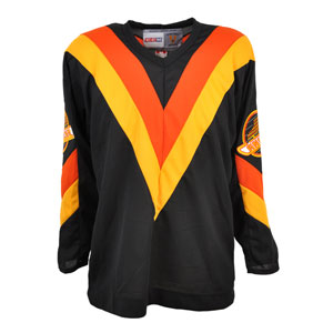
But they're all terrible:
images
s-l225.jpg
mcKGMq0inY8GZYxnIS3-umw.jpg
images


Also, why have they had so many logos, all of them bad? The 'zooming skate' I sort-of get. The orca logo is just ugly. And what's with the hockey-stick one? Is that supposed to be a 'C', or is it just a stick for no particular reason?
 

Killion

Registered User
Feb 19, 2010
36,763
3,224
meloche.jpg


howes.jpg


Original WHA Whalers (politically incorrect but hey, I like them,
love Whales too, not conflicted) & Seals a couple of my favorites
 
  • Like
Reactions: Boxscore

Ad

Upcoming events

Ad

Ad