- Jul 6, 2017
- 14,752
- 14,062
Definitely agree on that front.My biggest issue with the current Reverse Retro is that it's not "reverse" anything. It's a watered down version of an older jersey. They are so afraid to take a risk.
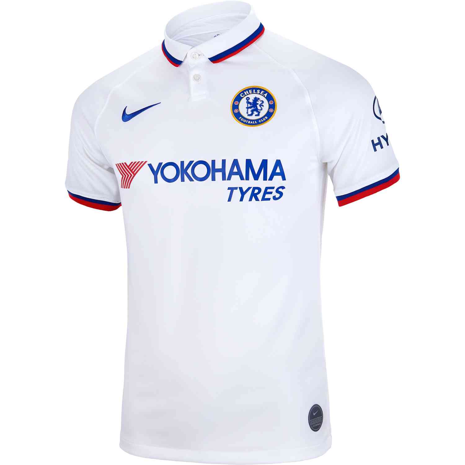
I think NHL teams could learn a lot from EPL teams when it comes to jerseys / kits. Teams keep the essence of their jerseys every year (Man U is always red and white; Chelsea is always blue; etc) — but they get creative with patterns. You’ll see zigzag patterns in muted colors underneath. You’ll see a white away jersey one year and a pink one the next and a lime one after that. It lets you explore different possibilities, bring more jerseys to market / to sell, and — let’s face it — is just fun.
Chelsea example: