
Any concept jerseys that you wish we had?
- Thread starter rangersfansince08
- Start date
-
Xenforo Cloud will be upgrading us to version 2.3.5 on March 3rd at 12 AM GMT. This version has increased stability and fixes several bugs. We expect downtime for the duration of the update. The admin team will continue to work on existing issues, templates and upgrade all necessary available addons to minimize impact of this new version. Click Here for Updates
You are using an out of date browser. It may not display this or other websites correctly.
You should upgrade or use an alternative browser.
You should upgrade or use an alternative browser.

tlk
hARry kane comeS homE

CommaSynapse
Registered User
- Nov 2, 2013
- 5,172
- 2,828
Watch them bring back something no one wants.
I loved the 2012 Winter Classic and the navy heritage jersey.
I felt very meh about the last 2018 winter classic jersey and the stadium series jersey.
I'm all for trying something new, but for RR, maybe a navy version of the 2012 Classic jersey?
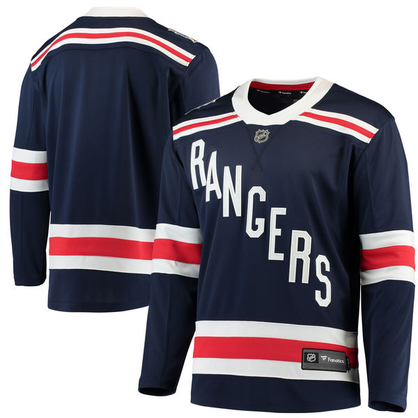
I just hope it's not the 76-78 jersey.
I loved the 2012 Winter Classic and the navy heritage jersey.
I felt very meh about the last 2018 winter classic jersey and the stadium series jersey.
I'm all for trying something new, but for RR, maybe a navy version of the 2012 Classic jersey?
I just hope it's not the 76-78 jersey.
will1066
If you score four, you better f'n win the game
- Oct 12, 2008
- 52,289
- 75,356
White Lady Liberty with white gloves and chrome blue helmets.
I'd wear a chrome blue helmet to the bodega to get lotto tickets. Sign me up!White Lady Liberty with white gloves and chrome blue helmets.
lakeshirts37
Registered User
- Jun 25, 2019
- 1,612
- 1,698
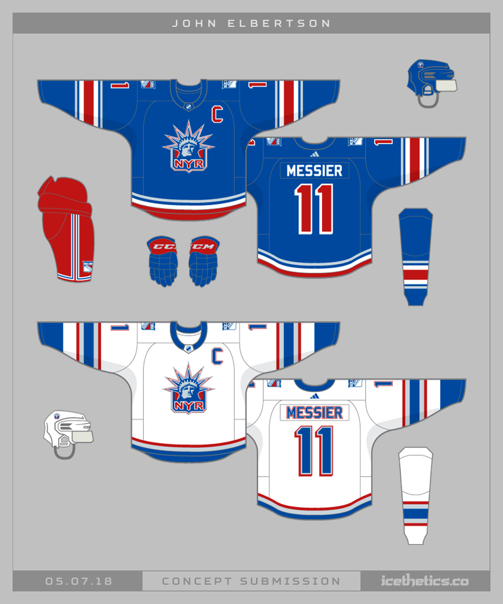
these are quite nice, but I just can’t stand the font used for NYR. feels so outdatedThis update to the Liberty jersey is so fresh. The blue one, to be clear. That red shoulder yoke... *chef's kiss*

Peltz
Registered User
- Oct 4, 2019
- 3,925
- 5,628
These were dope:

these too:
And these:

I like this too:

these too:
And these:
I like this too:
Kane One
Registered User
I would like the Navy blue Jersey style jerseys the Rangers wore in the 80s-mid 90s especially the ones with the New York letterings:

egelband
Registered User
- Sep 6, 2008
- 16,199
- 15,058
Peltz
Registered User
- Oct 4, 2019
- 3,925
- 5,628
Cmox
Registered User
Navy and cream is a cant miss combo. I might be bias though, navy is my favorite color.These were dope:
these too:
And these:
I like this too:
Machinehead
HFNYR MVP
I would love a modern/classic take on the liberty jerseys.
The logo f***s but the whole presentation is a bit 90's.
I quite like the 90's but timeless Rangers jerseys have that vintage feel.
Some ideas:


The logo f***s but the whole presentation is a bit 90's.
I quite like the 90's but timeless Rangers jerseys have that vintage feel.
Some ideas:
HockeyBasedNYC
Feeling it
The last one is my favorite Rangers jersey. I love the condensed font, deeper blue, fat stripes and the white collar ties it all together. It really enhanced the timeless look of the standard Rangers uniform.I loved our heritage jerseys. Anyone we wore for the winter classics.
I honestly can't stand Lady Liberty jerseys


I always felt like any Captain or Alternate Rangers jersey was the most balanced no matter what the design is that features the diagonal crest.
The NY shield accomplishes that balance for all of the players on the team and it is something unique that no other team has. And then they swapped the N.Y. for the A and C which was such a simple but effective idea.
Last edited:
- Jul 6, 2017
- 14,752
- 14,062
Amazing Kreiderman
Registered User
- Apr 11, 2011
- 45,070
- 40,920
Love the cream jerseys. A red Rangers jersey just seems so wrong.
Why? It's not as if it's replacing a current jersey.
If the Penguins can play in blue, the Canadiens can play in blue, the Leafs can play in green, the Canucks can play in black-red-yellow, I don't see why the Rangers can't have an alternate Jersey in red.
Unless fans are somehow upset it's too much like the Devils?
- Jul 6, 2017
- 14,752
- 14,062
Too much Habs — and I despise the Habs more than any organization. Also, and this is minor, just don’t care for them. Would rather see navy alternate.Why? It's not as if it's replacing a current jersey.
If the Penguins can play in blue, the Canadiens can play in blue, the Leafs can play in green, the Canucks can play in black-red-yellow, I don't see why the Rangers can't have an alternate Jersey in red.
Unless fans are somehow upset it's too much like the Devils?
Hitch16
Easily Triggered
Not the Ferguson 76-78 jerseys but I would like to see a jersey with the official Rangers shield as the logo.

Maybe the 2012 Winter classic with the official Ranger crest. Or a blue version (so we can wear at home)
Maybe the 2012 Winter classic with the official Ranger crest. Or a blue version (so we can wear at home)
Amazing Kreiderman
Registered User
- Apr 11, 2011
- 45,070
- 40,920
Too much Habs — and I despise the Habs more than any organization. Also, and this is minor, just don’t care for them. Would rather see navy alternate.
Isn't that just more of the same?
Would like to see some more 'out there' jerseys.
The intent isn't to replace the current home/away, so don't be bound too much by tradition. Give us something conceptually new. A new logo, new colour pairings, something other than the word 'Rangers' written in a certain direction.
The intent isn't to replace the current home/away, so don't be bound too much by tradition. Give us something conceptually new. A new logo, new colour pairings, something other than the word 'Rangers' written in a certain direction.
- Jul 6, 2017
- 14,752
- 14,062
Yes, but the current reverse retro looks dirty, because the silver looks gray. The navy jerseys with oversized “New York” in the front looks awkward.Isn't that just more of the same?
Amazing Kreiderman
Registered User
- Apr 11, 2011
- 45,070
- 40,920
Yes, but the current reverse retro looks dirty, because the silver looks gray. The navy jerseys with oversized “New York” in the front looks awkward.
My biggest issue with the current Reverse Retro is that it's not "reverse" anything. It's a watered down version of an older jersey. They are so afraid to take a risk.
Latest posts
-

-
 Speculation: Roster Building thread - Part XVII - (TDL is March 7th)
- Latest: SnowblindNYR
-
 GDT: GM 57: Caps to Oil the machine in B2B afternoon games
- Latest: Alexander the Gr8