AI Generated NHL Mascots

  • Work is still on-going to rebuild the site styling and features. Please report any issues you may experience so we can look into it. Click Here for Updates
The Habs one looks like they kidnapped the Bruins one, made it go through some traumatizing stuff, and then put on a Habs jersey on it.

And the Wild one looks like they also kidnapped the Bruins and forced it to do bath salts.

And the Rangers one just looks like they just invited the Bruins one to a bar and it got drunk.
 
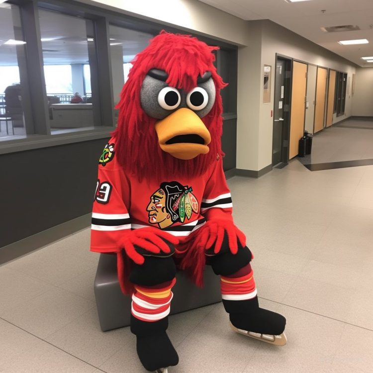
ai-reimagines-nhl-mascots-blackhawks-750x750.jpg


This guy is killing me too.
 
I hope the people who find this hilarious take some comfort in it, a fleeting memory of the time when their life had purpose and enjoyment before AI destroyed civilisation. Laugh it up while you can before it destroys you.
Well there's no playoff Photoshop threads any more around here unless I missed. That was fun.
 
We live in the end times.

Pretty f***in hilarious though. First few aren’t bad, then I scrolled to my Sabres and it got weird real quick.
 
Now that I'm finally done digesting all the funny parts, some of these designs do rip @Machinehead. That Stars jersey was hot, I kind of love the Buffalo jersey from what I can see (I know it's wild but I think there's something kind of cool about the patch detail essentially being the size of the whole shoulder yoke) but obviously the crest is a huge wildcard.

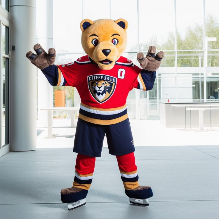
This Panthers logo is pretty cool too:
ai-reimagines-nhl-mascots-panthers-750x750.jpg


Chemo Gritty's nice clean orange set is kind of nice too, and even though it's extravagant and dumb I think you could simplify the Senators jersey a little and come up with something that's at least unique and interesting.

Chemo gritty LMAO
 
  • Like
Reactions: HTFN
Saw the Anaheim one first of course and thought "ok that's not awful...I could see it working alright..." then I saw the rest lol. Yikes.
 
Can you believe that the AI took the CBJ's canon, turned it into a penis (I guess it saw BJ in CBJ), put a large mustache on it and put it in a wheelchair and named it Boomer??? Freaking hilarious!!! Machines are so dumb.

1683769837024.png


I have just been informed that this was an actual CBJ mascot that lasted about 2 weeks. Damn those were dark days.
 
VGK came out way too good and looks so out of place because of it lmao.

These are hilarious. Honestly got a really good laugh out of this. The eyes on the Buffalo Sabres mascot are unnecessarily creepy though.
 
  • Like
Reactions: TheDawnOfANewTage
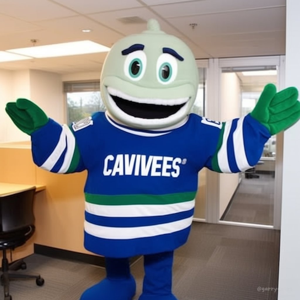
Rangers have the worst, Islanders have the best along with the Canucks.

Flyers looks like someone either shaved gritty or pomaded down his fur.


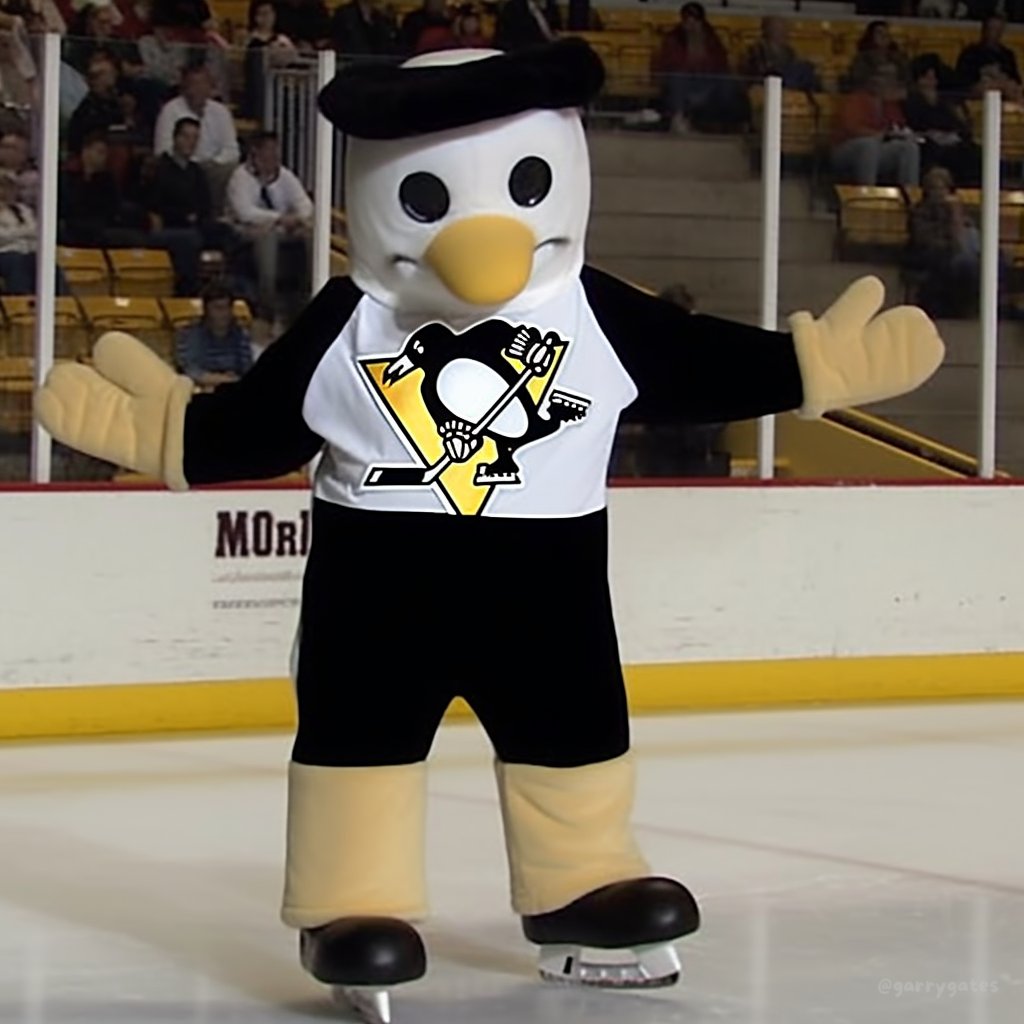
Oh and, uncanny!

ai-reimagines-nhl-mascots-penguins.jpg

jimdwightofficeprank.jpg
 
St Louis’s mascot looks like evil Thomas the tank engine.
 

Ad

Upcoming events

Ad