Uncle Bill
Know it all
- Sep 21, 2011
- 770
- 327
Dallas needs a redo, Get away from that Dallas logo, Jerseys arent bad, But other ones were better..
I love the Dallas green uniforms. Classic, clean. Beauty!
Dallas needs a redo, Get away from that Dallas logo, Jerseys arent bad, But other ones were better..
I disagree, I like the new jerseys better. To me they are much more modern and sleek looking. I don't hate the old jerseys by any means, but I prefer the new. (And yes I am old and was around for the Jets 1.0)
I don't really like it. Light blue on black is meh.
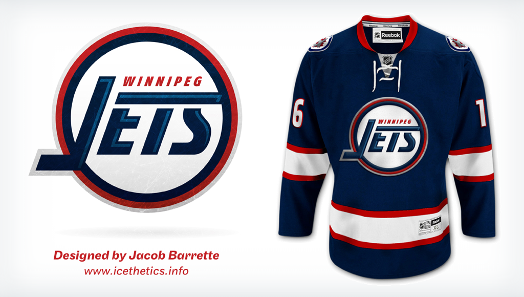
Now something based around this needs to happen.


I have a black Jets jersey like this one that looks a lot like your concept that I got for next to nothing:

Personally I don't like either one but that's JMO
I don't really like it. Light blue on black is meh.
Now something based around this needs to happen.

I don't really like it. Light blue on black is meh.
Now something based around this needs to happen.

I don't really like it. Light blue on black is meh.
Now something based around this needs to happen.

Haha thanks! People were very split on this concept when I premiered it on Icethetics, but since then, everytime it comes up it gets positive feedback
It's nice cause it honours the past, but it's new. Something like this would be a great choice for a 3rd.
Those are great
