24giovanni
Registered User
- Aug 2, 2005
- 2,059
- 508
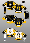
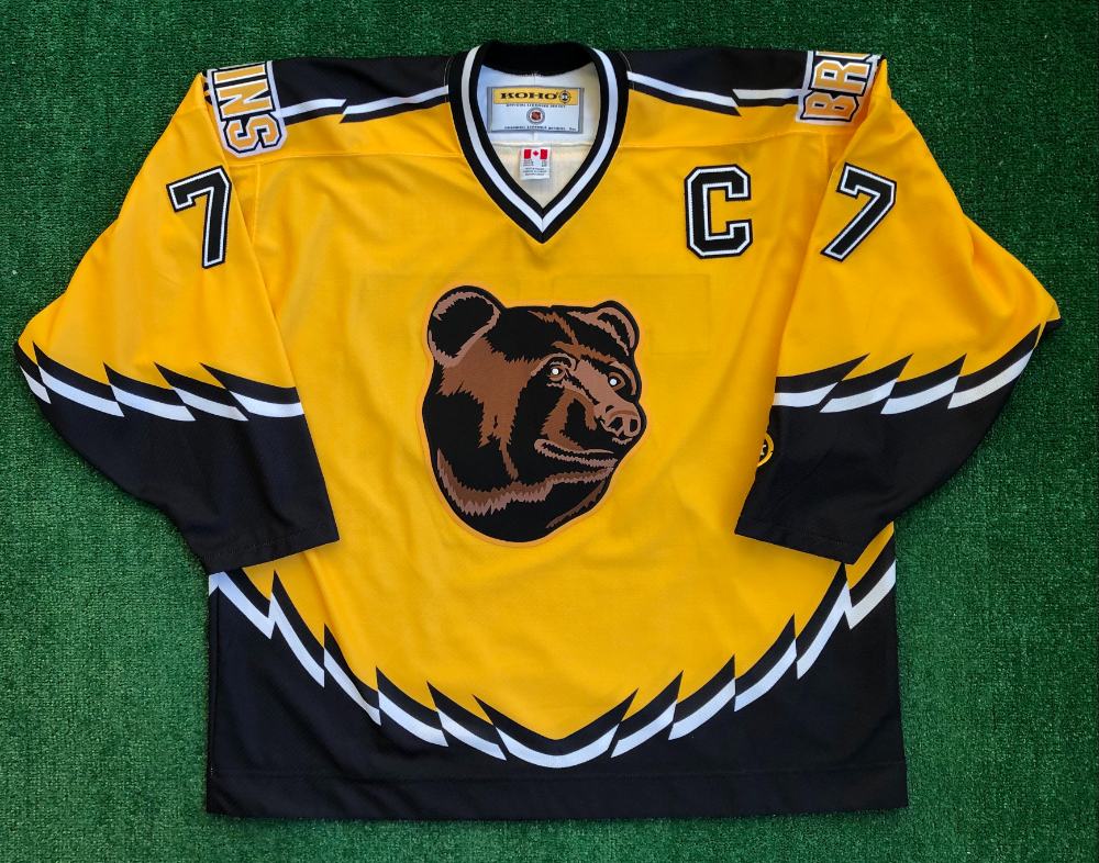
Check out this thread and tell me what uniform you like the best please?

 985thesportshub.com
I like the 70's throwback the best.
Bruins to introduce three new jerseys for 2023-24 season
The Bruins are going to roll out three new jerseys for the 2023-24 NHL season.
985thesportshub.com
I like the 70's throwback the best.