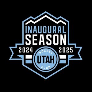
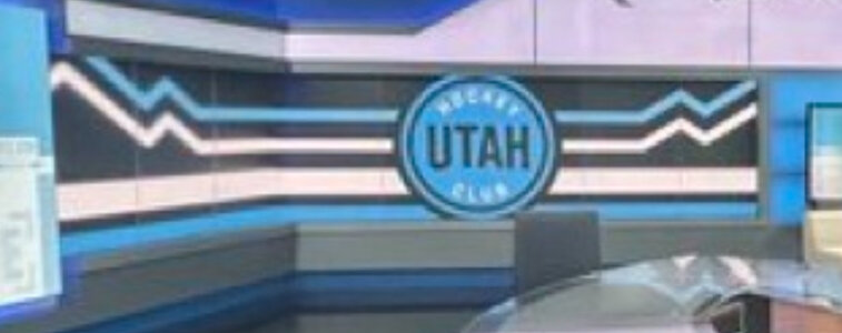
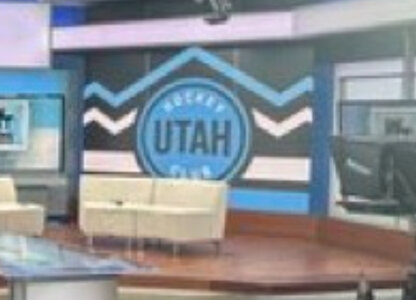
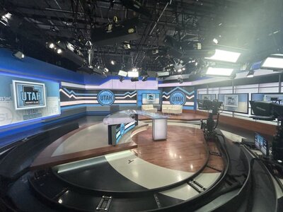
Uniform full shot

  • PLEASE check any bookmark on all devices. IF you see a link pointing to mandatory.com DELETE it Please use this URL https://forums.hfboards.com/

Llewzaher

Registered User
Aug 2, 2005
4,505
2,114
North America
1725468896417.png
 

rt

Clean Hits on Substack
I am sorry but these are not great...
I like the colors a lot. And I generally like Doubleday & Cartwright’s sports branding portfolio for the most part. So assuming the colors are permanent, I have high hopes for the final kits.

I can’t say I really care too much about the one season placeholders. They’re fine. Better to have this very plain and obviously temporary look for a season than to rush into something crappy.
 

Canis Latrans

Registered User
Jan 19, 2015
1,269
983
Australia
Colors are good, don't mind the stripes on the socks and armbands much, but it's plain when it's the highlight against the boring wordmark. I figure once they have more to the uniform, they'll be an accent piece and it won't matter. Too much solid color for me. Also, no design elements yet.

It's really a color placeholder and that's about it.
 

DustyDangler

Registered User
Dec 20, 2023
1,293
2,119
The colors are too soft
Black symbolizes emptiness
So generic

What you going to expect from
THE UTAH YOKELS?

Doan for the Calder
First, Johnny Cash did not symbolize emptiness.

Second, the black flag in American history signified no quarter given. As in, no mercy will be rendered to NHL clubs when they face the Utah 6'4"+ monsters skating at high speed.

Also, Johnny Cash.
 

Schemp

Registered User
Nov 12, 2018
4,281
2,733
Still stuck in Forum 40
Well Johnny Vas
First, Johnny Cash did not symbolize emptiness.

Second, the black flag in American history signified no quarter given. As in, no mercy will be rendered to NHL clubs when they face the Utah 6'4"+ monsters skating at high speed.

Also, Johnny Cash.
Well Johnny Cash did have a gig at Folsom Prison and sang about some guy name Sue... and June was much greater than being his best half, at least seven eights if not more!
 
  • Like
Reactions: VaCaps Fan

Heldig

Registered User
Apr 12, 2002
17,466
11,125
BC
Would prefer the map of Utah logo. And I agree with @TheLegend the font is too large.

The pants and gloves need some colour as well. Even if they added the map logo on the side of the pants and some blue striping on the gloves...
 

rt

Clean Hits on Substack
Looks like a knockoff of the current Jets jerseys.
In the way that it looks completely different and not at all similar in any way? Great point.

Would prefer the map of Utah logo. And I agree with @TheLegend the font is too large.

The pants and gloves need some colour as well. Even if they added the map logo on the side of the pants and some blue striping on the gloves...
I’m hoping they use the mountains as trim on the waist and sleeves next year.
 

Attachments

  • IMG_2100.jpeg
    IMG_2100.jpeg
    63.2 KB · Views: 2
  • IMG_2101.jpeg
    IMG_2101.jpeg
    111.3 KB · Views: 2
  • IMG_2386.jpeg
    IMG_2386.jpeg
    391.6 KB · Views: 2
  • IMG_2385.jpeg
    IMG_2385.jpeg
    633.2 KB · Views: 3
  • IMG_2384.jpeg
    IMG_2384.jpeg
    189.7 KB · Views: 3
  • Like
Reactions: Arizonatah Coyetis

Ad

Upcoming events

Ad

Ad