Yeah I am not a fan .. I also think the word Utah is too big .. I do t mind the colours , but they just don’t seem to stack up against the NHL jerseys ..
Thankfully it’s only 1 year… they may grow on me as Insee them more..
I like the colors a lot. And I generally like Doubleday & Cartwright’s sports branding portfolio for the most part. So assuming the colors are permanent, I have high hopes for the final kits.
I can’t say I really care too much about the one season placeholders. They’re fine. Better to have this very plain and obviously temporary look for a season than to rush into something crappy.
I like the uni, just don't care for the logo. Put just about anything but UTAH on the front and it instantly gets cooler. Don't think I'd be disappointed if all they do is put the new logo on it once it's developed.
Colors are good, don't mind the stripes on the socks and armbands much, but it's plain when it's the highlight against the boring wordmark. I figure once they have more to the uniform, they'll be an accent piece and it won't matter. Too much solid color for me. Also, no design elements yet.
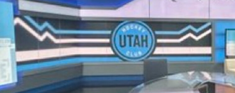
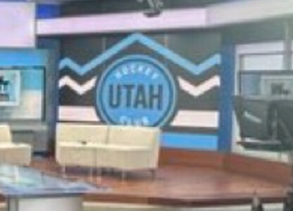
It's really a color placeholder and that's about it.
Second, the black flag in American history signified no quarter given. As in, no mercy will be rendered to NHL clubs when they face the Utah 6'4"+ monsters skating at high speed.
Second, the black flag in American history signified no quarter given. As in, no mercy will be rendered to NHL clubs when they face the Utah 6'4"+ monsters skating at high speed.
Well Johnny Cash did have a gig at Folsom Prison and sang about some guy name Sue... and June was much greater than being his best half, at least seven eights if not more!
This site uses cookies to help personalise content, tailor your experience and to keep you logged in if you register.
By continuing to use this site, you are consenting to our use of cookies.


 Preliminary Final Port Adelaide Power vs Sydney Swans - SCG, SydneyWagers: 1Staked: $500.00Event closes