The wild have I think the best looking jersey.

  • Xenforo Cloud will be upgrading us to version 2.3.5 on March 3rd at 12 AM GMT. This version has increased stability and fixes several bugs. We expect downtime for the duration of the update. The admin team will continue to work on existing issues, templates and upgrade all necessary available addons to minimize impact of this new version. Click Here for Updates
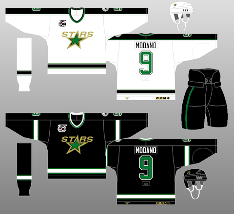
It’s a shame they couldn’t keep the “North Stars” name and the OG logo; something about the new logo in green/yellow is a bit off.

A little black might have been a nice touch but that might bring them too close to Dallas’ colors for their liking.

Pics for reference:

Wild
IMG_6921.jpeg


North Stars
IMG_6922.jpeg
 
  • Like
Reactions: BTO
Not sure if tonight’s game is the jersey they always use but it’s a beautiful jersey. Absolutely love them. Really brings the nostalgia back of the North stars.

I pretty much said this to my parents last weekend, as I watched the VOD of TBL - MIN game. I also educated them on the intricacies of the Wild logo. :thumbu:
 
  • Like
Reactions: Marlowe Syn
Eat fresh
Ah yes. The Minnesota eat fresh, sponsored by Subway.
:rolleyes:

Yeah, because corporations definitely own colour schemes like.... green and gold :facepalm:

Using a colour scheme that a corporation also uses means the jerseys and logo are bad, automatically... right? New York Pepsis, am I doing this right?? :laugh:
But name one throwback that isn't a winner?
I do think the 80s and 90s were a very good time for jersey designs in general, but there are always some exceptions:

MapleLeafs33.png
Kings18.png
NorthStars18.png
Lightning01.png


Not to mention a risk of the leagues' teams' looks becoming too similar and stale:

Jets12.png
Devils08.png

Blues16.png
BlueJackets01.png


But to answer your question:

Blues18.png
Islanders16.png

Flames12.png
Sabres18.png

Predators01.png
Sharks06.png


These all need to be left behind for good, in my opinion :help:
 
Seattle’s home jersey is damn beautiful. Calgary’s third jersey that they wore when Carolina played them this year was amazing as well.
 
Vancouver and Calgary black alternates give the Minnesota alternates a run for the money. All three kick ass. The Minnesota ones are exceptional. Everything about them, including the numbers, really pop.
 
I have always loved the Wild logo. The sweaters themselves have been at best a mixed bag at best.

As an old school fan, the North Stars are near and dear. So I appreciate the nostalgia involved, and I do like them, but these sweaters never pulled at my purchase strings. I got a North Star Broten road jersey already.

If the Wild want to continue the nostalgia train in the near future, thinking a Minnesota Fighting Wild alt jersey. Although I actually like to see some more original design alts in the future personally.
 
Home jersey still looks like ass, the 3rd and away shirts are cool.
 
The Wild's 3rd greens are fantastic. More teams need some cooler colour combos. I like the forest green homes too.

Too many royal blue uniforms. And please, NO MORE black primaries. Awful. Boring.
 
I have always loved the Wild logo. The sweaters themselves have been at best a mixed bag at best.

As an old school fan, the North Stars are near and dear. So I appreciate the nostalgia involved, and I do like them, but these sweaters never pulled at my purchase strings. I got a North Star Broten road jersey already.

If the Wild want to continue the nostalgia train in the near future, thinking a Minnesota Fighting Wild alt jersey. Although I actually like to see some more original design alts in the future personally.
I loosened my purse strings for the green reverse retro the day it was announced, love it and needed a replacement for my yellowing North Stars jersey.

I also think it would be cool to see some more original designs, although if they did a throwback to the MN Moose and pulled out a purple and black jersey, I would be all over it. I wish the MN PWHL team would have taken advantage of that history and the fact that they have purple, but not a fan of what they came up with sadly.
 
  • Like
Reactions: Marlowe Syn
:rolleyes:

Yeah, because corporations definitely own colour schemes like.... green and gold :facepalm:

Using a colour scheme that a corporation also uses means the jerseys and logo are bad, automatically... right? New York Pepsis, am I doing this right?? :laugh:

I do think the 80s and 90s were a very good time for jersey designs in general, but there are always some exceptions:

MapleLeafs33.png
Kings18.png
NorthStars18.png
Lightning01.png


Not to mention a risk of the leagues' teams' looks becoming too similar and stale:

Jets12.png
Devils08.png

Blues16.png
BlueJackets01.png


But to answer your question:

Blues18.png
Islanders16.png

Flames12.png
Sabres18.png

Predators01.png
Sharks06.png


These all need to be left behind for good, in my opinion :help:

Bro, if you like them, go ahead and like them.

For me, the first thing that comes to mind is subway when I look at these uniforms. Nothing can be done to get that out of my mind. I never said anything about a corporate colour scheme or whether it's a bad thing. Just said it looks alot like subway, and I was just trying to have some fun with it.

Lighten up.
All good. It's more that SO MANY people make those Subway comparisons, seemingly as if to critique the jerseys as though they don't look good, not your comment specifically - just kinda touches a nerve with me :laugh:

I mean, most nice colour schemes in sports are going to be used by major companies as well, because well... they look good!
 
Green is underrated and underutilized in hockey.

The Everett Silvertips had the best jerseys/uniforms I think In 2019

hq720.jpg
I disagree. Only 2/3 of the league using blue and white/blue and red/blue and blue/black isn’t enough. I was so happy when the Utah team picked the unused Jets prototype
 
  • Like
Reactions: Stive Morgan
As far as Minnesota goes I really think their 1969 - 1972 were the best. Clean, classic design that gave them a very Original Six vibe that well represents a very long and old hockey tradition in the state.

1000066110.png
 
I've always had a soft spot for the Wild jerseys. Another one that I feel was pretty underrated was the Rangers navy blue & cream 3rd jersey from 2010-17. Just a good, classic-looking jersey
 

Ad

Upcoming events

Ad