The apron jersey trend

  • PLEASE check any bookmark on all devices. IF you see a link pointing to mandatory.com DELETE it Please use this URL https://forums.hfboards.com/

senseimike

Registered User
Dec 6, 2015
104
36
Any of you guys know what the thinking was behind the jersey design feature of a few years ago where a bunch of teams looked like their jersey was an apron?

What was the rationale for such a striking (and weird IMO) design choice? And why did only some teams have it and not others?
 
  • Haha
Reactions: EdJovanovski

Lt Dan

F*** your ice cream!
Sep 13, 2018
11,779
19,760
Bayou La Batre
youtu.be
5d14fec33da62.image.jpg
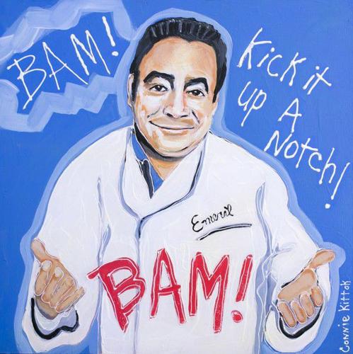
So they can kick it up a notch. Bam!
 

Ceremony

blahem
Jun 8, 2012
113,969
16,774
Because Reebok designed them that way. Here are some blogposts I found after a quick search:
 

usahockey22flyers

2 years away from being 2 years away
Nov 9, 2009
6,236
2,778
Philly
I might be alone but I really enjoyed the Reebok 2007-2008 -> jerseys. I think it was called Reebok Edge? Loved the Flyers jerseys
 

Ad

Upcoming events

Ad

Ad