The apron jersey trend

senseimike

Registered User
Dec 6, 2015
106
38
Any of you guys know what the thinking was behind the jersey design feature of a few years ago where a bunch of teams looked like their jersey was an apron?

What was the rationale for such a striking (and weird IMO) design choice? And why did only some teams have it and not others?
 
  • Haha
Reactions: EdJovanovski

Lt Dan

F*** your ice cream!
Sep 13, 2018
12,082
20,511
Bayou La Batre
youtu.be
5d14fec33da62.image.jpg


So they can kick it up a notch. Bam!
 
Last edited:

Ceremony

How I choose to feel is how I am
Jun 8, 2012
114,244
17,262
Because Reebok designed them that way. Here are some blogposts I found after a quick search:
 

usahockey22flyers

2 years away from being 2 years away
Nov 9, 2009
6,360
2,906
Philly
I might be alone but I really enjoyed the Reebok 2007-2008 -> jerseys. I think it was called Reebok Edge? Loved the Flyers jerseys
 

Golden_Jet

Registered User
Sep 21, 2005
26,072
13,472
Any of you guys know what the thinking was behind the jersey design feature of a few years ago where a bunch of teams looked like their jersey was an apron?

What was the rationale for such a striking (and weird IMO) design choice? And why did only some teams have it and not others?
Do you have an example or 2 with pic.
 

Toby91ca

Registered User
Oct 17, 2022
2,538
1,861
Any of you guys know what the thinking was behind the jersey design feature of a few years ago where a bunch of teams looked like their jersey was an apron?

What was the rationale for such a striking (and weird IMO) design choice? And why did only some teams have it and not others?
I honestly have no idea what you are talking about....aprons?
 

tarheelhockey

Offside Review Specialist
Feb 12, 2010
86,615
143,965
Bojangles Parking Lot
I honestly have no idea what you are talking about....aprons?

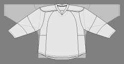
He’s talking about the Reebok Edge jersey template that had seams along the sides of the torso, that a lot of teams highlighted as piping.

image-asset.jpeg


IMO, these designs were hot burning garbage that violated basic principles of what a hockey jersey looks like. I was hoping they would at least age well but they have not.
 

KirkAlbuquerque

#WeNeverGetAGoodCoach
Mar 12, 2014
36,251
43,237
New York
He’s talking about the Reebok Edge jersey template that had seams along the sides of the torso, that a lot of teams highlighted as piping.

image-asset.jpeg


IMO, these designs were hot burning garbage that violated basic principles of what a hockey jersey looks like. I was hoping they would at least age well but they have not.
Straight up horrible design.
 
  • Like
Reactions: tarheelhockey

Rebels57

HFBoards Sponsor
Sponsor
Sep 28, 2014
78,084
125,499
These were horrendous. Didn't Calgary keep their Edge design like 5 years longer than everyone else too?
 
  • Like
Reactions: piqued

Weztex

Registered User
Feb 6, 2006
3,137
3,833
Ugliest era of jerseys ever. Reebok tried to outdo things and leave their mark by completely pissing on the traditional aesthetic of the game.

Now that the Ducks have moved on, the Caps are the only team that still have some kind of vertical design going on. Couple that with a wordmark instead of an actual logo and to me they have the worst jersey in the league. Unfortunately , career will always keep those in the collective memory.
 

Figgy44

A toast of purple gato for the memories
Dec 15, 2014
13,888
9,202
He’s talking about the Reebok Edge jersey template that had seams along the sides of the torso, that a lot of teams highlighted as piping.

image-asset.jpeg


IMO, these designs were hot burning garbage that violated basic principles of what a hockey jersey looks like. I was hoping they would at least age well but they have not.

Wait.. that design wasn't to try and create an illusion of a slimmer bodied player? They always looked a little weird to me, but I assumed it was some ridiculously poor attempt as a slim fit illusion because the team colors on the arms were too wide. Hockey jerseys are sweaters. Enter too far into the slim fit range and you're getting into cardigans or something. It looks weird.

I legit thought for a time that those were slim fit designs inspired by a tuxedo t-shirt or something.

These were horrendous. Didn't Calgary keep their Edge design like 5 years longer than everyone else too?

Maybe? But I think that might be due to the fact that Calgary's design didn't have as many noticeable lines on the front of the torso of the jersey. I think those lines were tucked to the side a bit more. The fact we had jersey laces for way too damn long annoyed me though.
 

IceManCat

#StanleyCupChampions2024🏆
Jul 13, 2006
6,389
3,097
The Rat Den
Pajama jersey is referring to the jerseys without a stripe on the bottom hem. This gave them a "floating" look. I believe the New Jersey Devils are the only and last team to still have this styling.

september-30-2014-san-jose-sharks-defenseman-taylor-doherty-77-in-action-during-the-nhl-hockey-game-between-the-los-angeles-kings-and-the-san-jose-sharks-at-the-sap-center-in-san-jose-ca-the-kings-defeated-the-sharks-4-1-damon-tarvercal-sport-media-cal-sport-media-via-ap-images-2P459MR.jpg


BNG-L-SHARKS-0516-311.jpg


940427948.jpg.0.jpg


2010-11-st-louis-blues-graham-mink-number-52-game-issued-white-jersey-dp12299_ss2_p-13455611+pv-2+u-obvtid1pnxyz9ybiplop+v-jsamtvbqylleyaibrksv.jpg


Taylor Hall Scores His First NHL Goal - The Hockey Writers - - NHL News,  Analysis & More
 
  • Like
Reactions: Hisch13r

tarheelhockey

Offside Review Specialist
Feb 12, 2010
86,615
143,965
Bojangles Parking Lot
Wait.. that design wasn't to try and create an illusion of a slimmer bodied player? They always looked a little weird to me, but I assumed it was some ridiculously poor attempt as a slim fit illusion because the team colors on the arms were too wide. Hockey jerseys are sweaters. Enter too far into the slim fit range and you're getting into cardigans or something. It looks weird.

I legit thought for a time that those were slim fit designs inspired by a tuxedo t-shirt or something.

This is pulling from old memory so I may have some details wrong, but:

I believe the design actually started with the athletic purpose of the jersey, and the determination that a traditional hockey sweater’s seams weren’t ideal for athletic movement. If you look at where the seams go in the Edge template, they’re in ergonomic places to accommodate the twisting and stretching that happens during a hockey game.

Edge.png


That template in and of itself created issues, because traditional hockey jerseys usually have straight lines over the shoulders (either that, or no lines at all). So for example, St Louis relied heavily on the visual effect of straight lines running from collar to shoulder, and this was no longer practical from a production standpoint:


517ed22bfc25620fba159c7e86aab4b8.jpg


So that production problem got passed along to the design teams for a solution, which is where things really went off the rails. Having been given license to follow the new template, they set about the creation of a new visual profile for the NHL. Of course this was basically a license to force new jersey sales leaguewide, so it’s not like the league was pushing back on them.

So from the jersey above, you get the Edge-ified Blues:

47f395f8fa88c0b8868f95af68ad3a09.jpg


Of course, they made up some marketing BS about this being a tribute to the Arch, but it was a straightforward matter of needing the shoulder stripes to follow the curving seams near the collar.

BUT, it got even dumber. Because again — production problem without a good design solution. Look at Oshie’s jersey above, if he gains the captaincy where do you put a letter?

Well…

akjflakf.png


So from what started as a simple matter of trying to make the jerseys less bulky and restrictive, we ended up in the theater of the absurd from a design standpoint. Nobody in their right mind would deliberately set out to create the visual mess you see in that last picture, but the train had left the station from an engineering standpoint.

Some teams had it a lot worse than others. Florida went from this:

olli-jokinen.jpg


To this:

image-asset.jpeg


And Calgary went from this:

detroit-goaltender-miikka-kiprusoff-of-the-calgary-flames-defends-his-net-against-the-detroit.jpg


To this:

calgary-flames-goaltender-henrik-karlsson-takes-a-break-during-the-second-period-of-the.jpg


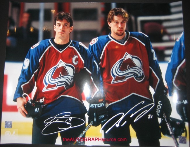
And maybe the worst of all, poor Colorado going from this:

2295_c.jpg


To this:

colorado-avalanche-rookie-center-matt-duchene-warms-up-before-facing-the-vancouver-canucks-in-the-first-period-of-an-nhl-hockey-game-in-denver-on-tuesday-march-9-2010-ap-photodavid-zalubowski-2NE4262.jpg


So in short, they came up with a solution for something that wasn’t really a problem… painted themselves into a corner where form and function could no longer co-exist… and ended up torching the visual identity of the league for a while.
 

cptjeff

Reprehensible User
Sep 18, 2008
21,791
39,215
Washington, DC.
Ugliest era of jerseys ever. Reebok tried to outdo things and leave their mark by completely pissing on the traditional aesthetic of the game.

Now that the Ducks have moved on, the Caps are the only team that still have some kind of vertical design going on. Couple that with a wordmark instead of an actual logo and to me they have the worst jersey in the league. Unfortunately , career will always keep those in the collective memory.
I actually think that Caps design was one of the few (hell, only) jerseys where that approach worked. And the wordmark is a variation on their original logo, and it's not like wordmarks have ever been foreign to hockey jerseys. The sleeve elements are coherent, there's still a stripe at the bottom to define the jersey, I've always liked it. Though the Adidas template really hurt it.

If that's the worst jersey in the league right now (though to me, that's the Devils- they took a perfectly proportioned jersey and ruined it), that means the league is in a really good place visually right now.
 

Figgy44

A toast of purple gato for the memories
Dec 15, 2014
13,888
9,202
I wonder why the other teams jersey seams are vertical but Calgary's seams are all ¯\_(ツ)_/¯ in comparison.
 

Ad

Upcoming events

Ad

Ad