
wunderpanda
Registered User
- Apr 9, 2012
- 5,618
- 820
Yup looked like clip artYep, all the names aren't good. They can make up for it, if the logo is good, but whatever those preliminary ones were weren't good enough
It's going to be Mammoth, which is fine...still holding out hope for a new team back in AZ called the "Arizona Outlaws".Oopsie…….
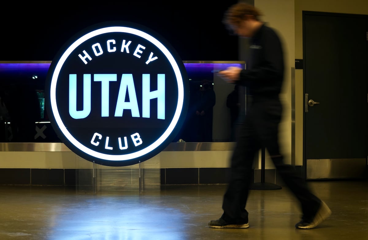
Utah Hockey Club may have just accidentally leaked its new name
Utah Hockey Club's YouTube handle briefly changed before the page was deleted, causing a stir on social media.www.sltrib.com

Sorry man….. “Utah Mangosteens” didn’t make the cut.

I like how the logo pulls Utah into the logo. Depends on how the rest of the uniform looks^Too cartoony
well shit...didn't see the pic above. Welp, that sucks, not enough colorIt's going to be Mammoth, which is fine...still holding out hope for a new team back in AZ called the "Arizona Outlaws".
If that's the real logo, I'm fine with it. Wish it had some more "hidden" stuff than just a mountain, like the Wild's for example. Maybe there is and I'm just not privy?
Logo looks ready to be slapped on the current jersey without any other changes. Wonder if a logo replacement is all that's planned.
Edit: Not a fan if the font they used.
I doubt that’s the logo … isn’t that what they had for the vote?If that's the real logo, I'm fine with it. Wish it had some more "hidden" stuff than just a mountain, like the Wild's for example. Maybe there is and I'm just not privy?
Logo looks ready to be slapped on the current jersey without any other changes. Wonder if a logo replacement is all that's planned.
Edit: Not a fan if the font they used.
The logo is a fan-based adaptation from what fans voted on. The Utah text is the logo for a Utah hockey podcast.
I think the below is pretty close to the final logo, and what was voted on.
If you want to incorporate mountains, just keep it simple and put them on a shoulder patch.


