
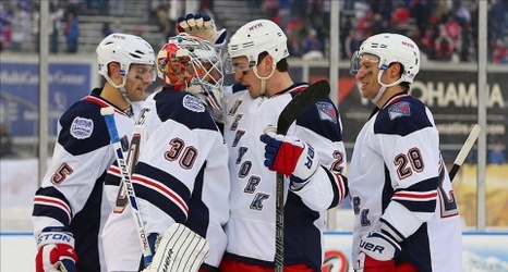
Confirmed with Link: Rangers Reveal Liberty Jersey (and somehow mess it up)
- Thread starter EdJovanovski
- Start date
-
Xenforo Cloud will be upgrading us to version 2.3.5 on March 3rd at 12 AM GMT. This version has increased stability and fixes several bugs. We expect downtime for the duration of the update. The admin team will continue to work on existing issues, templates and upgrade all necessary available addons to minimize impact of this new version. Click Here for Updates
You are using an out of date browser. It may not display this or other websites correctly.
You should upgrade or use an alternative browser.
You should upgrade or use an alternative browser.

pld459666
Registered User
These have always been my favorite but I wouldn't be upset with the cream.
I like these as well
RGY
Kreid or Die
My thoughts exactly. At the very least the traditional crest on the front definitely never interested me. The 2012 Winter Classic Crest with that shield like design wasn’t bad by any means.I love the Rangers crest as a logo, and as a side patch on a jersey.
It's never done it for me as the main focal point of a jersey though.
I prefer the Liberty jerseys, both navy and white. Always have, always will. That is NY right there.
Amazing Kreiderman
Registered User
- Apr 11, 2011
- 45,070
- 40,920
I like these as well
IMO those were the worst alternates. They're so bland.
the Wolfpack have always had horrible jerseys though I don't want the Rangers taking any inspiration form them.
The Whalepack however....

White Liberty and something new that isn't any of diagonal words, the Ranger crest or the Liberty picture would be my preferred options
lakeshirts37
Registered User
- Jun 25, 2019
- 1,616
- 1,700
I like these as well
Interesting seeing all the different opinions. I personally think these are terrible lol.
That being said, I think the liberty would look good but with NYR in a different font. I know its on the side kf helmets but looks outdated to me.
HockeyBasedNYC
Feeling it
Navy classic jerseys were the best alternate Rangers jerseys made. Like them a lot more than the Liberties or the Creams
Chytilmania
Registered User
- Dec 31, 2017
- 4,767
- 7,288
I like the colors better and the regular Rangers jerseys are bland too lol.IMO those were the worst alternates. They're so bland.
- Aug 5, 2010
- 13,845
- 9,479
Hear me out...
Jersey no 1: Cream coloured (based on the 2012 Winter Classic) heritage jersey with the letters "New York" in navy blue diagonally on the front
Jersey no 2: Royal blue Liberty
I see you with 2018 Winter classic and raise with white Liberty!
NYRFAN218
King
I don't think we're getting two jerseys and that might be poorly worded. Icethetics has reported the "fourth" jersey is the reverse retro jersey and it's called that because a lot of teams already have a 3rd. Every team is getting some form of reverse retro which will be worn 1-2 times this season. Brooks reported the Rangers had plans for a third jersey this season but had put it off a season due to the uncertainty of everything during the summer. Never know though I guess.
Baby Duck Homme
Still waiting to catch a puck from Fotiu...
I live right by Lady Liberty. I worked in the Liberty Science Center in Liberty State Park for many years and met my wife there. I love Ms. Liberty. Actually watched the Ken Burn’s doc about her recently on PBS.
I do not like the Liberty jerseys though. Never have. I love the 70s V neck crest jerseys though. If we bring them back we should have JD model it for a photo shoot for old times sake. The C.R.E.A.M. winter classic jersey is a close second.
I do not like the Liberty jerseys though. Never have. I love the 70s V neck crest jerseys though. If we bring them back we should have JD model it for a photo shoot for old times sake. The C.R.E.A.M. winter classic jersey is a close second.
bbny
Unregistered User
- Apr 12, 2019
- 2,217
- 3,616
That 2018 Winter Classic jersey was fire.
bbny
Unregistered User
- Apr 12, 2019
- 2,217
- 3,616
Hear me out...
Jersey no 1: Cream coloured (based on the 2012 Winter Classic) heritage jersey with the letters "New York" in navy blue diagonally on the front
Jersey no 2: Royal blue Liberty
Yes to jersey #1. I didn't care for the shield on the cream jersey. I'm also good if it says RANGERS in navy blue lettering also. Basically a cream colored variant of the 2018 jersey.
Daves a mess
Registered User
- Jan 8, 2014
- 4,759
- 6,698
I love the white liberty jerseys. That Gretzky pic above is awesome to me.
Love to see those versions of the jersey return, always preferred them over the current uniforms.


will1066
If you score four, you better f'n win the game
- Oct 12, 2008
- 52,397
- 75,506
I have a white Liberty signed by Malik and Straka.
Oscar Lindberg
Registered User
The liberty is making a comeback no doubt, think you’ll also see a red based jersey for the other
Rempe73
RIP King of Pop
No. Liberty is.Winter Creamy Classic is the GOAT of Rangers alternate jerseys AINEC.
Last edited:
HFsNumber1Heel
FKA Roo Returns...Still A Contrarian Apparently
One should definitely be Liberty.
The other I'm fine with a slightly updated Heritage.
Please remove the laces too.
The other I'm fine with a slightly updated Heritage.
Please remove the laces too.
KirkAlbuquerque
#WeNeverGetAGoodCoach
Liberty is overrated. The logo is sweet, but the jersey itself is kind of ugly.
aufheben
#Norris4Fox
Rempe73
RIP King of Pop
How dare you lolLiberty is overrated. The logo is sweet, but the jersey itself is kind of ugly.
Maybe they can do a modified version of it?
TominNC
Registered User
I'd rather they just continue wearing the classiest sweaters in the league and stop with this nonsense. But I guess they need to make up some cash. So how about one with a giant Amazon logo in the middle?
Shesterkybomb
Registered User
- Dec 30, 2016
- 17,655
- 19,360
Latest posts
-

-
 Canucks & NHL News, Rumours, and & Fantasy GM | Chaos Lurks Beneath the Surface
- Latest: Baby Pettersson
-
