
Thenameless
Registered User
- Apr 29, 2014
- 3,866
- 1,801
Absolutely horrid.
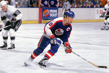
The old Nords jerseys are probably my favorite in all of sports. Why mess with a good thing?
Yes, the old Fleur de lis jerseys are much nicer.
Absolutely horrid.
The old Nords jerseys are probably my favorite in all of sports. Why mess with a good thing?
Jerseys were great but logo was terrible either.
This fits into second half of 90's with fisherman and robo-coyote.
Loved the old Nords jerseys. That said, what exactly was the logo? An igloo?


Quebec can use them if they get a team back, since I doubt they'll use these again.

Before anyone asks why, you don't see the new Jets rocking these still, do you?

Just because they don't, doesn't mean they shouldn't.
Without question. Actually, these are my favorite Jets rendition...but the Selanne era are sweet too.I am almost thankful the Nordiques moved instead of wearing those horrid wolf jerseys. Actually, I think there would have been enough backlash that they would scrap the idea or switch back after a year or two so bring hockey back to QC.
Jets should revert to the previous look.


"I'm . . . too 90s for my shirt.
So 90s, it hurts!!"
Those are God-awful. The Nords' jerseys in the late-80s/early-90s were things of beauty.
The wolf is not a bad jersey/design. Colours scheme is dated but that's fixed easy enough. I'd say it wasn't NHL caliber, but after looking at what the NHL does and has had for jersey design that wouldn't quite be true.
It's just that the Nordiques ones are that much better.
At one time the Nordiques in their final years were my favourite version, but now my top Nordiques uniform choice is this WHA one.
May he RIP - Dale Hawerchuk...Without question. Actually, these are my favorite Jets rendition...but the Selanne era are sweet too.
