DancingPanther
Foundational Titan
- Jun 19, 2018
- 35,342
- 74,102
I made my own, so you might want to bump that one downThe only correct answer:

Cap only makes S tier jerseys.
I made my own, so you might want to bump that one downThe only correct answer:
Cap only makes S tier jerseys.
I made my own, so you might want to bump that one down
St Paul and Tijuana are S tier
Quoted for truthSt Paul and Tijuana are S tier
You’re a huge fan of blue aren’t you?A tiers are my favs, and S tier is reserved for the Surge. S for Surge, after all. I placed them as my most favorite because of the simple but effective logo and excellent color scheme. Could absolutely be a pro jersey. Not that others couldn't, but the Surge could integrate pretty easily. So the top 2 tiers are just my favorites with and my favorite favorite in S.
B tier are great jerseys still, and most are located in this tier. That says it all honestly. I have no gripes with these jerseys and it's all just little things here and there that I don't like *as much* as my favorites, for example the M.A.D. Cats logo (sorry @JojoTheWhale). I'll get ripped for this but I never fawned over the whatever-it's-called Phoenix style jersey (but I still liked it), so it gets a B from me. For what it's worth, this logo is way better than that stupid Coyotes logo. Don't @ me
I'm not a fan of all 4 color schemes in C tier, and think the Sockeyes logo could use a touch up. It looks a little smudgy. The Fog go in this tier because of the color clash of the actual fog in the logo and the colors of the jersey. The turquoise fog doesn't play well with the shade of blue on the jersey imo, but the jersey without the logo? B tier.
D tier are basically C tier jerseys that I have stronger feelings about. The purple Villains doesn't do it for me, especially with all the black in the log. The Firesticks are style of jersey I never loved (intramural frat style). The Whalers go in this tier because it's just the real Whalers jersey. Which I love irl, but it's not what I'm looking for in a QV jersey
View attachment 581620
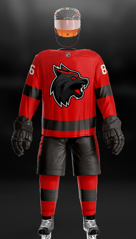
Yet it’s better than everything caps done, right @Captain Dave PoulinThrew this together for fun.
*obviously I didn't make the jersey or the logo... just found pieces I liked, changed some things, and put them together.
Yet it’s better than everything caps done, right @Captain Dave Poulin
 No, absolutely not, you shit-stirrer.
A tiers are my favs, and S tier is reserved for the Surge. S for Surge, after all. I placed them as my most favorite because of the simple but effective logo and excellent color scheme. Could absolutely be a pro jersey. Not that others couldn't, but the Surge could integrate pretty easily. So the top 2 tiers are just my favorites with and my favorite favorite in S.
B tier are great jerseys still, and most are located in this tier. That says it all honestly. I have no gripes with these jerseys and it's all just little things here and there that I don't like *as much* as my favorites, for example the M.A.D. Cats logo (sorry @JojoTheWhale). I'll get ripped for this but I never fawned over the whatever-it's-called Phoenix style jersey (but I still liked it), so it gets a B from me. For what it's worth, this logo is way better than that stupid Coyotes logo. Don't @ me
I'm not a fan of all 4 color schemes in C tier, and think the Sockeyes logo could use a touch up. It looks a little smudgy. The Fog go in this tier because of the color clash of the actual fog in the logo and the colors of the jersey. The turquoise fog doesn't play well with the shade of blue on the jersey imo, but the jersey without the logo? B tier.
D tier are basically C tier jerseys that I have stronger feelings about. The purple Villains doesn't do it for me, especially with all the black in the log. The Firesticks are style of jersey I never loved (intramural frat style). The Whalers go in this tier because it's just the real Whalers jersey. Which I love irl, but it's not what I'm looking for in a QV jersey
View attachment 581620
I like my minor league logo better, it's actually some ancient symbol depicting chaos. I forget what culture. But it's coolI was just looking at our minor league jerseys, and those are sexy too.
Ok, I bumped it up.
I guess I designed my own too, but Cap made my dreams reality.
No. But remember it’s never too late for the Boise Idatoes to join the Quackverse. Or maybe the Fargo RoboToes.
Where’s your NHL jersey tier list?????I like my minor league logo better, it's actually some ancient symbol depicting chaos. I forget what culture. But it's cool
Thanks, clapGood looking out, Pants - I appreciate the thoughts and feedback.
Told youWhere’s your NHL jersey tier list?????
Edit: never mind. I found it and now I’m mad.
How dare you sir. Err kid.
Cap did a great job. I just wanted to take a shot at it.
Redo the flames!i wanna make a jersey!!!!
Bern, we don’t deserve you.
Kind of you to say, HC. I can't ignore the quality. Cap'n's were Rembrandts, mine was fun to do on my own but was a paint-by-numbers in comparison.Bern, we don’t deserve you.
Shit, I swear I did mine before I saw this