
Predators and Lightning unveil Stadium Series jerseys
- Thread starter MMC
- Start date
You are using an out of date browser. It may not display this or other websites correctly.
You should upgrade or use an alternative browser.
You should upgrade or use an alternative browser.
aufheben
#Norris4Fox
WingsMJN2965
Registered User
- Oct 13, 2017
- 18,106
- 17,700
Those jerseys are the worst thing to happen to Nashville since painting the ice yellow for the offseason...
MK9
Registered User
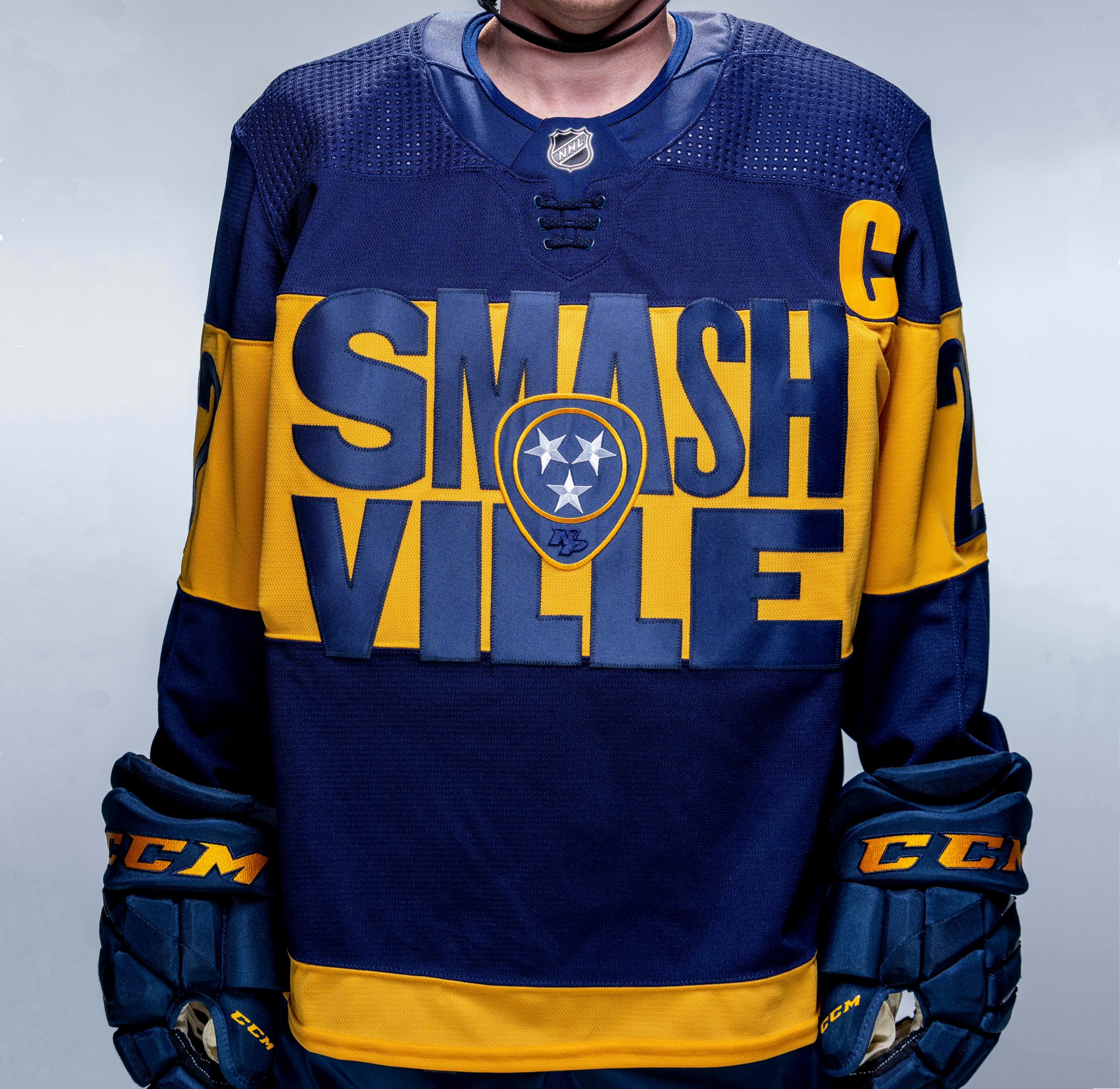
Am I wrong or are the 2 letter S's in Smashville a different font?
Doesn't look good to me at all...
Those look like pajamas for a 12 year old.

BertCorbeau
F*ck cancer - RIP Fugu and Buffaloed
People get paid to come up with these designs?
Where do I apply?
Where do I apply?
Platano King
Current mood
CanadienShark
Registered User
- Dec 18, 2012
- 37,443
- 15,261
Not crazy about the Smash part, but jerseys are nice. Bolts ones too, but they don't feel like a huge departure from other iterations.
Okay first off maybe I'm biased because I had a run of hating the Preds when they kept dummying the Ducks in the playoffs, but I've always found Smashville to be such a dumb nickname. Sounds like something a WWE "wrestler" would say when asked where he was born.
That aside, good God that wordmark is horrendous. Like I cannot believe anyone in that organization with eyes thought that was a good idea.
Tampa's is whatever.
That aside, good God that wordmark is horrendous. Like I cannot believe anyone in that organization with eyes thought that was a good idea.
Tampa's is whatever.
Ducks in a row
Go Ducks Quack Quack
BigFatCat999
First Fubu and now Pred303. !@#$! you cancer
If there was a poll of either buy the Nashville jersey or get COVID, cough on me
All you had to do to make that Preds jersey solid is make the guitar pick/dragon ball the primary crest. keep the stripe, maaaaybe add a bit of yellow to the bottom of it and you have a legitimately nice jersey. And then get rid of that horrendous ass text.
That version is just...no, man.
Tampa's looks okay though. A little formulaic but sometimes safe is better.
That version is just...no, man.
Tampa's looks okay though. A little formulaic but sometimes safe is better.

TheAngryHank
Expert
- May 28, 2008
- 17,988
- 6,930
- Jan 23, 2017
- 19,414
- 29,566
Have you seen their 3rds?Tampa could you be any f***ing lazier
MarkusKetterer
Shoulda got one game in
All you had to do to make that Preds jersey solid is make the guitar pick/dragon ball the primary crest. keep the stripe, maaaaybe add a bit of yellow to the bottom of it and you have a legitimately nice jersey. And then get rid of that horrendous ass text.
That version is just...no, man.
Tampa's looks okay though. A little formulaic but sometimes safe is better.
Agree to the Nashville one. That woulda been perfect.
Tampa’s would be way better with an actual logo. Like this one that was a shoulder one before:

MetalheadPenguinsFan
Registered User
BigFatCat999
First Fubu and now Pred303. !@#$! you cancer
If you watch the Hockey Guy on youtube, he has a jersey collection over 190. When talking about the Nashville jersey, he had look on his face like, 'don't f***ing make me buy this.'
PhysicalGraffiti
Bolts STM
BOLTS sucks so bad, get that out of here and put a logo on the front. Hate when teams do that, so lame. Would've been awesome if not for that, everything else looks well done.
But their logo sucks, so this is preferred.
The Red Line
Registered User
- Oct 11, 2010
- 8,272
- 5,311
And here is Tampa’s:
Bolts have a kind of Canada cup thing going on
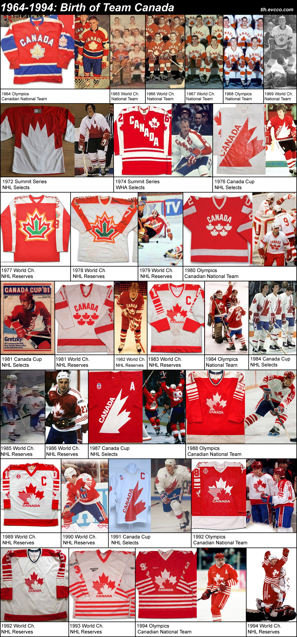
Canada's Hockey Uniforms - All of them!
Users who are viewing this thread
Total: 1 (members: 0, guests: 1)
Latest posts
-

-

-
 Confirmed with Link: 2025 NHL DRAFT Thread: The Isles Have Won the 2025 Draft Lottery (11 Viewers)
- Latest: TeamKidd
-
 Salary Cap: 24-25 Salary Thread Crosbicles Volume MXVII: Marner Watch (16 Viewers)
- Latest: Big Friggin Dummy
-
