
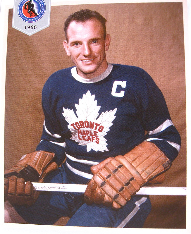
Teeder Keon
Defeat does not rest lightly on their shoulders
Nickelboring one of the all time most boring overrated bands in the history of musicThey’re definitely this era’s nickelback....
Nickelboring one of the all time most boring overrated bands in the history of musicThey’re definitely this era’s nickelback....
Precisely my thoughts on imagine dragons.... both awfulNickelboring one of the all time most boring overrated bands in the history of music
Don’t know them as I’m old lolPrecisely my thoughts on imagine dragons.... both awful
")
I like it without the outline of Ontario.
Maybe to troll other Canadian teams you should make an image with the outline of Canada since we are Canada's Team
I know we are known for Blue, but this would be interesting as a one off too.
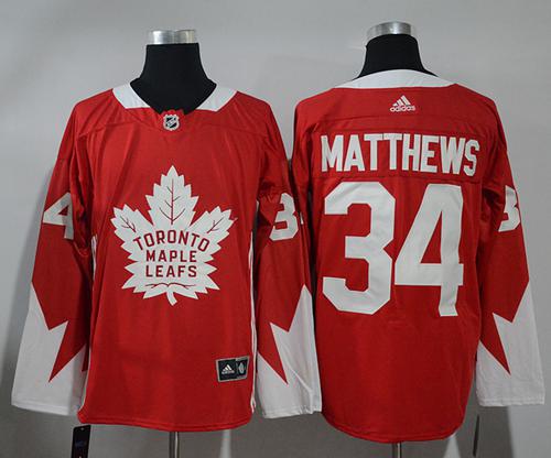
Honestly, I like this one a lot more than the St. Pat’s jersey.I know we are known for Blue, but this would be interesting as a one off too.
Looks very weird. but atleast it makes me think of Canada.I know we are known for Blue, but this would be interesting as a one off too.
??outline of Ontario
I like it without the outline of Ontario.
Maybe to troll other Canadian teams you should make an image with the outline of Canada since we are Canada's Team

You need four leaf clover to win more. Sorry, could not resist. LolAlso here’s a nice st pats concept jersey while we are discussing jerseys...
probably would win more with these...View attachment 426960
Canada day doesn’t fall mid season, but I’d love to see these as an “oh Canada series” or something.I know we are known for Blue, but this would be interesting as a one off too.
IMO they should have stuck with white trims instead of the grey and like our current logo (retro enough) -- this I would buy.honestly, I wasn't a huge fan of the reverse retro uni's but I have to say it looks great on the ice with the whole get up. I have a feeling this concept would be similar. Would look great on the ice, just not sure I'd ever buy one. Nice work though

It's so strange. When it first came out I wanted to puke. It looked like a cheap knock off you'd buy at a gas station. I hated the grey instead of the white. But when they put the whole kit together it actually isn't that bad. I can't believe I am saying it, but i'm actually coming around on it. I think i like it now lol. I think if it were white trim instead of grey I definitely would have bought it right away, but after seeing the current reverse retro, I think it would look worse on the Ice. As in, its a nicer jersey by itself and to wear as a fan, but I think the on ice uniform with pants and socks might not look as good.IMO they should have stuck with white trims instead of the grey and like our current logo (retro enough) -- this I would buy.
I hated them at first, thought they looked like a jersey you'd see a Leafs minor hockey house league team wear; but yea they grew on me too... maybe because all Leafs jerseys look good, can't think of one I really don't like.It's so strange. When it first came out I wanted to puke. It looked like a cheap knock off you'd buy at a gas station. I hated the grey instead of the white. But when they put the whole kit together it actually isn't that bad. I can't believe I am saying it, but i'm actually coming around on it. I think i like it now lol. I think if it were white trim instead of grey I definitely would have bought it right away, but after seeing the current reverse retro, I think it would look worse on the Ice. As in, its a nicer jersey by itself and to wear as a fan, but I think the on ice uniform with pants and socks might not look as good.
%100 I'd buy that with the white and updated logoIMO they should have stuck with white trims instead of the grey and like our current logo (retro enough) -- this I would buy.
I love it, what are they waiting for??not the poster you replied to but this is what i found online

I think the reason they are growing on me is that they break the traditional mold. I think you got to stick with the blue and white typically, but the whole get up just works I feel. One of my favorite jersey's is the Toronto Arena's but I just am not a fan of buying anything thats not "maple leafs". I dont cheer for the toronto arena's or toronto huskies, I cheer for the Leafs and Raps. I don't know if thats just me, but I always thought it was weird. Same with the millionaires jersey here in Van, its a beautiful jersey, just not the same franchise lol. May as well make a BC lions hockey jersey. Like if they would have replaced the Arena's lettering and put an old school blank white maple leaf with the Arena "T" smack dab in the middle of the maple leaf, i think that would be a sexy sweater. simple, and pays homage to the arena's with the arena "T". I don't know if anyone on here has photo shop skills to mock that up, and if I even made sense of what I am thinking. I Just think that simple look would have the cool retro feel you get with the Arena's sweater, but still have a Leaf feelI hated them at first, thought they looked like a jersey you'd see a Leafs minor hockey house league team wear; but yea they grew on me too... maybe because all Leafs jerseys look good, can't think of one I really don't like.
that's a beautiful sweater. I would buy that in a heart beatnot the poster you replied to but this is what i found online
