- Jul 23, 2013
- 5,182
- 3,234
I'll take the W, it's not the new leaping Panther logo. I do get where the big white stripe comes from, but it would have been (probably) much nicer if the bottom white was red and bottom red golden.
I'll take the W, it's not the new leaping Panther logo. I do get where the big white stripe comes from, but it would have been (probably) much nicer if the bottom white was red and bottom red golden.
Really slick looking. Not the best of the retros but definitely in the top few.
Some of them are horrible but I think ours looks really good.
I like the "in your face" silliness of the Ducks jersey. If you want ugly, look at Dallas and Detroit, they missed so badly.FLA is one of the top 5 ones imo, of course we're a little bias.
The best one is the CAR/HFD one, always loved that logo.
Like the OTT, SJ and WSH ones as well.
Look at the PIT, STL, ANA and TOR ones. Horrible.
I like the "in your face" silliness of the Ducks jersey. If you want ugly, look at Dallas and Detroit, they missed so badly.
^I like Arizona's, they remind me of the Johnny Cash voiced Simpsons coyote
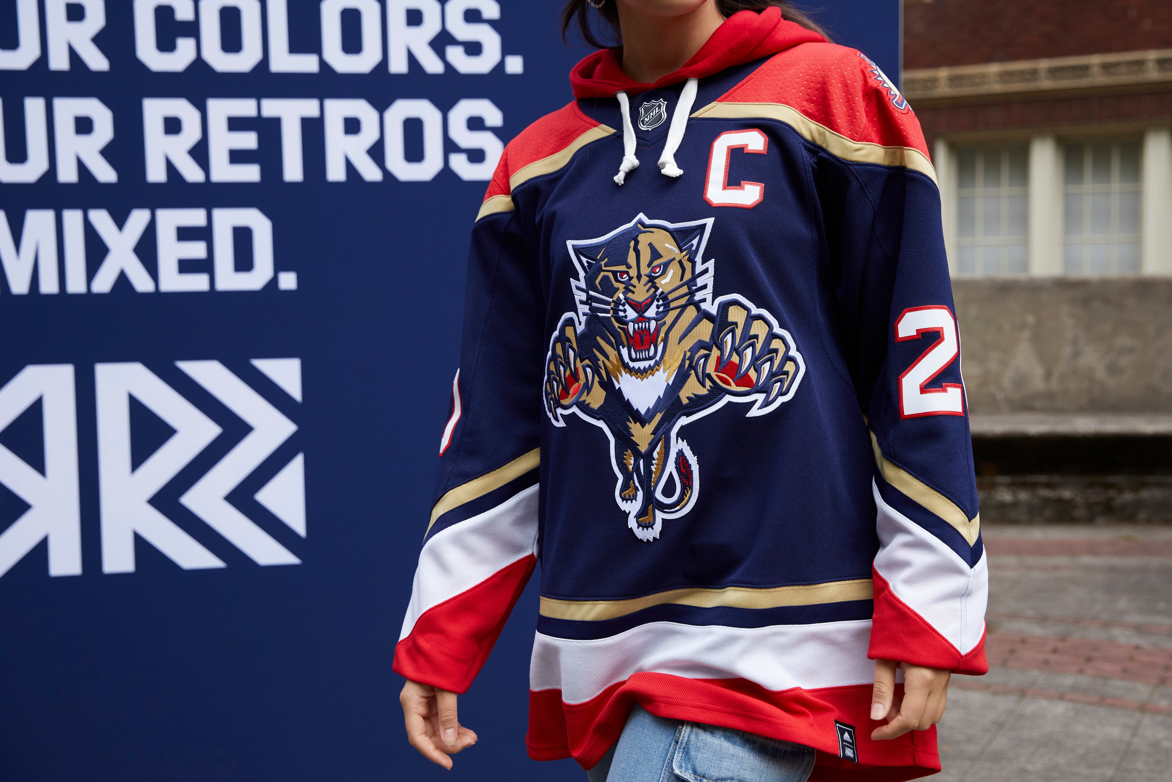
It's a reverse of the 96 jerseys, not a tweaking of our 98. That's why the collar says 96.As a Panthers jersey collector, I'm in of course.
Glad they went with the OG Panther instead of the new minimalistic one. Only thing that bothers me here is the "96" on the neck cause we didn't have the blue until 98-99. Those details is what make jersey collecting fun, HUGE missed opportunity to make this the leaping Panther with the broken stick and the 98 on the collar, more accurate for my picky ass taste.
Also, funny if they would have dropped a Reverse Retro of the JetBlue to piss everyone off haha. (I own one and love it, don't really care about the hate on that thing)
It's a reverse of the 96 jerseys, not a tweaking of our 98. That's why the collar says 96.
Would have been 10/10 if they didn't include the white.

Dislike DAL, CLB, TOR, CLG ( I strongly dislike Calgary's logo)FLA is one of the top 5 ones imo, of course we're a little bias.
The best one is the CAR/HFD one, always loved that logo.
Like the OTT, SJ and WSH ones as well.
Look at the PIT, STL, ANA and TOR ones. Horrible.
I agree, the navy blues were never my favorite. I’m impressed with how much better the new gold looks next to the blue than the original shade. The white stripes are a little too wide, but not terrible. But best of all, they didn’t slap that updated Leaping Panther on it. I think this is the best navy blue version yet.I actually like these even more than our old original blues. The original reds were my favorites (and whites) but the blues never hit the same with me. I think these are a much cleaner and sleeker version of those.
I originally didn’t like the white stripe at the bottom in the mock-ups, but seeing it in person I think the white goes well with the other colors (maybe a tad too thick but overall I like the addition) and I like the current gold over the yellow gold, which I’m a little surprised about, I thought I would’ve preferred the yellow striping more.
overall I think these are a fantastic new modern take on our old blue jerseys. I absolutely want one.
Are they only selling these in authentic version? I only see the authentic $210 version available
Can anyone with graphics skills try what the jersey would looked like if the white part was the same navy blue is other parts of the jersey or champagne on the jersey
You did a good job! I think I like the white even more, it looks a little boring without it. The white really pops and goes well with the reds, blues, and gold tone. Maybe it could’ve been thinner but that’s my only potential critique.Hacked this together lol
I'll give them the benefit of the doubt that they tried with thinner white.You did a good job! I think I like the white even more, it looks a little boring without it. The white really pops and goes well with the reds, blues, and gold tone. Maybe it could’ve been thinner but that’s my only potential critique.