Oh, I may as well do all of them. This is a thought exercise, I realise nobody cares what I think but I know everything I say is 100% correct. Enjoy reading your team and ignoring the rest.
Anaheim: Their jerseys should be the original Mighty Ducks set (including Wild Wing alternate) from now until global warming makes the concept of ice rinks commercially unviable.
Boston: Every year they seem to fuss around with details that nobody besides Bruins fans would ever notice or care about. But generally they look better with less black in their overall look.
Buffalo: The goat head is a good design and colour scheme, but I might only think that because it was what they had when I first got into hockey. Similar to Boston with too many details and tweaks over the years, generally better when it's just blue and yellow.
Calgary: The only real bad look they've ever had was when they had piping and the flag of Alberta on their shoulder. I like Blasty, I like the black C, I like the weird font on their 00s jersey. The current retro scheme is great too.
Carolina: Their best look is their original look. "Canes", the flag, the stupid redesigns in the 2010s, all terrible. The Whalers stuff is ugly too.
Chicago: Fine. Never really thought anything about it one way or the other. Best alternate is the black one with the white/red Habs stripe in the middle and the circle around the logo.
Colorado: Everything about it is great, and with the designs we've had in our history management clearly thinks the same way. Original alternate was great. Blueberry was hideous. Current 3rd is a good alternate because it's distinct enough to be a separate identity, but still clearly the Avalanche. I still don't like blue pants and helmets, though they work better on the homes than the aways. I also find it quite telling that we seem to use our white jersey as our main look - everyone was wearing them at the 22 cup parade, we use it at the drafts, we use it for arena banners. The only odd thing is that despite a distinctive colour scheme and lots of striking imagery, nothing seems to lend itself to good goalie mask designs.
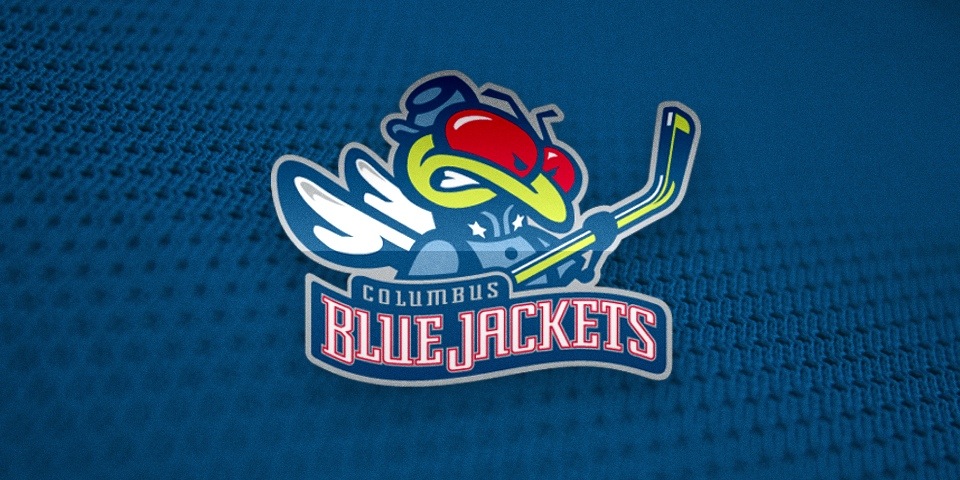
Columbus: Bit boring, bit pointless. Bit like the team. Fits well. I don't like the number font. Bring back Stinger.
Dallas: Obviously agree with everyone else in the world who says go back to the classic star design. Their current logo is ugly, their jerseys are boring and look like Chicago's St. Patrick's Day outfits, their goal song is the most obnoxious thing in the world (not a bad thing if you're a Stars fan tbf)
Detroit: I am fundamentally opposed to the Detroit Red Wings as a concept but even I offered my commiserations on their board when they added an ad to such an iconic design.
Edmonton: Blue and orange works. I liked the navy too. Didn't really like when they switched to orange for their primary. They've always looked good.
Florida: Their original jerseys and logo are great. I don't know why people don't like the old logo. Their current look is very boring and the logo looks cheap.
Los Angeles: They would objectively be better off with yellow/purple but that screams 70s in a way people presumably think when they say 90s expansion teams look dated. If they're sticking with white/grey/black, at least their logo is better now.
Minnesota: Everything about their existence is irredeemable. The North Stars colours are ugly too.
Montreal: Yep, carry on. Not so sure on the big collar on the red jerseys right now.
Nashville: When they switched to yellow I remember reading someone online somewhere saying something like "they need an identity. Ugly is an identity." Nobody else really does yellow so fair enough. Their blue alternates they had for about a year are still their best look, probably. Don't really see a problem with the name either.
New Jersey: I don't mind the current ones too much but their original look is obviously the best.
Islanders: Same as Edmonton, the colour scheme works and I like the chunky stripes at the waist/cuffs and nothing elsewhere. Never really liked the fisherman but appreciate how garish and over the top it is. Ironically I think they'd suit a jersey with ISLANDERS on it diagonally but obviously never would.
Rangers: Home and away is a good look. Dark navy Liberty alternate is the best choice, though I like the one with New York on it too. I also like any commemorative patches they wear being on their shoulders rather than the front.
Ottawa: I like the black and red. I like the logo. Never really liked the SNES jerseys. Quite liked the O jerseys.
Philadelphia: Pick a f***ing lane, boys. Either use the Lindros jerseys or the Pronger jerseys. Orange/white/black. Don't mess around with details, just go with the classics and stick with them. Alternate every ten years or whenever you need to distract from being terrible and sell some new merch.
Pittsburgh: I think I've always liked all of their styles. I liked robo penguin. I liked their baby blue jerseys. It all works.
San Jose: Similar to Colorado I think I prefer black helmets, although going big on a unique colour works.
Seattle: Terrible name, boring jerseys, boring colour scheme. Bad logo. Try again.
St. Louis: I think I've run out of ways to say I hate teams but I don't think they ever really do bad jerseys.
Tampa Bay: What they have is dull, but success sells and in a way it's hard to picture them in anything else. Still boring though. If your design could be improved by adding black then it's probably not very good.
Toronto: I don't like their current look. The single stripe on the waist is too small and looks like a modern, corporate attempt at being retro. Cynical. I think an actual retro look is their best option but I'm not sure on the fine details.
Utah: So boring I forgot what it looked like about three seconds after I closed the thread on here. I did agree with the guy who said it looks like it was a logo from create a team in NHL 09 though.
Vancouver: I've never really minded whatever they wheel out. I think I like the stick in the rink the best, though I can see the appeal of the flying spaghetti logo. Green and blue is a unique look, stick with that.
Washington: I can only hope or assume that about five minutes after Ovechkin retires they ditch their boring, boring logo and terrible, terrible piping.
Winnipeg: Bad logo, bad jerseys (what are those stripes on the sleeves), stinking out the place for years when a fundamentally simpler and yet much better look exists. As an organisation they seem to exist to disappoint.
Obviously, Dallas and the Rangers deserve extra points for not sullying their existence with a jersey ad. I would add which teams do ads well (hint: that big blue thing on Montreal is a crime against humanity) but that feels too much like validation, so I'm not going to.