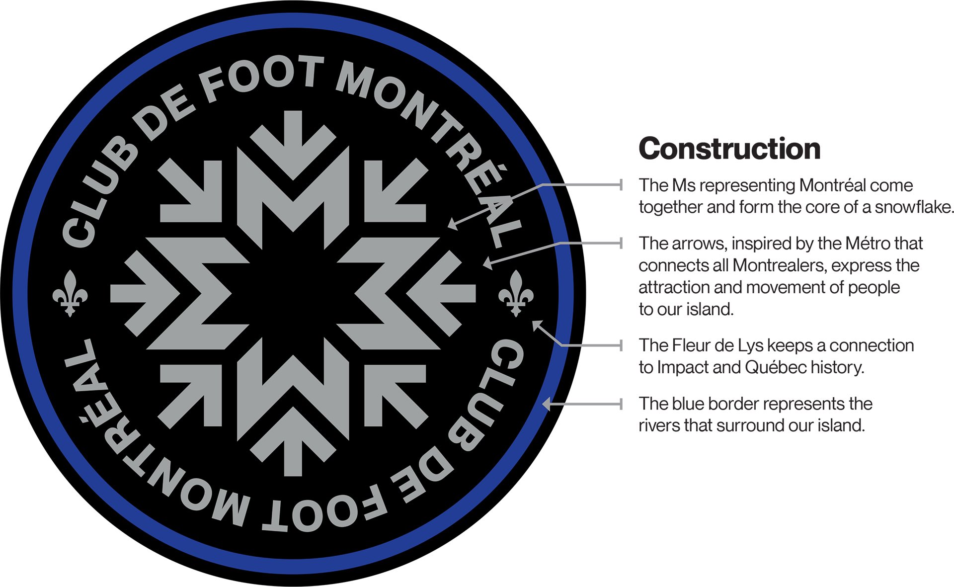
Something keeps coming back to me from the presentation: Gilmore and Kingsley played a lot on the "unique snowflake" thing, on the things that make Montreal different from the rest of the MLS cities, etc..
Yet, they gave us another round logo with the team name going around it. There are six teams in MLS alone with similar logos. If they loved the snowflake so much, I wish they had the guts to go with just the snowflake-shaped logo. That would've been truly singular, if not good-looking lol. I know they explained the circle shape as "the water that goes around the Montreal island" but it just doesn't cut it for me.
They went super hard on the edgy modern creative vibes for their campaign and settled for the worst of both worlds: a gutsy logo inside the most generic possible shape and overused "modern" logo type.